Noted: New Logo, Identity, and Packaging for Filthy Food by Mother Design
“Filthy, not Stirred”
(Est. 2009) "Filthy Food (stuffed olives, cherries, onions) is the cocktail garnish choice of the best bars, restaurants, hotels and liquor stores in the world. For decades, oily, salty, salad olives have been re-purposed to garnish premium drinks. Filthy presents a delicious, balanced and memorable alternative that complements premium alcohol by not masking the subtle flavors of the cocktail, while adding to the guest's overall experience. We don't use a chemical curing process. Filthy olives are naturally fermented, so they retain the rich, nutty and woody flavor usually associated with olive oil. Why are we called Filthy? Life is not about dipping your toe in or getting a little dirty, it's about getting FILTHY in everything you do because that's where the joy is."
Design by
Mother Design (New York, NY)
Related links
Mother Design project page
Relevant quote
As the company began evolving from a predominantly B-to-B model to include a wider retail footprint and DTC distribution, Filthy needed a look and feel as refined and hand-perfected as their product.
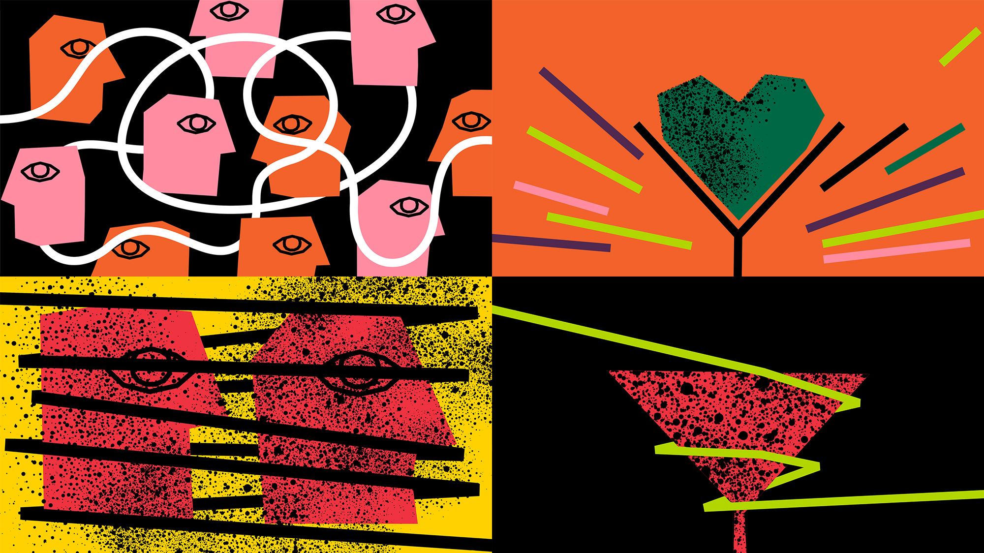
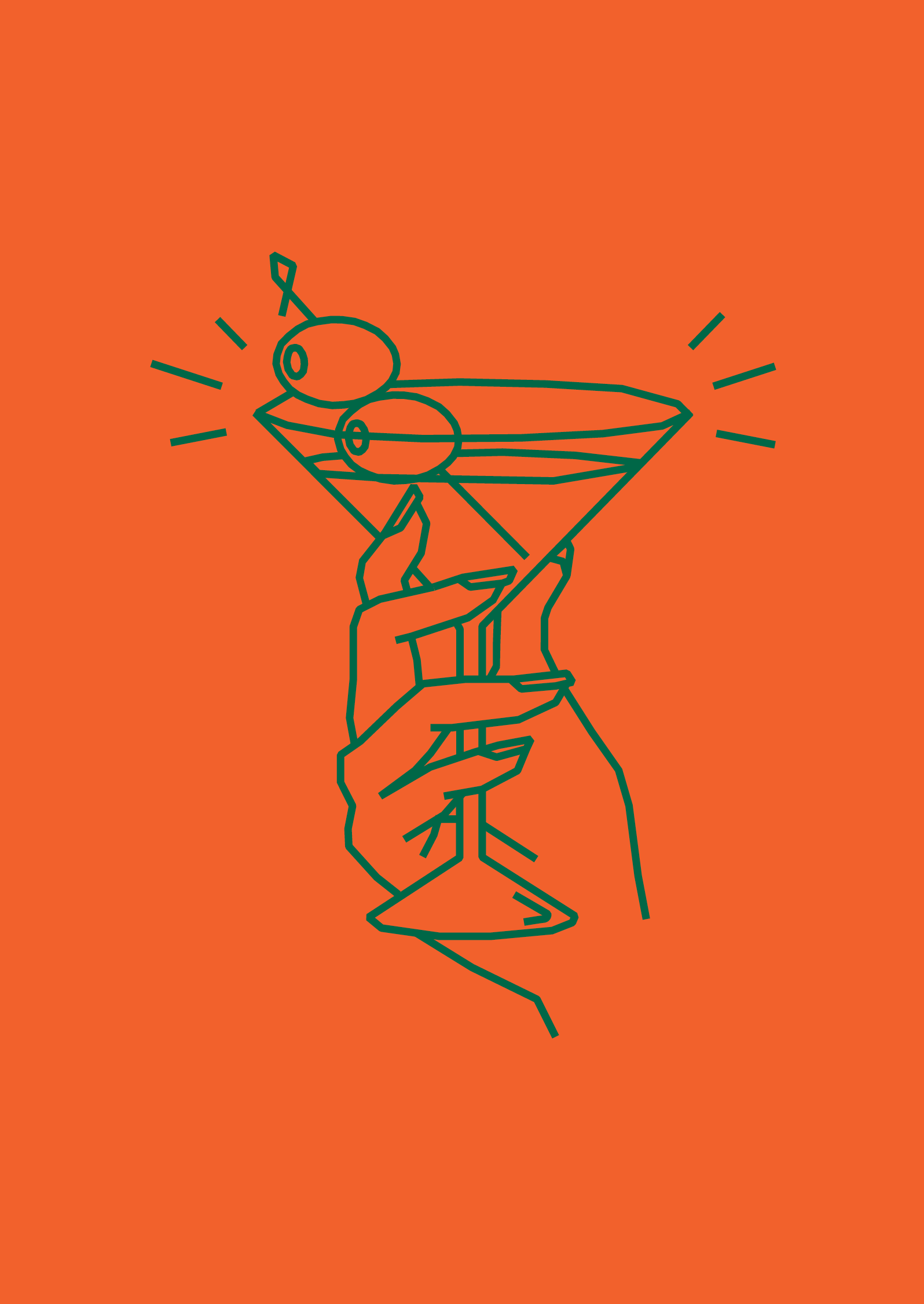
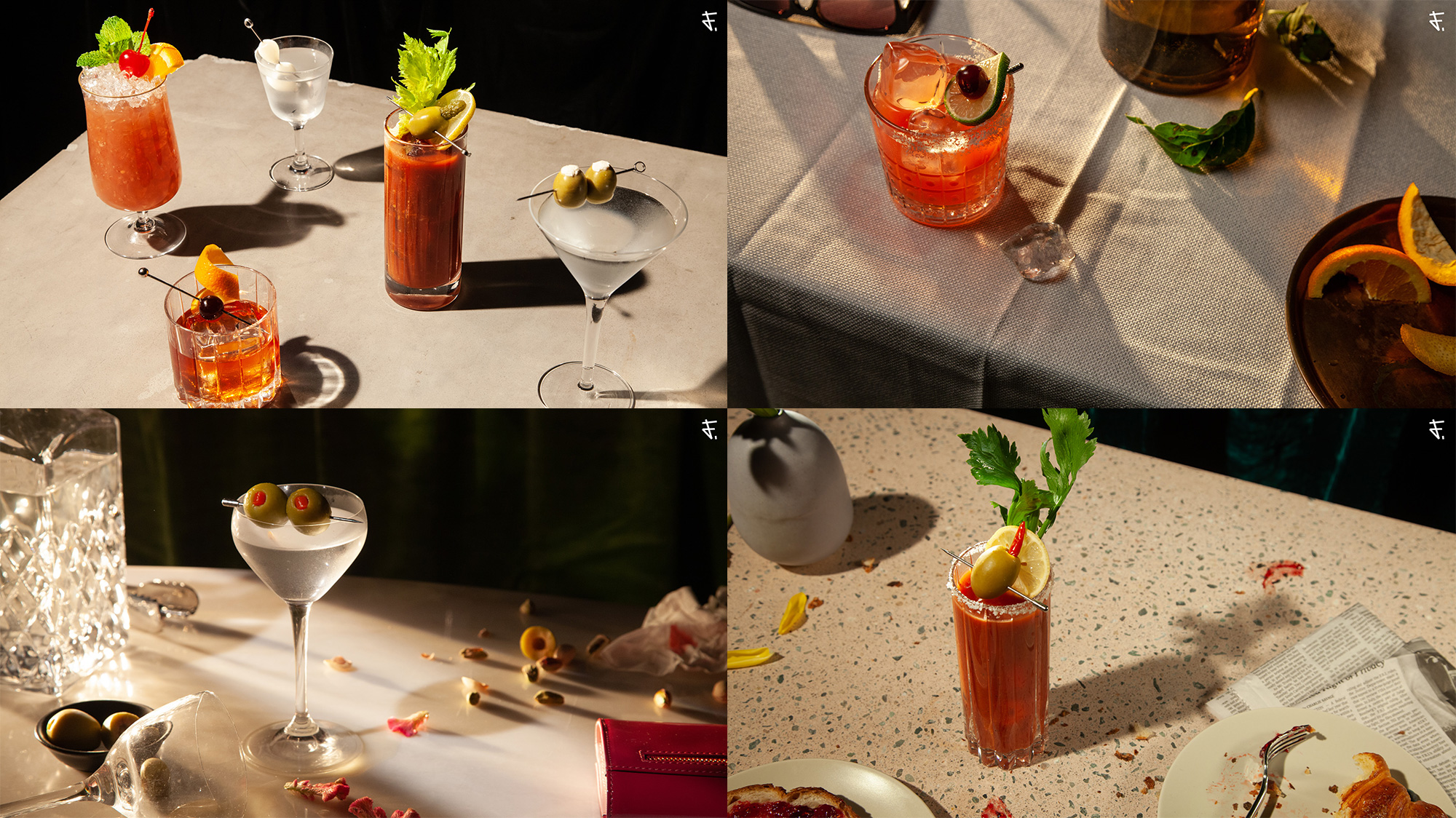
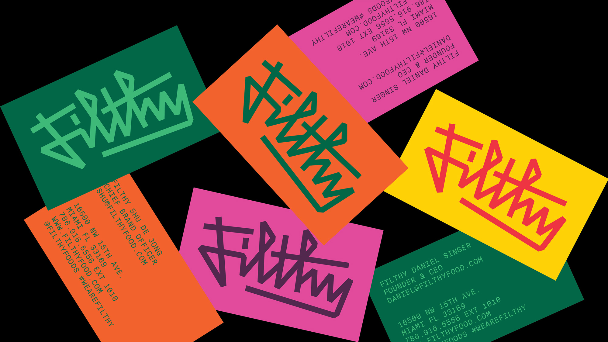
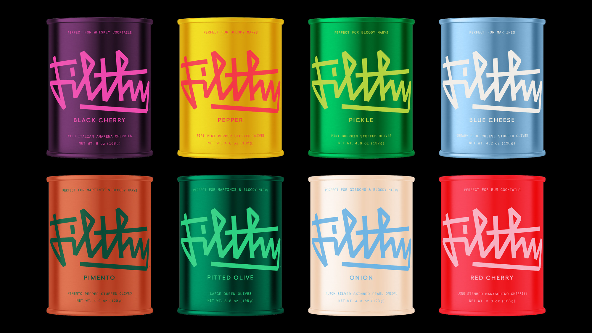
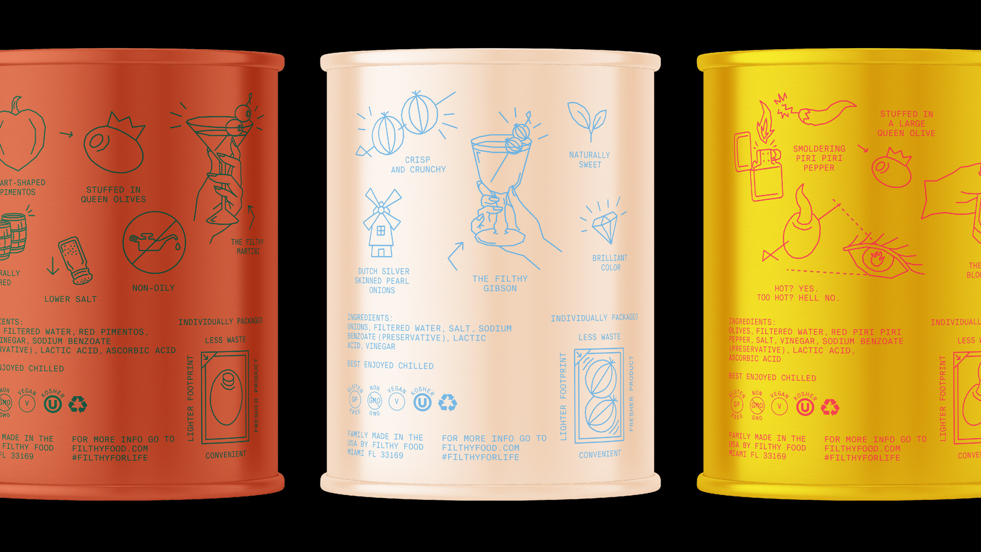
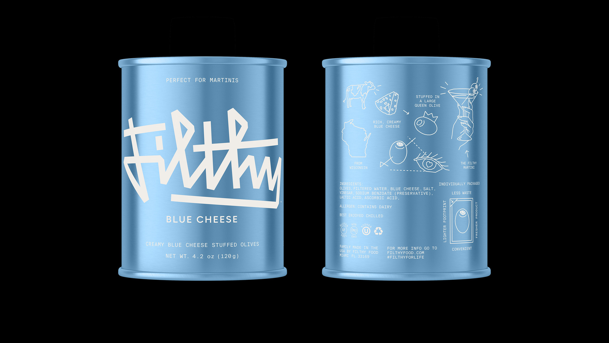
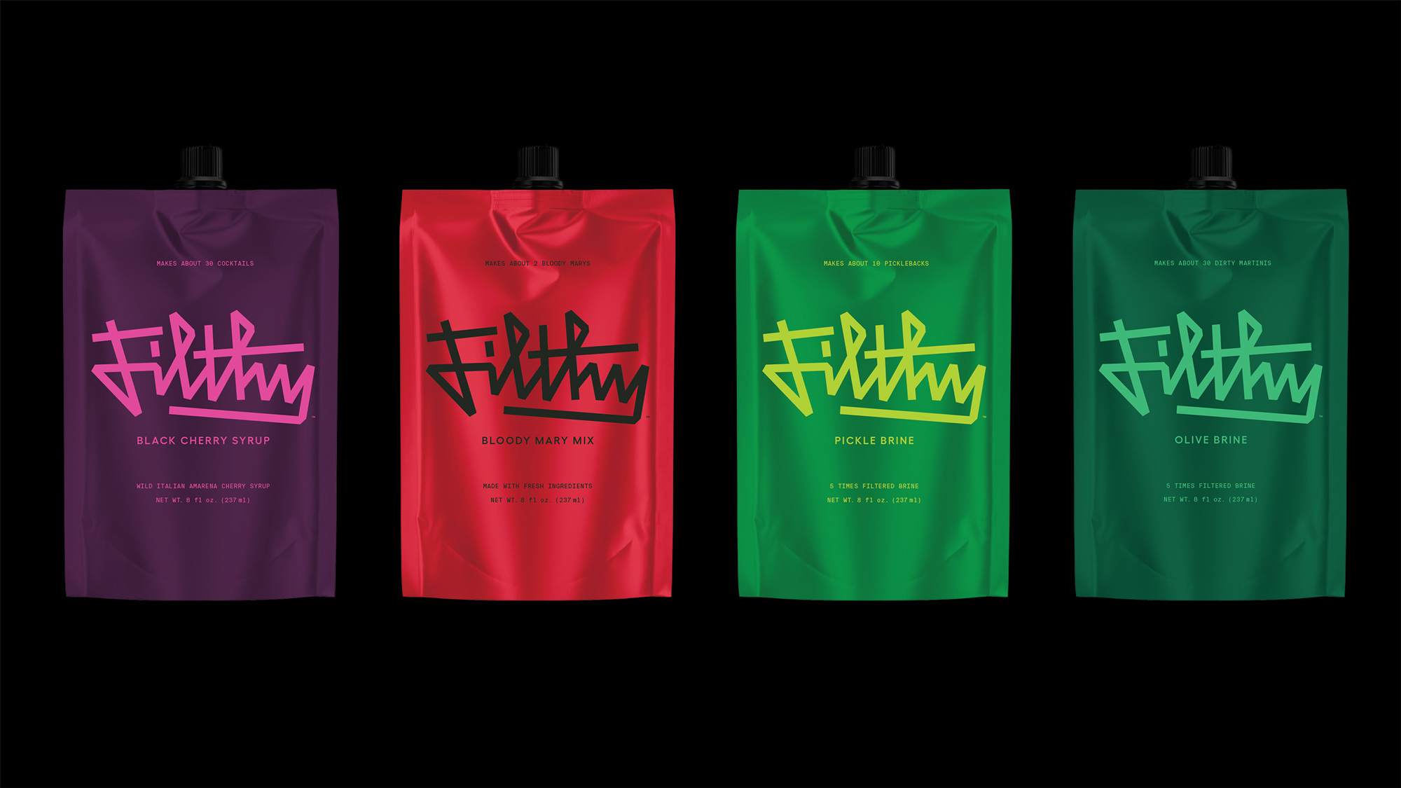
We developed a “perfectly imperfect” visual world that retains the brand’s rebellious spirit while refining its typographic, illustrative, and photographic elements. The wordmark combines a harried angularity with a hint of classical script construction to strike the balance between elegance and fervor. The illustrations and motion design bring to life the products’ attributes in a complementary style, while the photography subtly depicts evidence of nights (and the odd devious morning) well spent. The sum of the creative parts evokes an everyday sophistication and joyful energy that are rooted in the brand’s DNA.
Images (opinion after)
Opinion
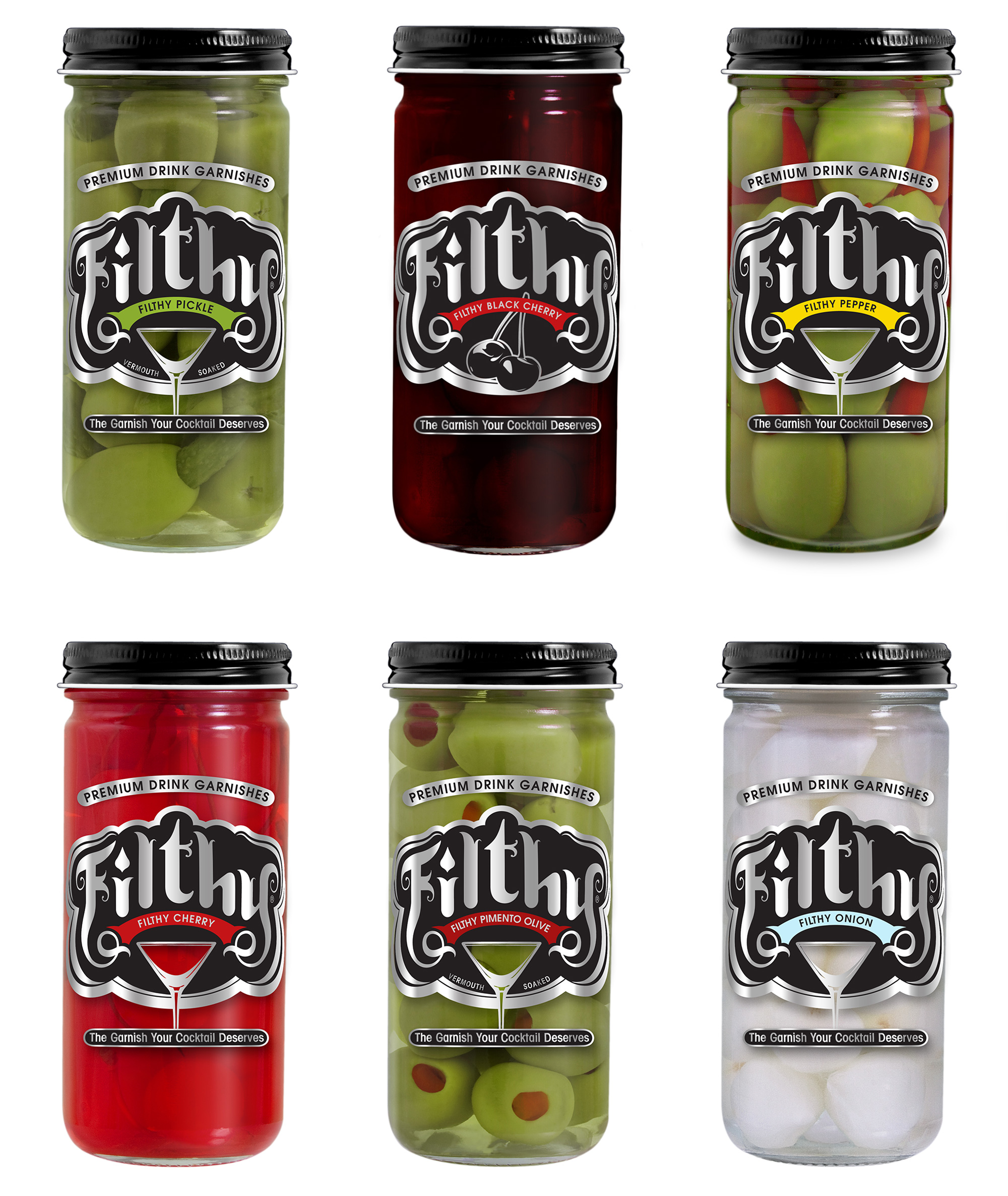
The old logo had the right intention with a kind of tattoo-parlor look that gave it daring-ish attitude but the illustration of their signature pickle-in-an-olive was… unfortunate. (Aside from possible sexual innuendos I was more reminded of the Pacific Geoduck.) The new logo is a great, angular script brimming with attitude and a bit of street style. I love how neatly all the letters interact with each other and the initial “Fi” ligature is excellent. The illustrations are great too, following the angular style of the logo — I’m not sure about the “dirty” texture as it might be too literal but I can go along with it. The old packaging was fine… not my cup of brine but it got the point across. The new packaging — if those renders end up being real — while very cool in a design-y way, I worry that they literally obscure the product. For something called “filthy” I feel like I would really want to get a glimpse at the product. Still, I can’t wait to see those in real life if these PSDs meet their destiny. Overall, a great evolution on the logo and lots of potential yet to be realized as the design comes to life and integrates the illustrations into a design system.
In ấn Anpic In nhãn mác Anpic In brochure Anpic In card visit Anpic In catalogue Anpic In thiệp cưới Anpic In tờ rơi Anpic
In Ấn Anpic – Nổi Tiếng In Đẹp In Nhanh
Số 5 Ngõ 75 Nguyễn Xiển, Thanh Xuân, Hạ Đình, Hà Nội
0963223884
baogiainananh@gmail.com
https://anpic.vn
https://g.page/inananpic
In nhãn mác Anpic ✅ In brochure Anpic ✅ In card visit Anpic ✅ In catalogue Anpic ✅ In thiệp cưới Anpic ✅ In tờ rơi Anpic
https://anpic.vn/in-nhan-mac-dep
https://anpic.vn/in-brochure
https://anpic.vn/in-an
https://anpic.vn/in-voucher-in-phieu-giam-gia-khuyen-mai
#inananpic


Comments
Post a Comment