Reviewed: New Logo and Identity for Regent's Place by DixonBaxi
“Everything in its Place”
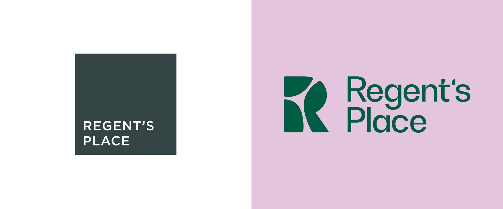
Completed in 1972, Regent's Place is a 13-acre, mixed-use business, retail, and residential development in London, UK. Developed by British Land, one of the largest property development and investment companies in the UK, Regent's Place totals around two million square feet and is home to more than 20,000 residents and workers (from companies like Santander, Manchester City FC, and Facebook), not to mention the thousands of customers that pass through every day for food, drink, and entertainment (whether it be on their outdoor plaza or two community theaters). Located at the intersection of the Knowledge Quarter, Camden, and the West End, the development features sustainable architecture, thoughtful green spaces, and opportunities for community connection. Recently, Regent's Place introduced a new identity designed by London-based DixonBaxi.
The existing brand felt corporate and functional and didn't reflect Regent's Place local heritage of progressiveness or feel fully integrated with, and sensitive to the surrounding community. This led us to embrace the ethos 'responsible urbanism'. We positioned Regent's Place as a pioneering destination where people and planet rise. A big ambition that lays the foundation for the next decade as the neighbourhood evolves and changes to reflect this human-centred mission.
The identity reflects the unique advantages of Regent's Place by highlighting its location at the intersection of three iconic districts: a neighbourhood at the crossroads of the Knowledge Quarter, Camden, and the West End. A compelling mix that brings together arts and science, research and creativity.
This distinctive location inspired the logo symbol. The three districts combine to make the 'R' symbol, which is used as a window to Regent's Place and the community. It's created to be transparent and almost disappear. The symbol, which is supported by a beautifully crafted wordmark, plays a central role in the identity and is consistently used to express the brand's ethos. It allows for framing different perspectives and provides a canvas for the community's vision and creativity. Each application becomes a space to tell a story.
A set of 3D idents was created to reflect the concepts of a close-knit community and nature reclaiming the space.
DixonBaxi provided text
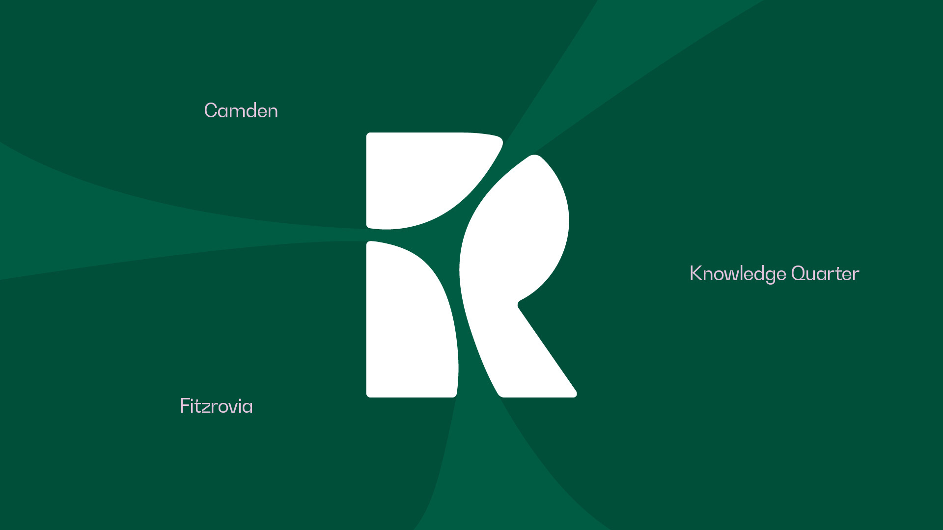
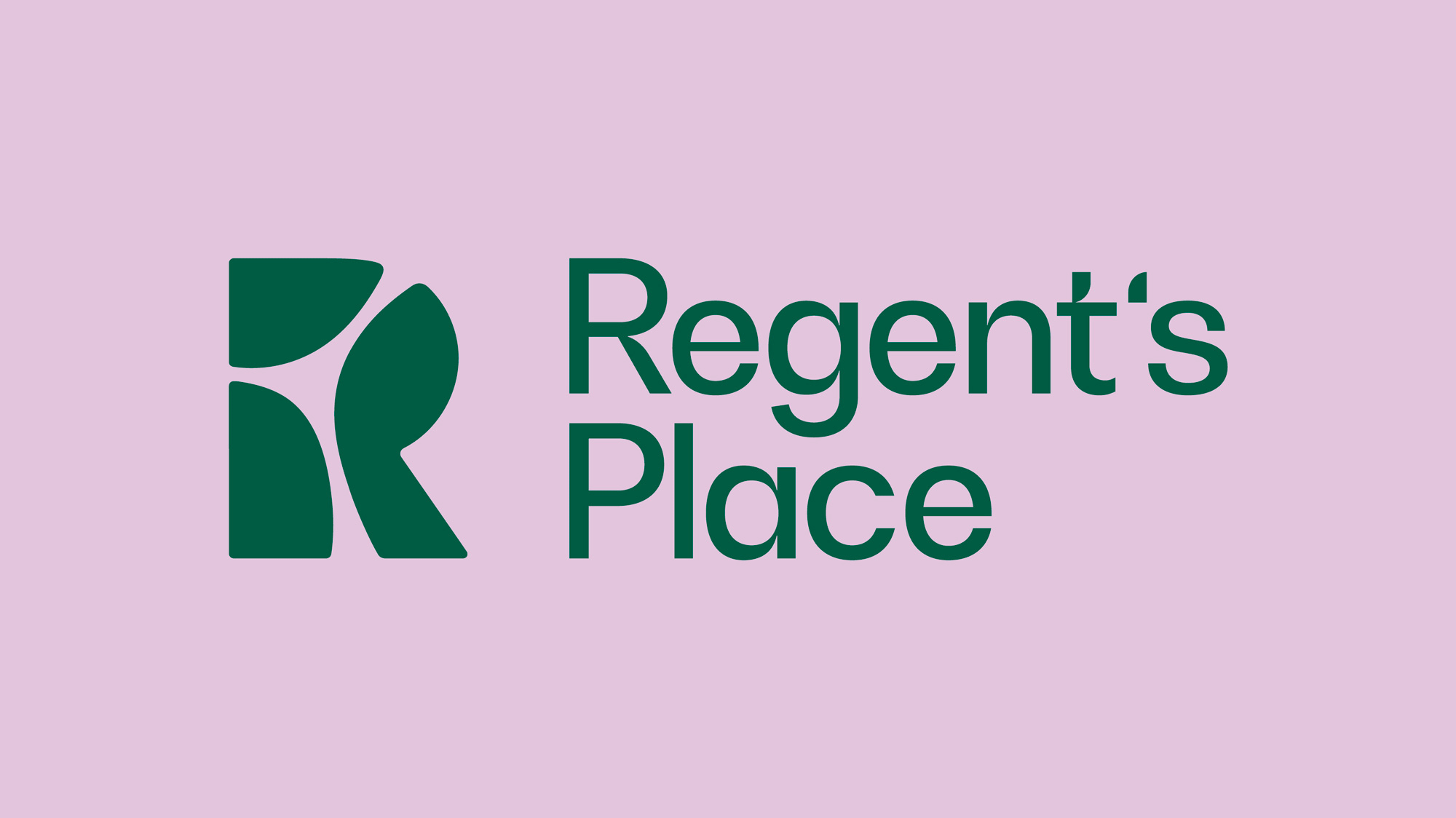


The old logo was very dry, corporate, and, in a way, rather uninviting with such a big, hard, sealed-on-all-sides square. The monogram in the new logo is the complete opposite almost literally by featuring an "R" with multiple entry points, all done with a flow-y, curvy approach that creates a very soft appearance. Constructing the abstract "R" from the three converging areas where the development sits is a solid concept and its execution is unexpected -- by breaking the "R" apart in unconventional places -- and delightfully simple. (Our London readers will have to confirm for me if the geography is correct or if creative liberties were taken.) The monogram also works well as a stroke, although personally I would have thickened it a bit to give it some softness. The wordmark, typeset in BW Gradual, is an interesting complement that adds a touch of urban edginess to the monogram -- I wonder if the notches in the letters should have been rounded at the corners to make it more cohesive with the monogram.
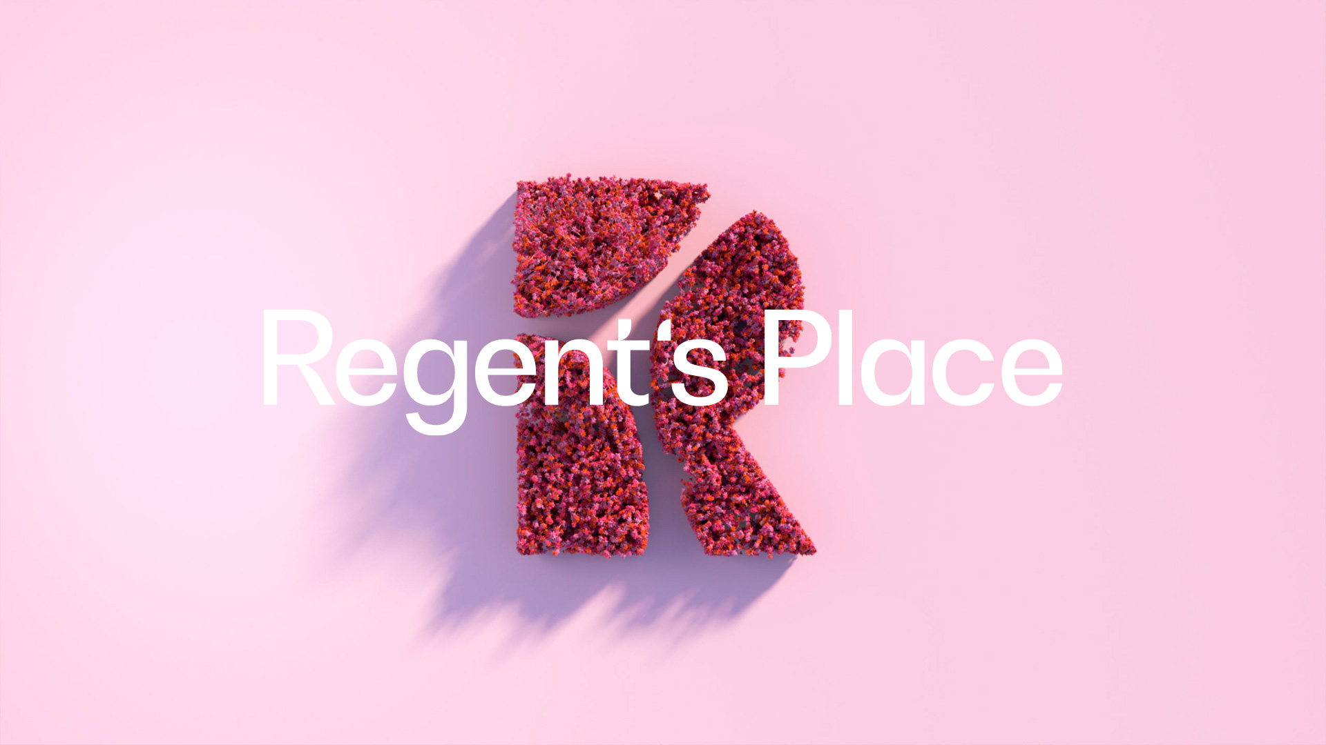
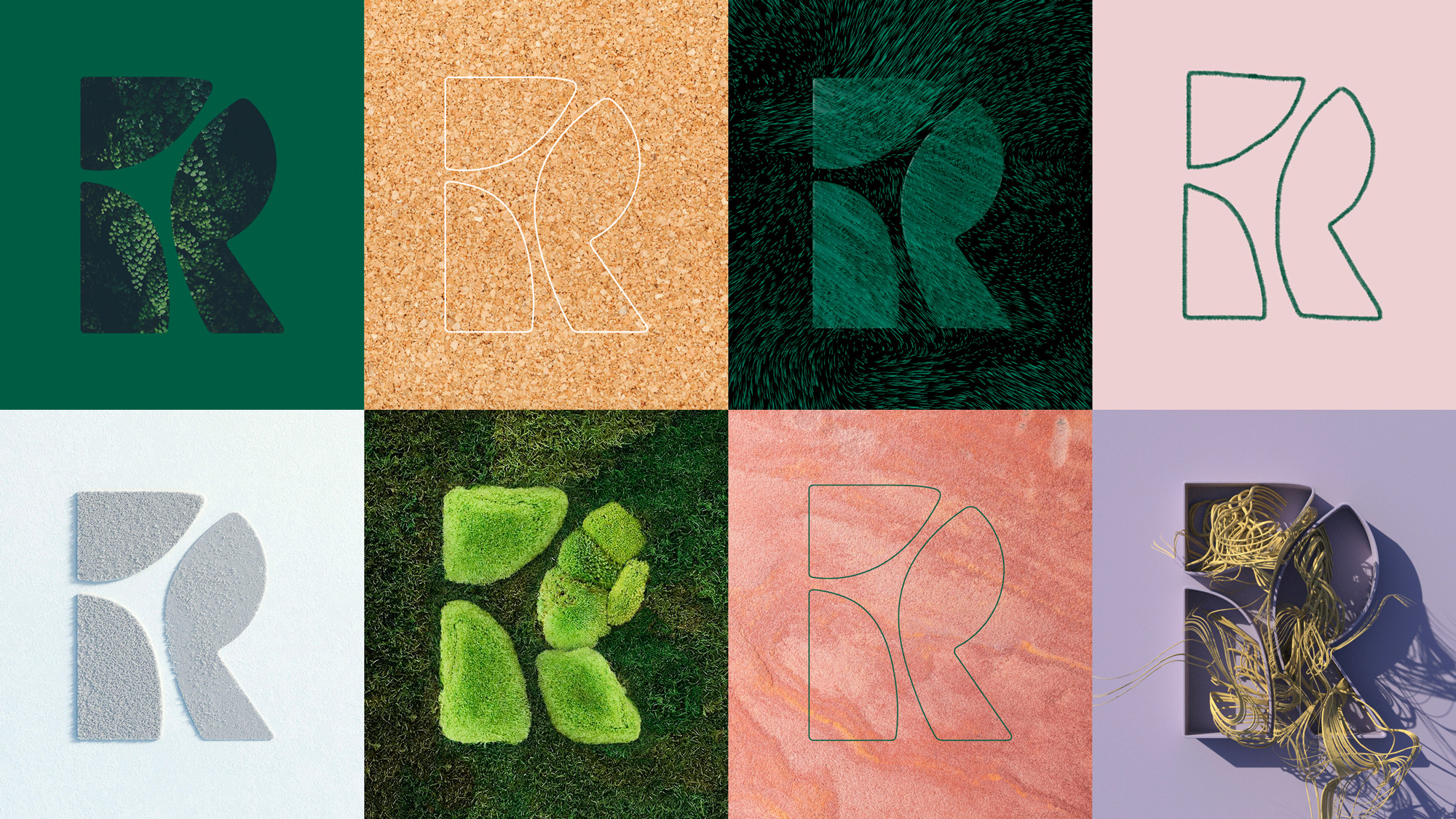

Because you can't stop DixonBaxi from DixonBaxi'ing -- and I mean that with love not sarcasm -- the monogram can be brought to life and animated in different ways that speak to different aspects of Regent's Place, whether it's to highlight their green spaces through the Games of Thrones-esque pink and red flower animation or the convergence of thousands of people through the particle-esque animation. While they could be deemed gratuitous, these can probably serve the function of activating physical spaces where screens are available as well as the obligatory Instagram Stories.

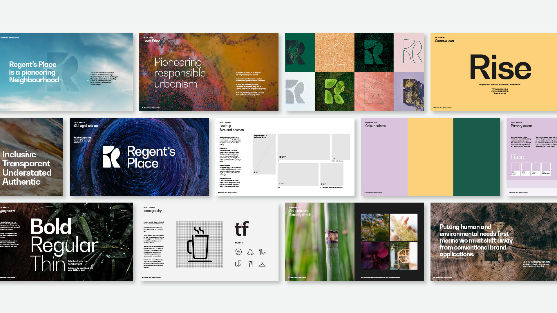
The natural environment influences every aspect of design and behaviour. Softness is used with confidence: organic lines and natural colours allow for a more calming experience. Clarity is created through creating an editorial visual language which is carefully considered on digital experiences and printed surfaces such as hoardings and signage systems. Through thoughtful layouts informed by stories, immersive art direction and an understated tone of voice, the brand feels open, warm, and human.
DixonBaxi provided text

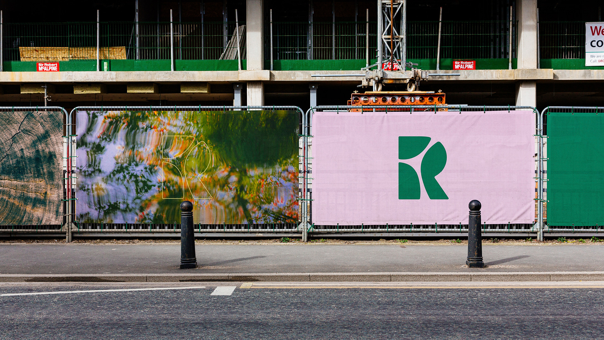
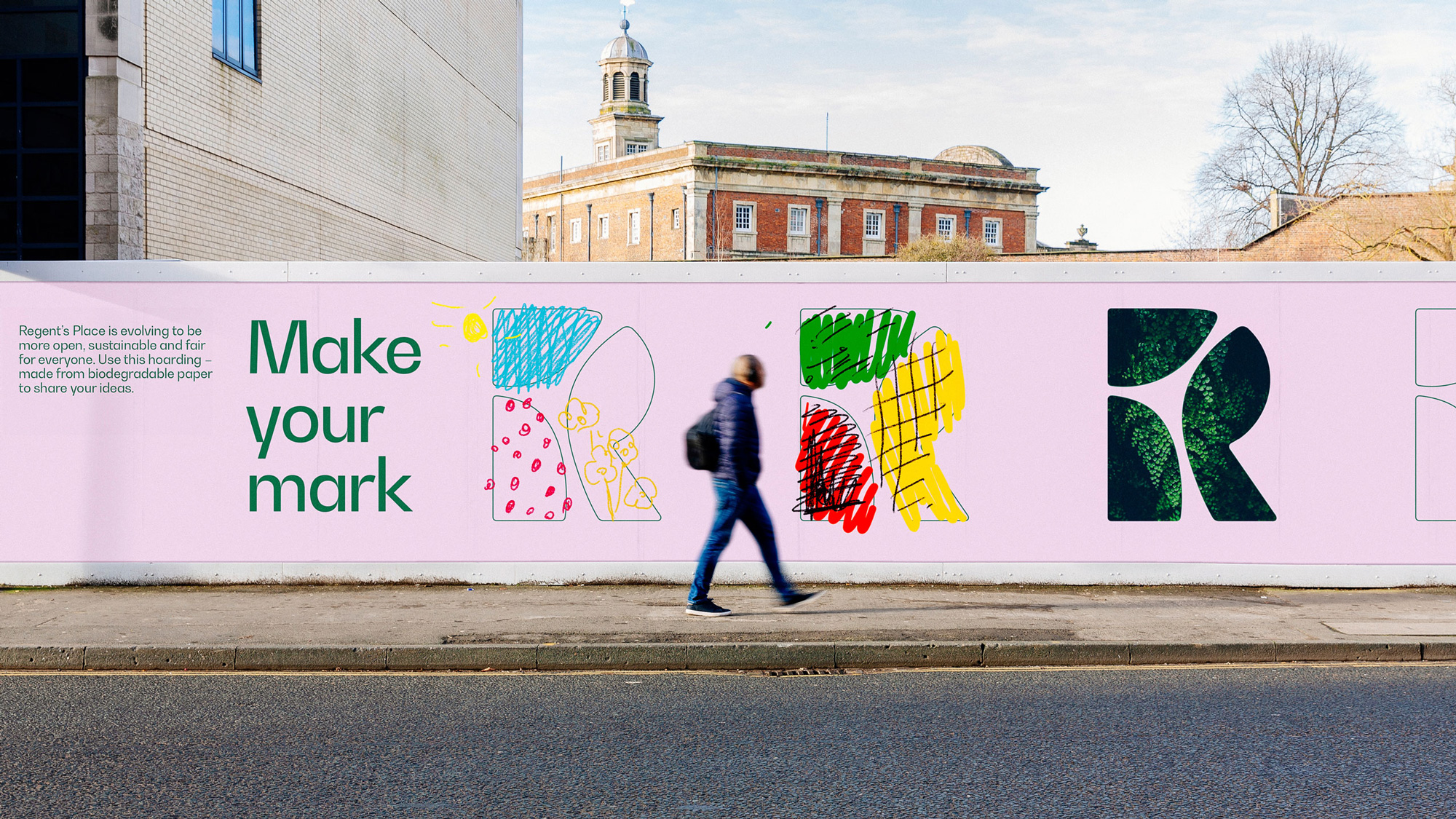
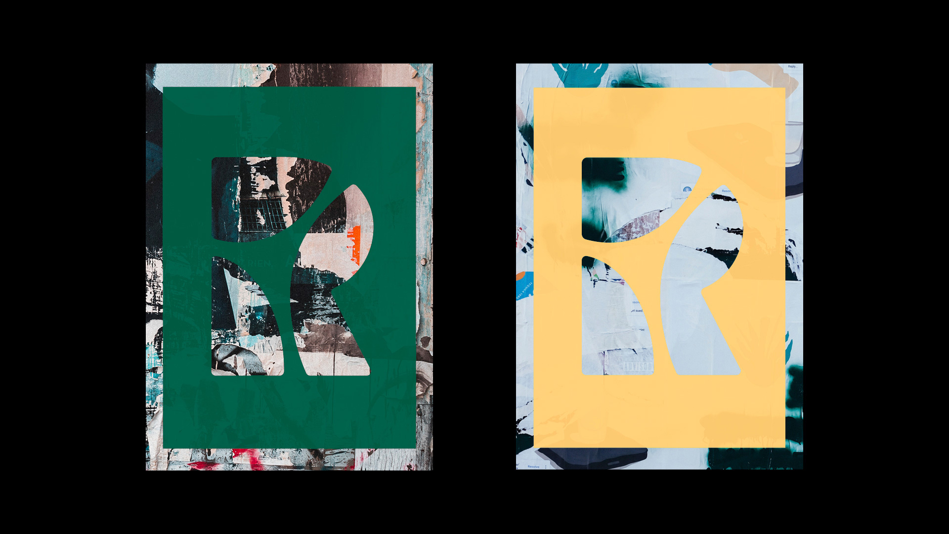
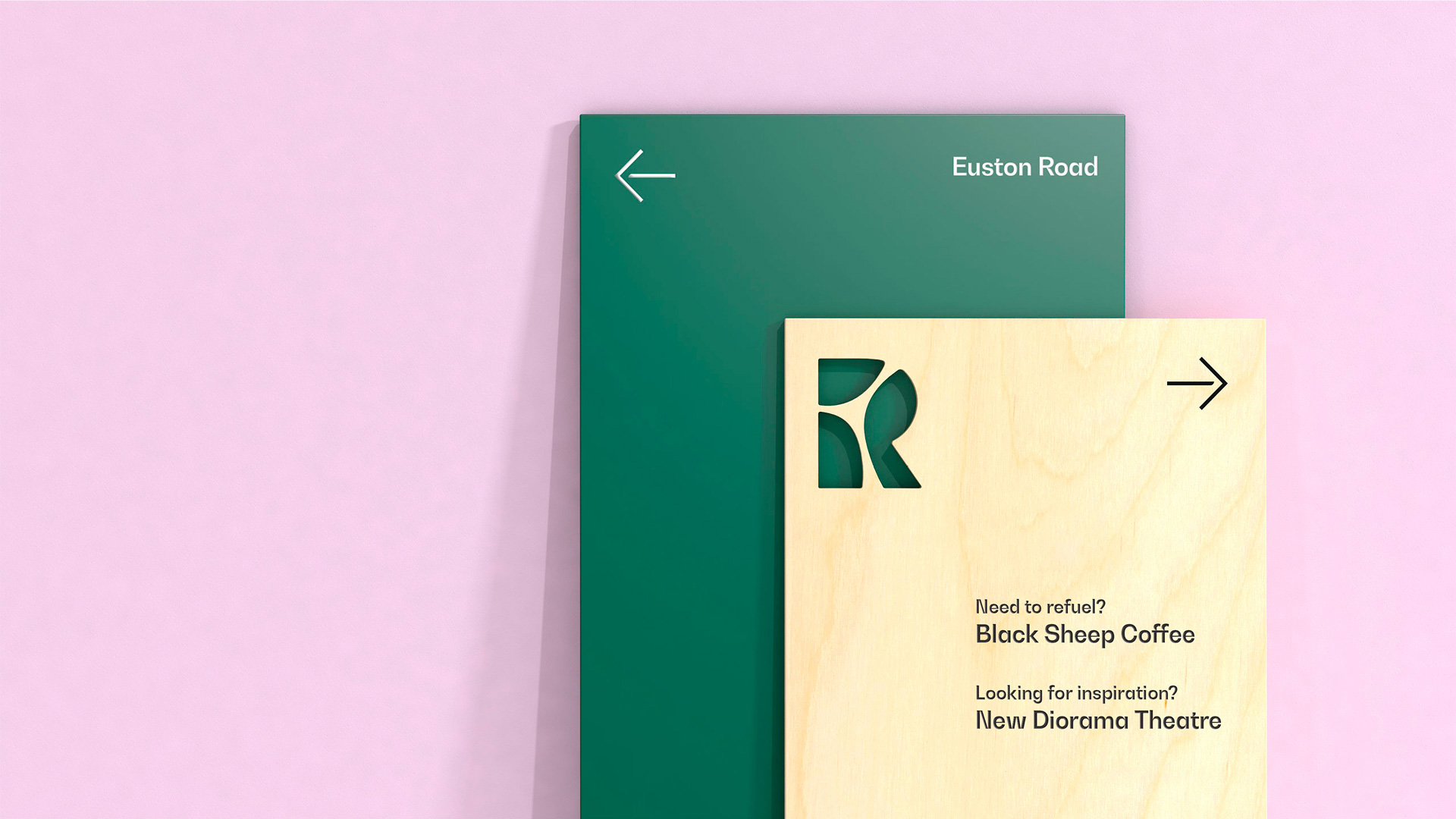
There is not a whole lot in application yet. It's the monogram on things -- or, in some cases, out of things (which is really great) as in the business card and closing image below -- and the monogram in its different variations sometimes with some BW Gradual text to accompany it. I'm sure more muscle will be needed from the identity in actual applications but, for now, these applications show how easily that "R" can brand any aspect of Regent's Place.

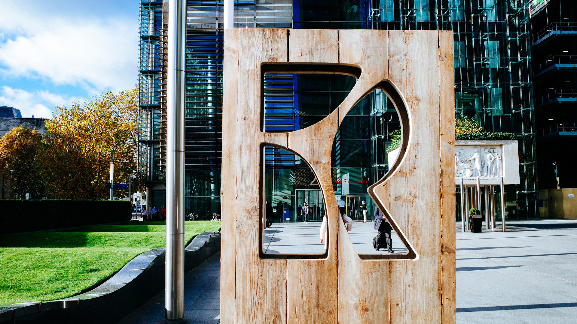
Overall, this is a very pleasing identity that gives Regent's Place a more relatable logo for visitors, tenants, and residents and a more marketable logo for management -- whereas the old logo looked like it was designed with only management in mind.
In ấn Anpic In nhãn mác Anpic In brochure Anpic In card visit Anpic In catalogue Anpic In thiệp cưới Anpic In tờ rơi Anpic
In Ấn Anpic – Nổi Tiếng In Đẹp In Nhanh
Số 5 Ngõ 75 Nguyễn Xiển, Thanh Xuân, Hạ Đình, Hà Nội
0963223884
baogiainananh@gmail.com
https://anpic.vn
https://g.page/inananpic
In nhãn mác Anpic ✅ In brochure Anpic ✅ In card visit Anpic ✅ In catalogue Anpic ✅ In thiệp cưới Anpic ✅ In tờ rơi Anpic
https://anpic.vn/in-nhan-mac-dep
https://anpic.vn/in-brochure
https://anpic.vn/in-an
https://anpic.vn/in-voucher-in-phieu-giam-gia-khuyen-mai
#inananpic
Comments
Post a Comment