Reviewed: New Logo and Identity for Oklahoma Christian University by Switch
“Everything’s A-OC”
Established in 1950, Oklahoma Christian University (OC) is a private Christian university in Oklahoma City, OK, offering undergraduate and graduate programs to approximately 2,000 students. The university counts with 94 full-time faculty and, along with students, they participate in mission opportunities around the world. Their athletics teams, the Eagles, compete in NCAA Division II. With the start of the 2019 - 20 academic year, OC introduced a new identity designed by local firm Switch.
The primary finding during our interview/discovery phase was that OC wasn't many of the stereotypical things you associate with college life. There is no Greek system, football team, or expected university architecture.
In search of where OC pride came from, we had to pivot from the normal way of thinking about university pride. We found that when we asked about why people were proud to be associated with OC, there was always a story -- a trip, a class, a professor, a friend.
We constucted OC's new messaging strategy around this concept: The World Awaits Your Story. Rather than abstract statistics and rankings, the new voice of OC would be shared through real, tangible action, experience, and results.
Switch project page
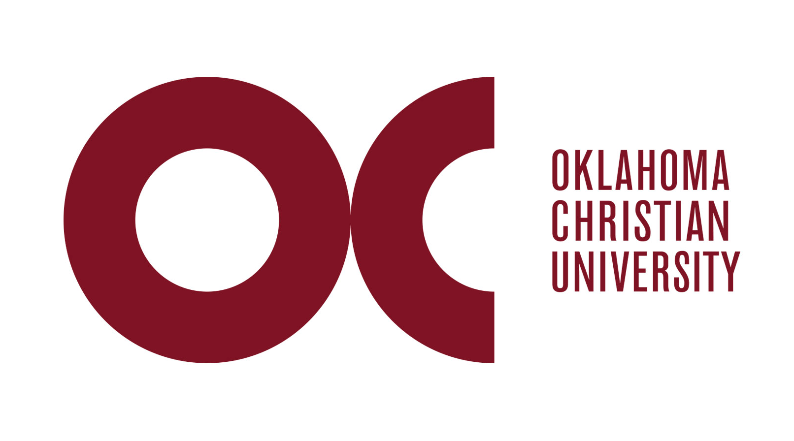
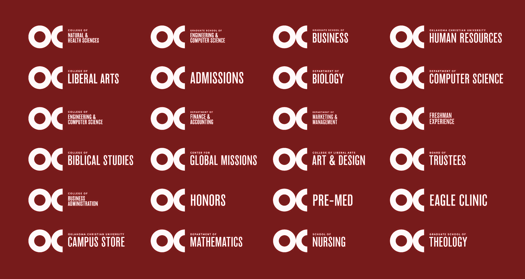
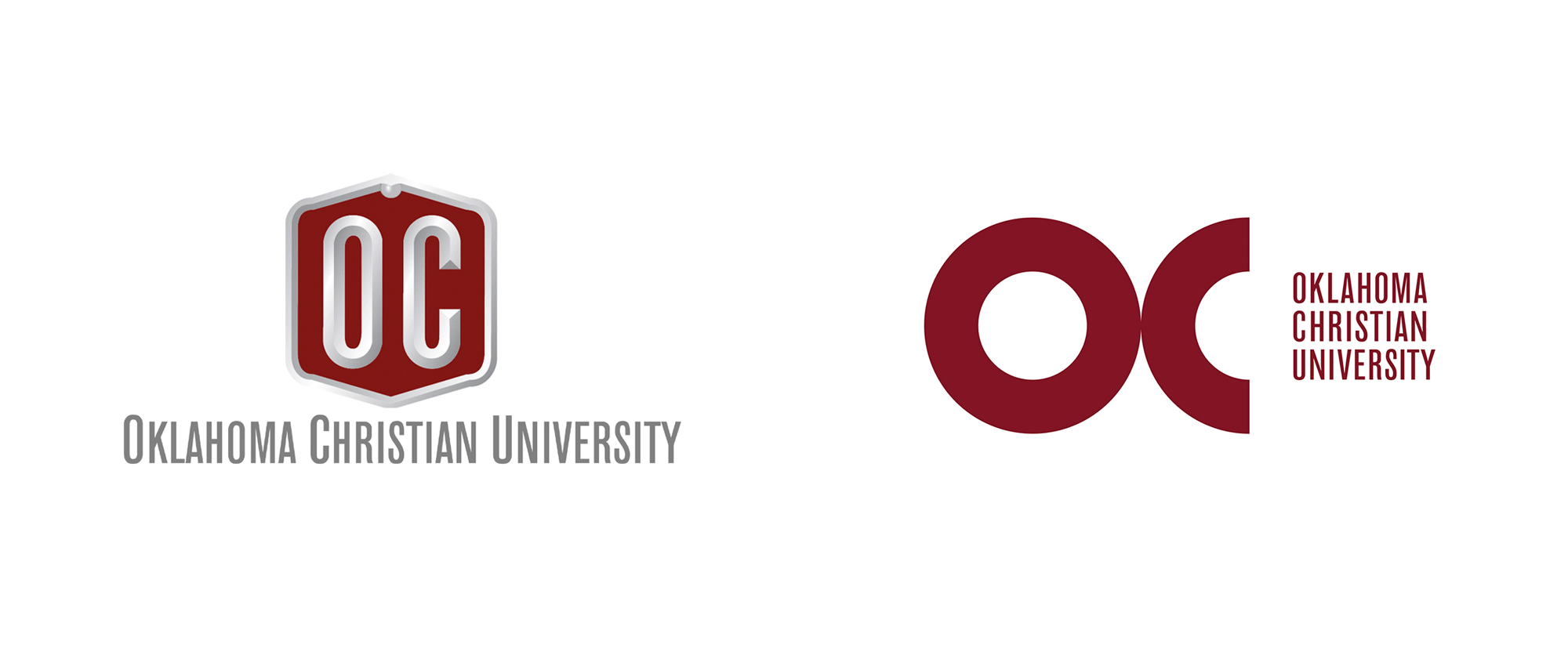
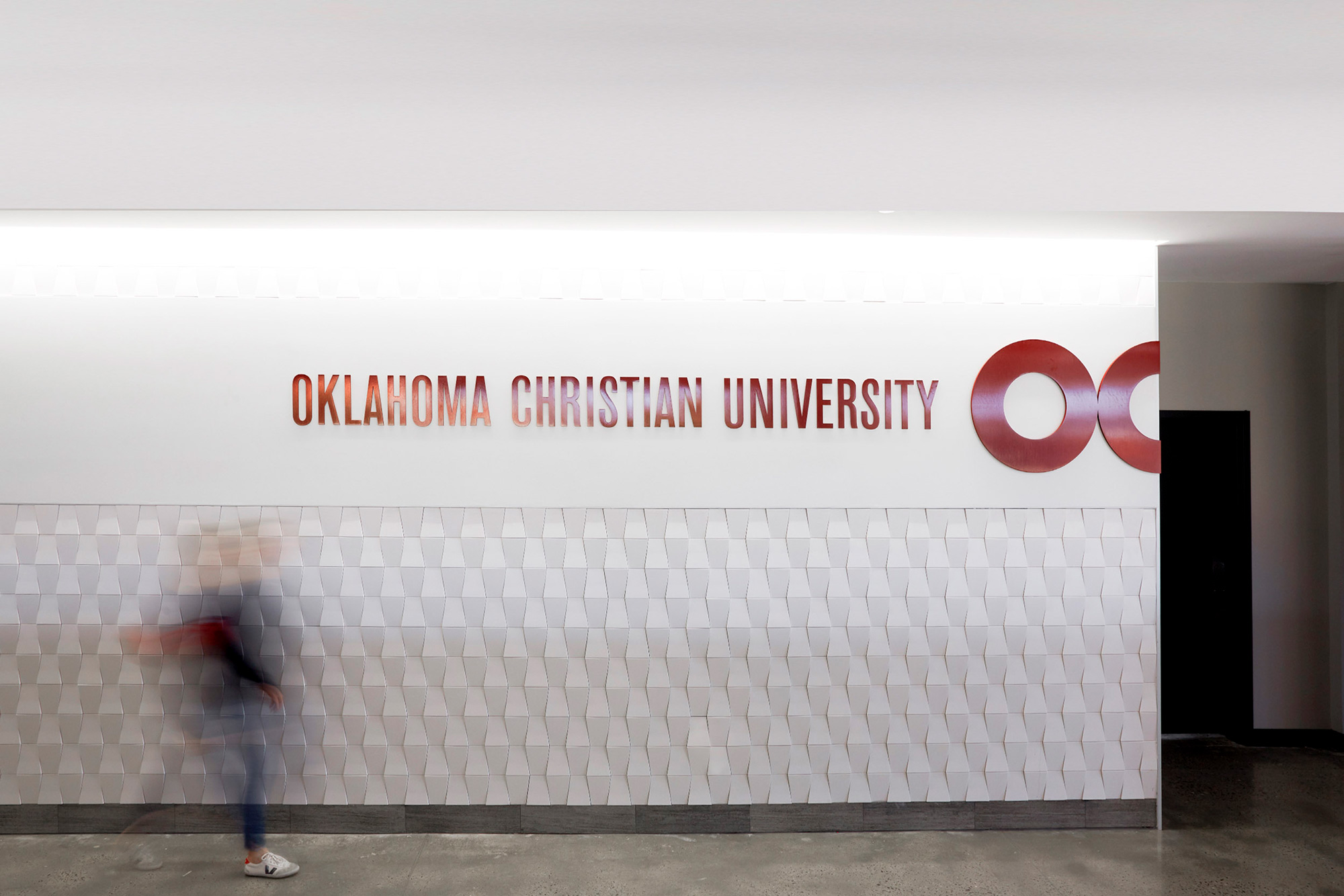
I'm not sure if the holding shape in the old logo had any particular meaning beyond just a shape where "OC" fit decently but beyond that, it was a slightly painful logo to appreciate, not just for its amateur shading but for the poor construction that created little bubbles on the corners of the holding shape. At first I thought it was a problem with one file I found but, nope, that was the official logo applied everywhere. Anyway, it had the right idea in the condensed typeface for the wordmark to be able to fit that long name -- unfortunately, they used fake small caps on it. The new logo maintains the same condensed typeface for the wordmark but introduces a great "OC" monogram with a perfect circle "O" and half perfect circle "C", that on its own can feel literally half-finished but when used in application at the edge of a layout it creates a great effect. Even on its own I do like it and the condensed wordmark is a great visual contrast. I'll admit that the stacked wordmark, with the "Y" sticking out to the right makes my alignment neurons short-circuit because it was so close to being fully justified but I think they did the right thing in letting be as is. The sub-brands are crisp and they solved as well as they could the really long names of some of the department and colleges.
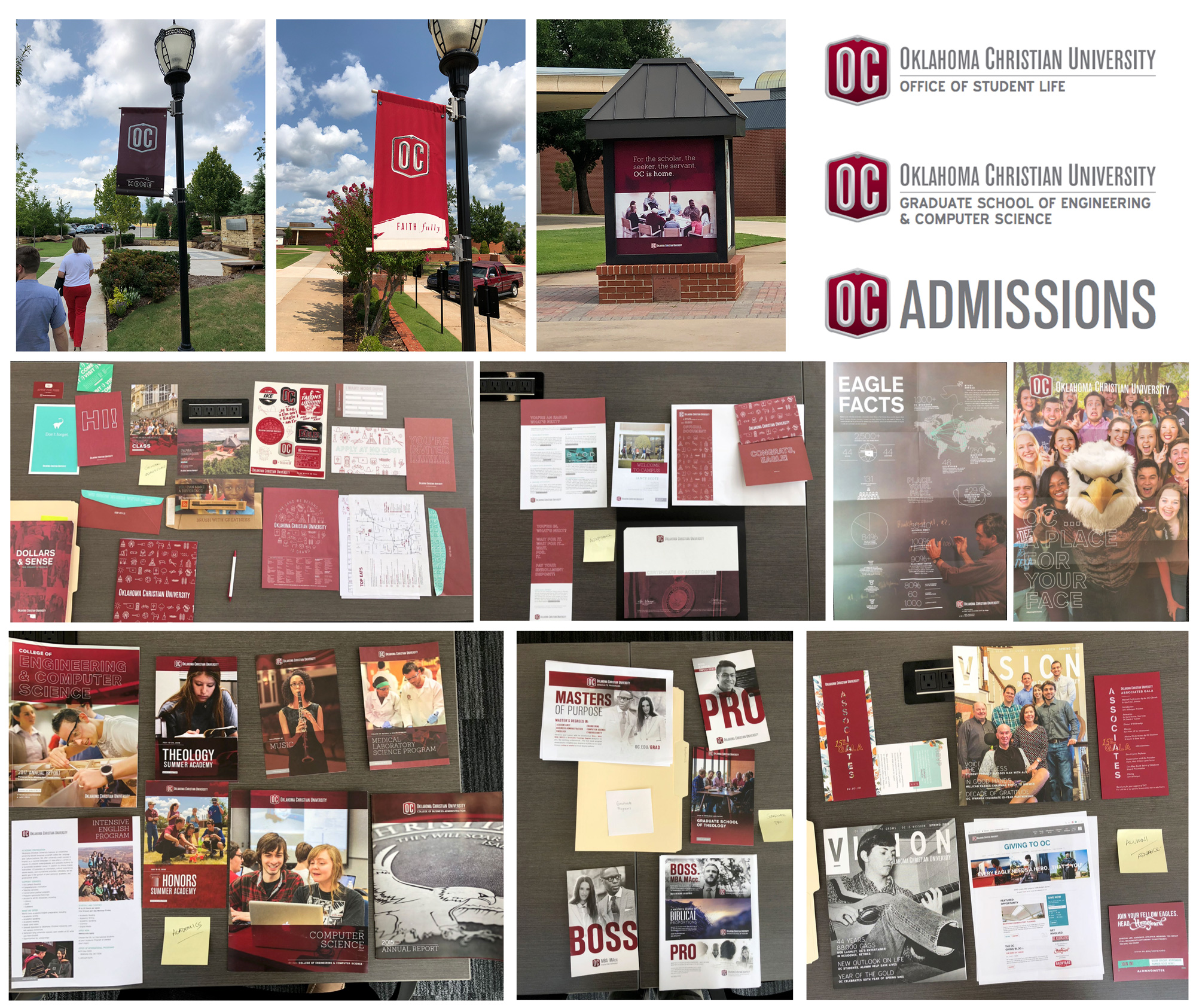
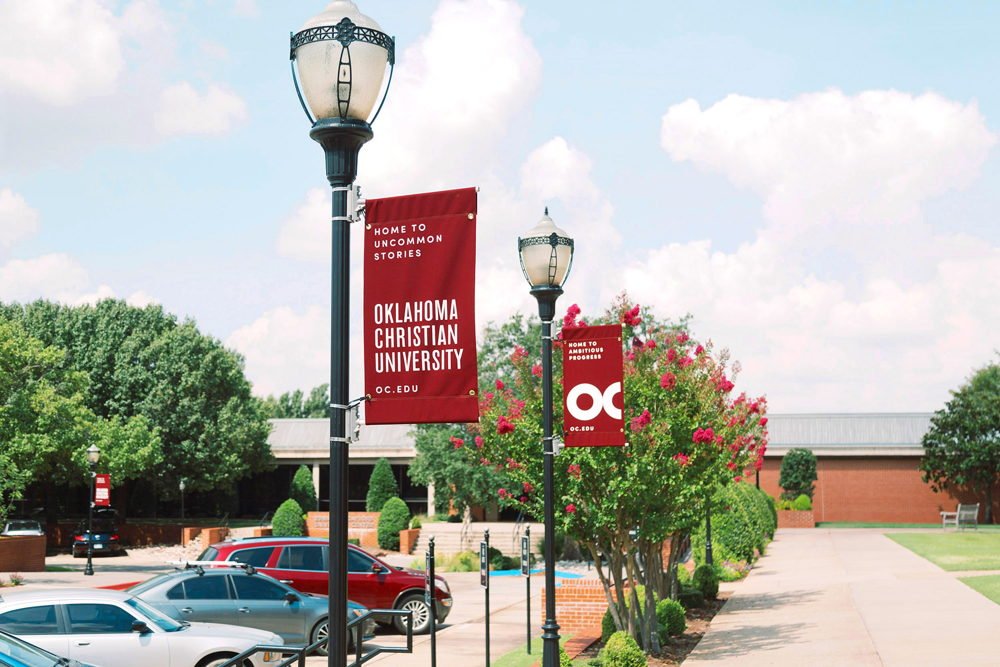
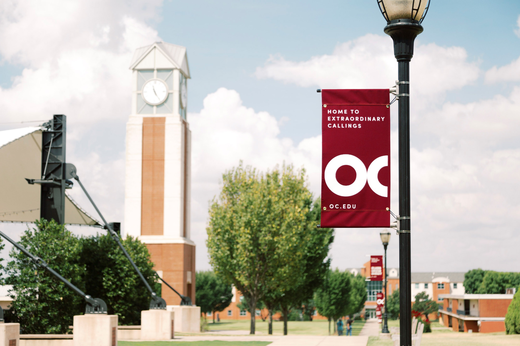
The cost of implementing a complete rebrand is not easy for any organization, much less a private university. In order to offset this cost, we designed a smart system that allowed OC to retain existing brand installations around campus.
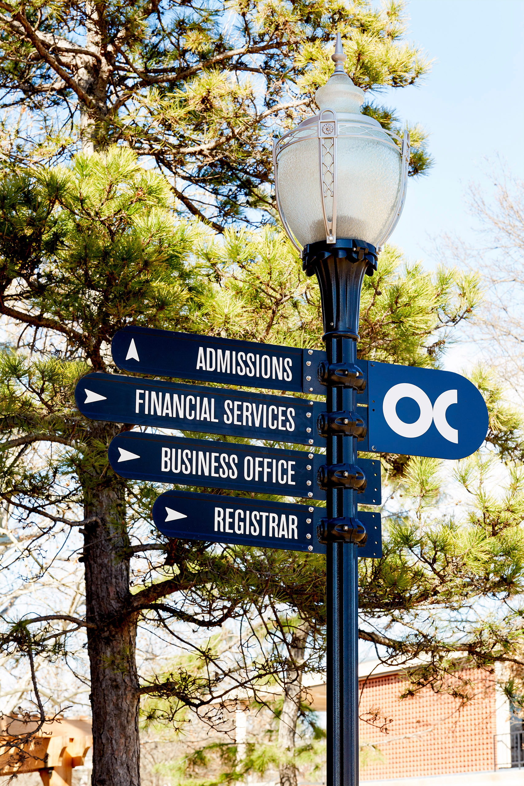
Previous to the rebrand, OC's primary typeface was Standard Condensed. By keeping the typeface in the brand system and reimagining its use, it allowed almost all wayfinding and department signage to remain untouched while still consistent with the new brand.
These typographic decisions saved the university substantial costs in the campus rebranding effort.
Switch project page
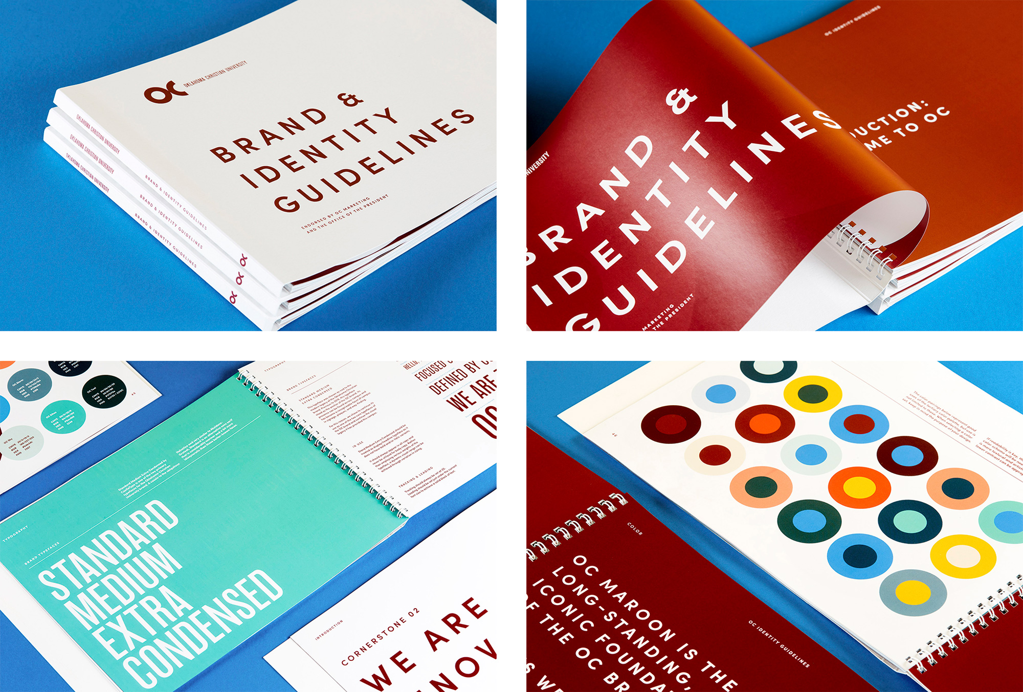

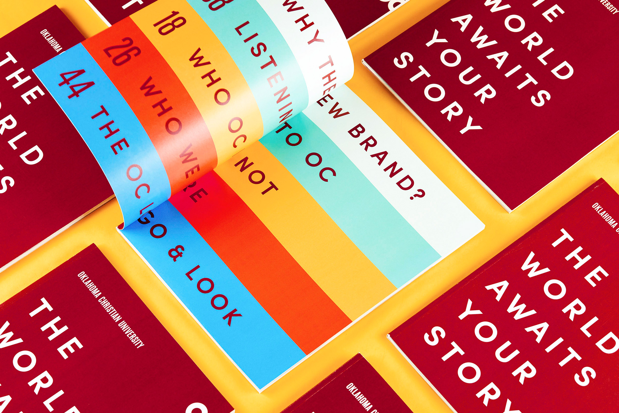
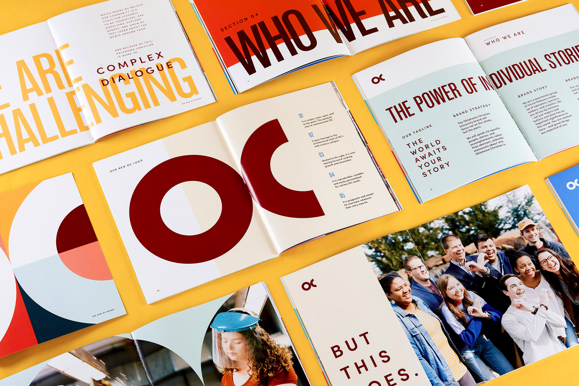
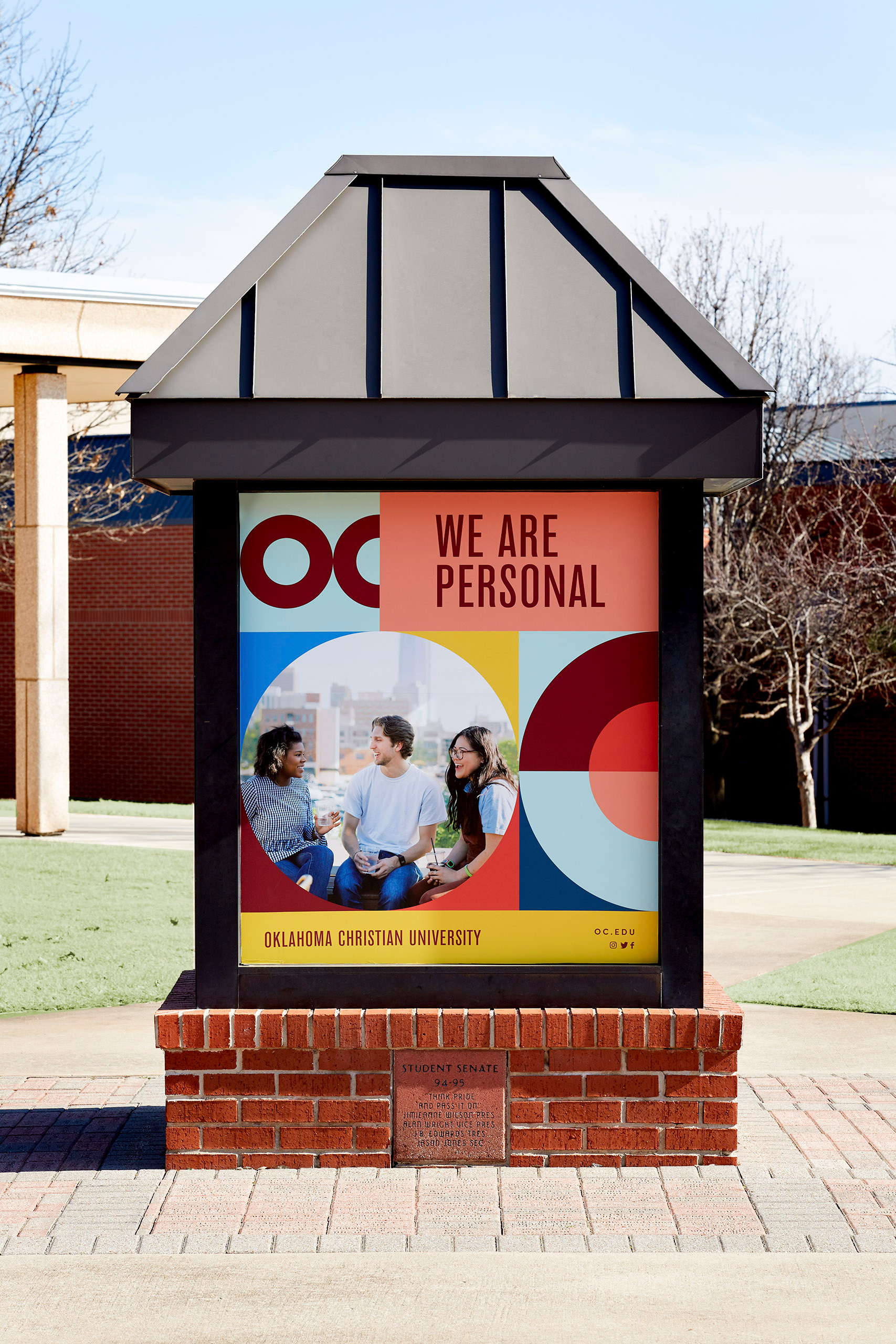
During the Discovery process, we learned that there was frustration among academic leaders that their admissions materials were the same from department to department. The OC brand system now allows for variation in color and layout, allowing each department to show their personality while remaining consistent with the university brand.
While the core brand system of logos, type and color were designed to last for decades, a geometric pattern system was implemented for the launch of the brand. This was designed to show the full scale of the new color system and introduce the brand in an exciting way. In the future, other campaigns will take over while the core brand remains intact.
Switch project page
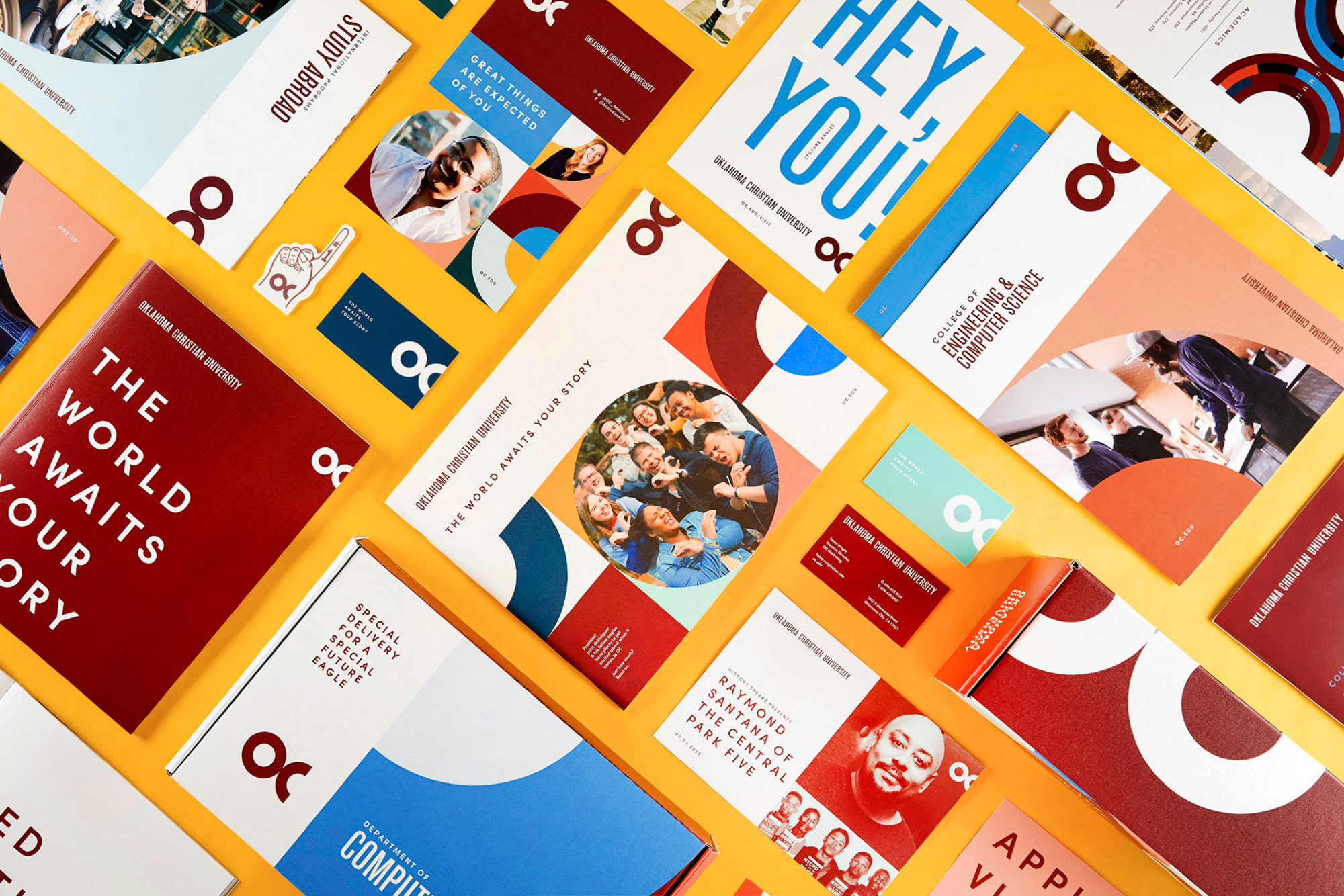
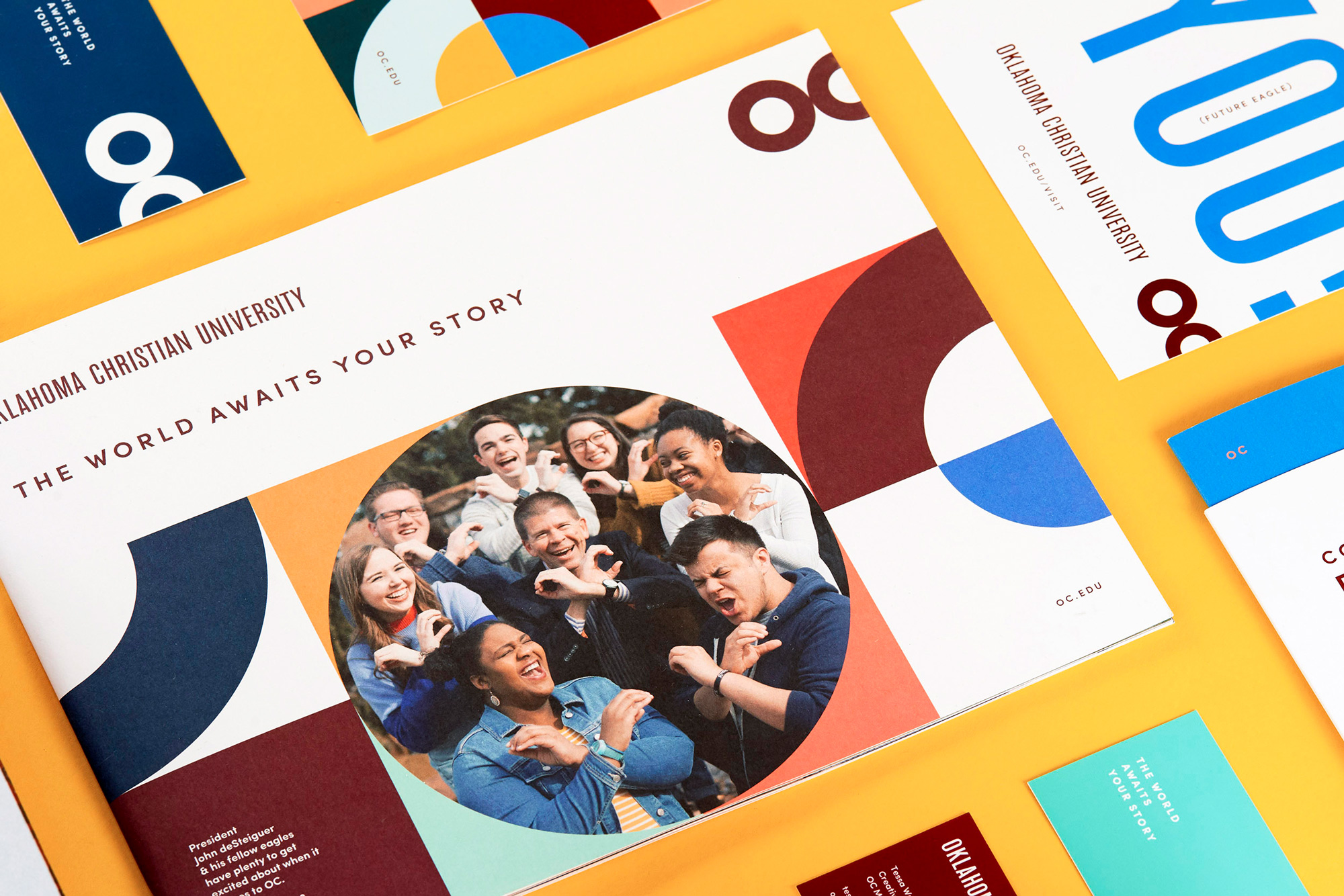

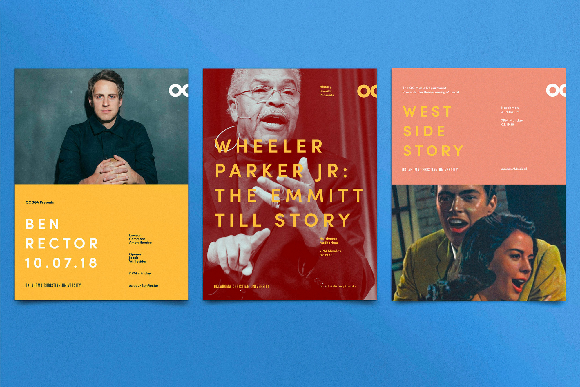
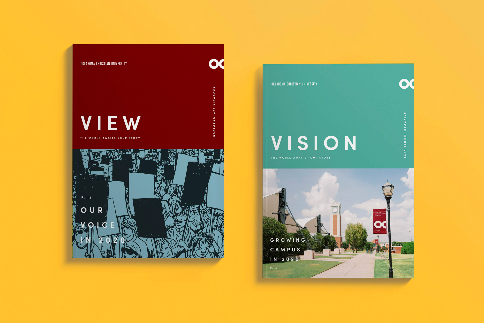
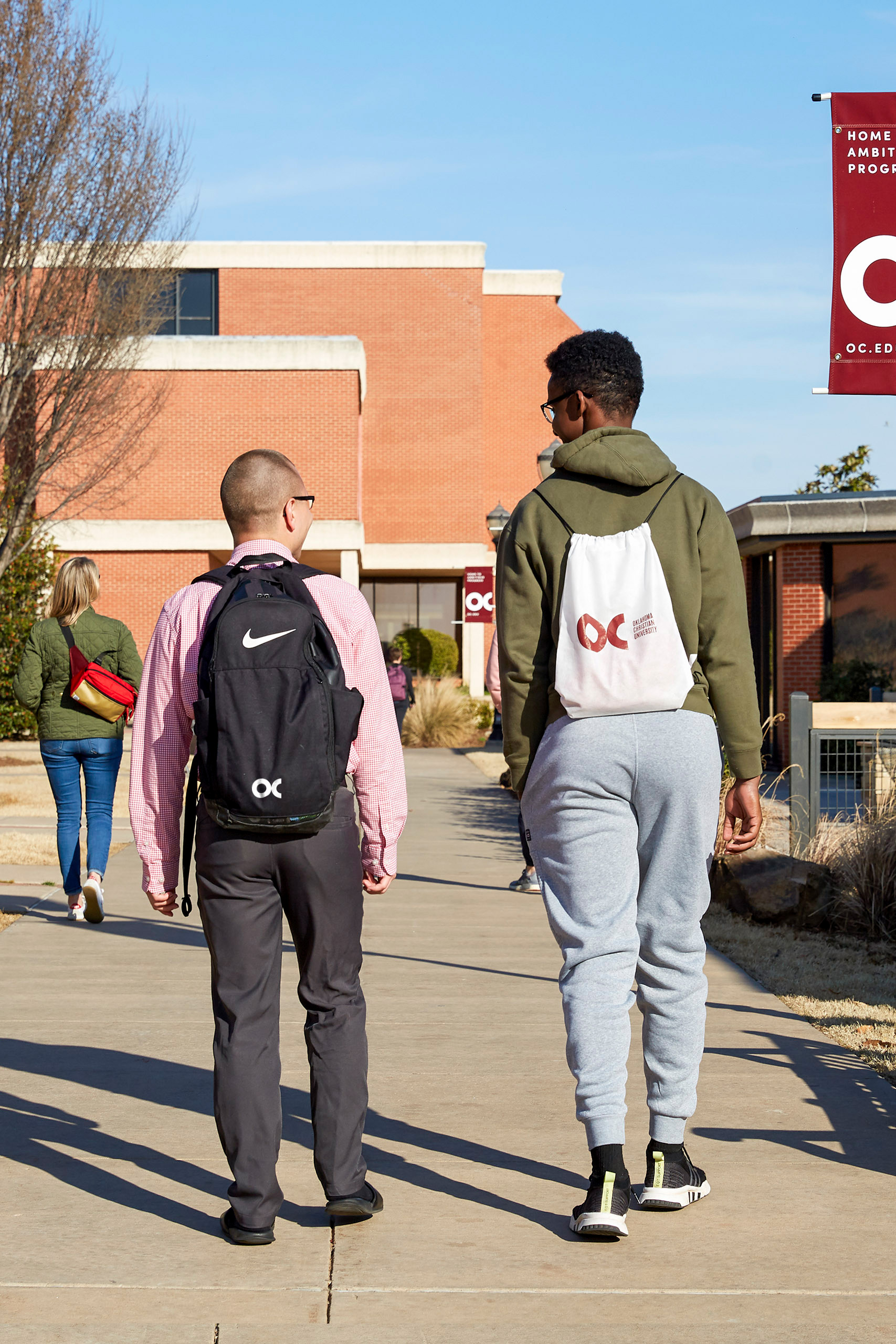
The applications look really great. They are lively and energetic but still manage to convey a certain conservativeness that's appropriate for the university. I love how well they mix the condensed sans with a complementary round-ier, loosely-spaced sans serif, all of it in uppercase. And, as I mentioned in the logo paragraph, the monogram used on the right edge of the layouts looks so good.
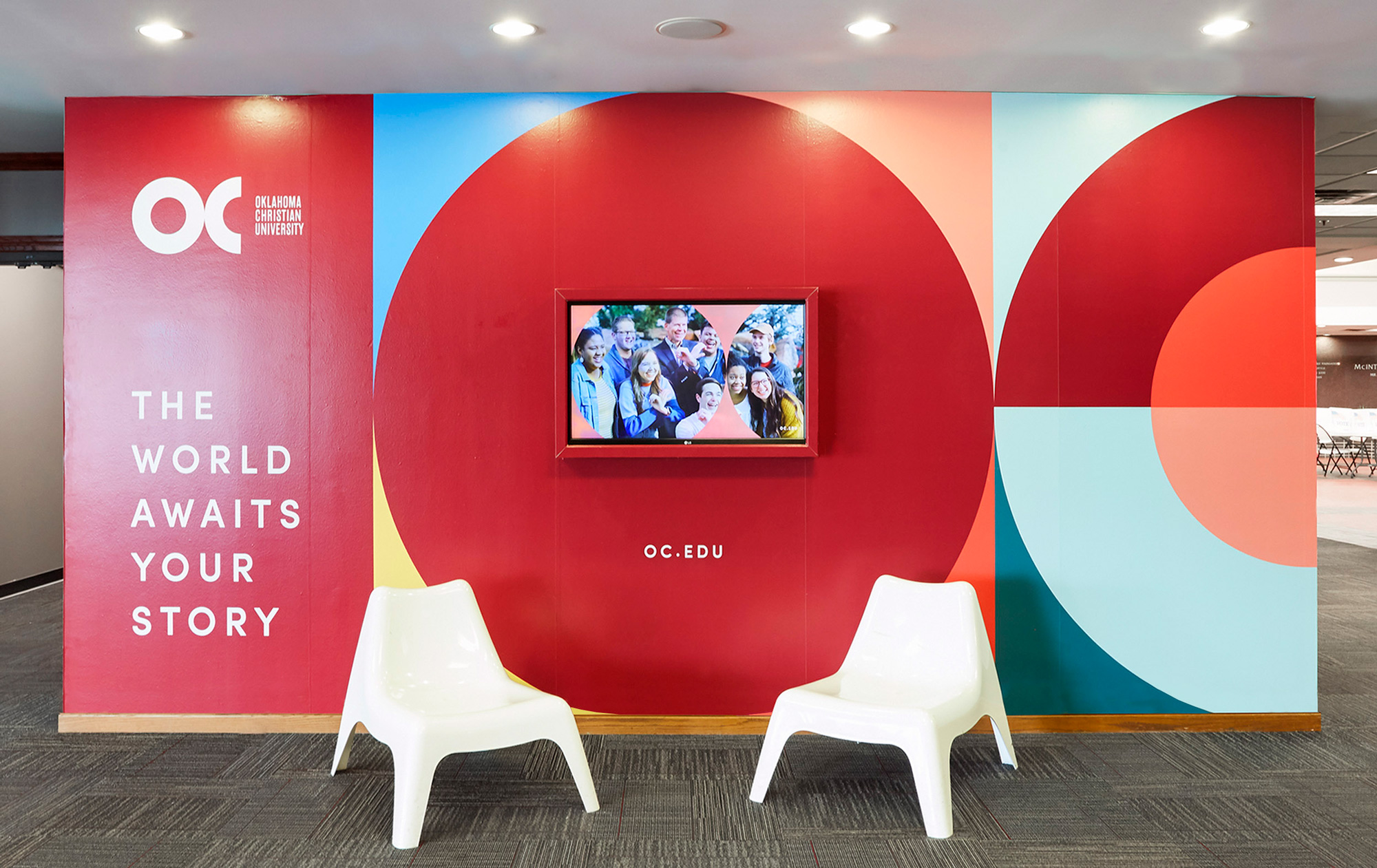

Overall, this is simply very well executed from top to bottom with clear and concise messaging and nothing feels out of place or like a far-fetched reach. The university knows and understands it's a small, private Christian university and now presents that proposition in a relatively exciting way.
In ấn Anpic In nhãn mác Anpic In brochure Anpic In card visit Anpic In catalogue Anpic In thiệp cưới Anpic In tờ rơi Anpic
In Ấn Anpic – Nổi Tiếng In Đẹp In Nhanh
Số 5 Ngõ 75 Nguyễn Xiển, Thanh Xuân, Hạ Đình, Hà Nội
0963223884
baogiainananh@gmail.com
https://anpic.vn
https://g.page/inananpic
In nhãn mác Anpic ✅ In brochure Anpic ✅ In card visit Anpic ✅ In catalogue Anpic ✅ In thiệp cưới Anpic ✅ In tờ rơi Anpic
https://anpic.vn/in-nhan-mac-dep
https://anpic.vn/in-brochure
https://anpic.vn/in-an
https://anpic.vn/in-voucher-in-phieu-giam-gia-khuyen-mai
#inananpic
Comments
Post a Comment