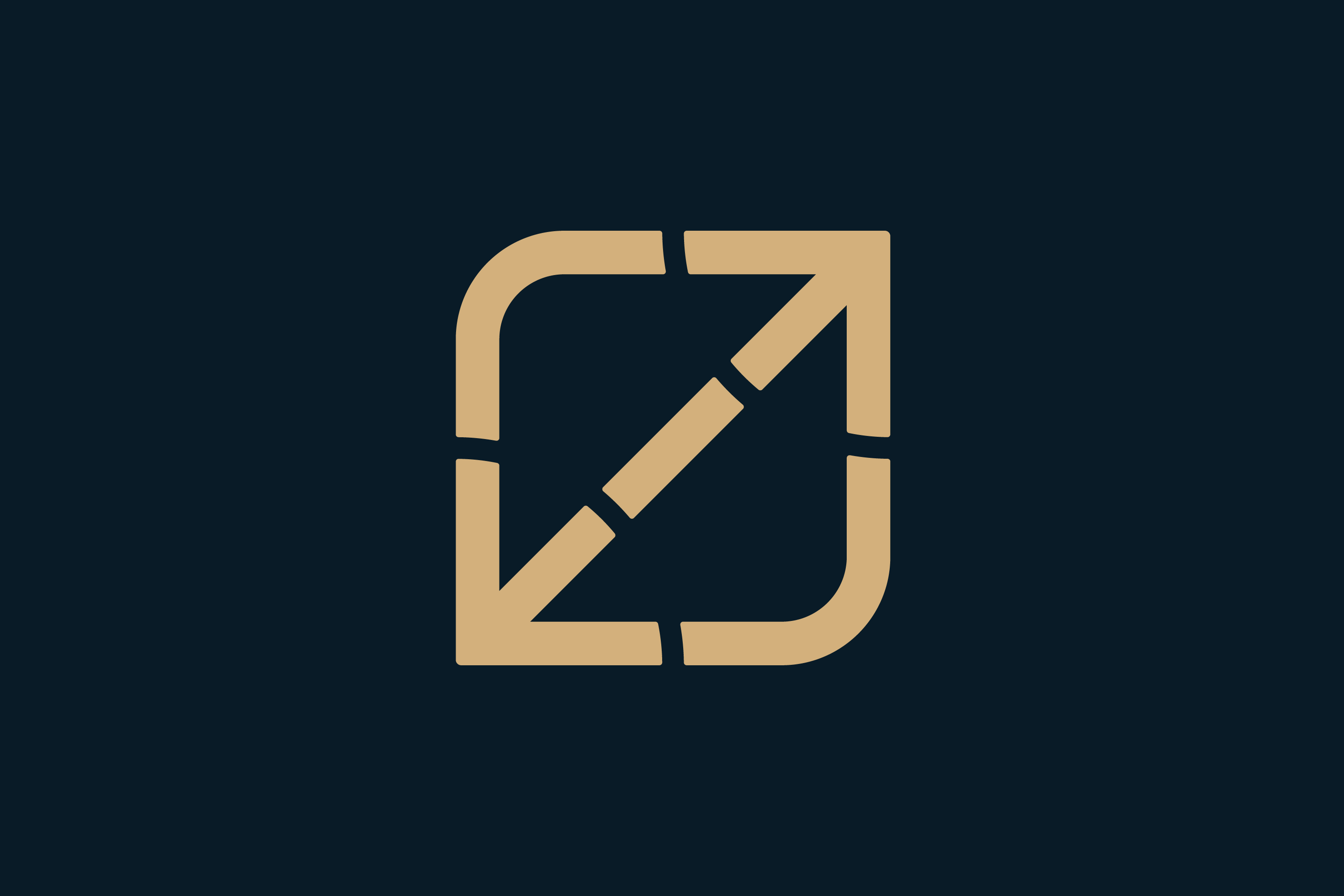
Noted: New Logo and Identity for LoL Esports
“No Laughing Out Loud Matter”

"As League of Legends heads into its next 10 years of operation, the new LoL Esports brand embodies values that position esports as a meaningful life pursuit. LoL Esports will serve as the platform and voice for the global sport and regional leagues, and as a marker of world-class competition and the best entertainment experience for fans. LoL Esports will serve as the platform and voice for world-class global competition and the biggest sports entertainment experiences for fans worldwide. In the near term, you can expect to see our continued commitment to delivering unrivaled events and entertainment while spotlighting content that celebrates the best moments from within our 12 regional leagues around the world."
Design by
N/A
Related links
LoL Esports press release
Relevant quote
When creating a new look for LoL Esports, we took inspiration from Summoner’s Rift, pulling color and iconography from our sport’s legendary arena. We aimed to have this update reflect a step into the modern while honoring the game that made it all possible.
Images (opinion after)


Opinion
As an initial disclaimer I want to point out that I’m not 100% sure if there was a “before” logo — as far as I can tell no and, unfortunately, the lolesports.com url on Wayback machine is not tracked so I can’t see what was there before. I think it was just the League of Legends logo. Anyway, that only means there is no “before” to talk about so let’s dig into the “after”. For us, non-League-of-Legend fans, the icon in the logo may just look like arrows — myself, I interpreted each arrow as an “L” with the overall shape being an “O” for “LOL” — but for the rest of the world, it’s a visual representation of Summoner’s Rift, which is a landmark of significance in the LoL world that, as we all very well know, is located in a remote forest between Freljord, and the Ironspike Mountains. So, for LoL fans, this is probably and instant and satisfying read. Execution-wise, it’s fine… I kind of like the wobbliness of the ends of the notches simply as an antidote to Adobe Illustrator perfection. I don’t like it per se, but I don’t mind it. The wordmark — in what I think is a modified GT Pressura — is more or less okay. Could be better, could be worse. The visual language — mainly, the video — is fun and exciting although it feels somewhat separate from what the logo is doing as it introduces a lot of thin lines and thin-stroked typography that have no relation to the logo but, overall, this is all perfectly done to get the audience excited while, also, not taking away from or overpowering the identities of the individual leagues (like this one).
In ấn Anpic In nhãn mác Anpic In brochure Anpic In card visit Anpic In catalogue Anpic In thiệp cưới Anpic In tờ rơi Anpic
In Ấn Anpic – Nổi Tiếng In Đẹp In Nhanh
Số 5 Ngõ 75 Nguyễn Xiển, Thanh Xuân, Hạ Đình, Hà Nội
0963223884
baogiainananh@gmail.com
https://anpic.vn
https://g.page/inananpic
In nhãn mác Anpic ✅ In brochure Anpic ✅ In card visit Anpic ✅ In catalogue Anpic ✅ In thiệp cưới Anpic ✅ In tờ rơi Anpic
https://anpic.vn/in-nhan-mac-dep
https://anpic.vn/in-brochure
https://anpic.vn/in-an
https://anpic.vn/in-voucher-in-phieu-giam-gia-khuyen-mai
#inananpic
Comments
Post a Comment