Noted: New Name and Logo for St. Louis City SC
“Soccer and the City”
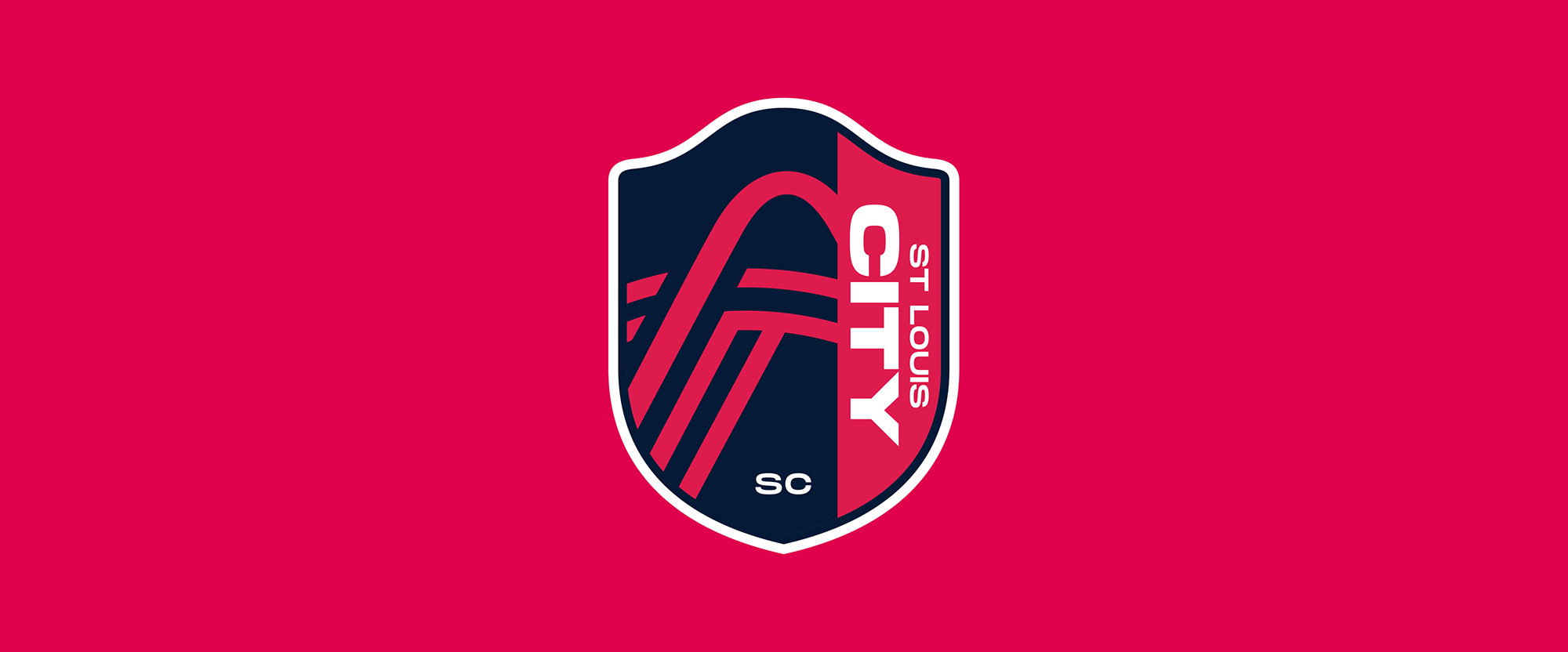
(Est. 2019) "St. Louis City SC will begin play in MLS in 2023, joining Sacramento as the 29th and 30th teams in the league. The team will feature the only majority female-led ownership group in Major League Soccer, led by Carolyn Kindle Betz."
Design by
“A diverse group of over 20 local designers”
Related links
MLS press release
Relevant quote
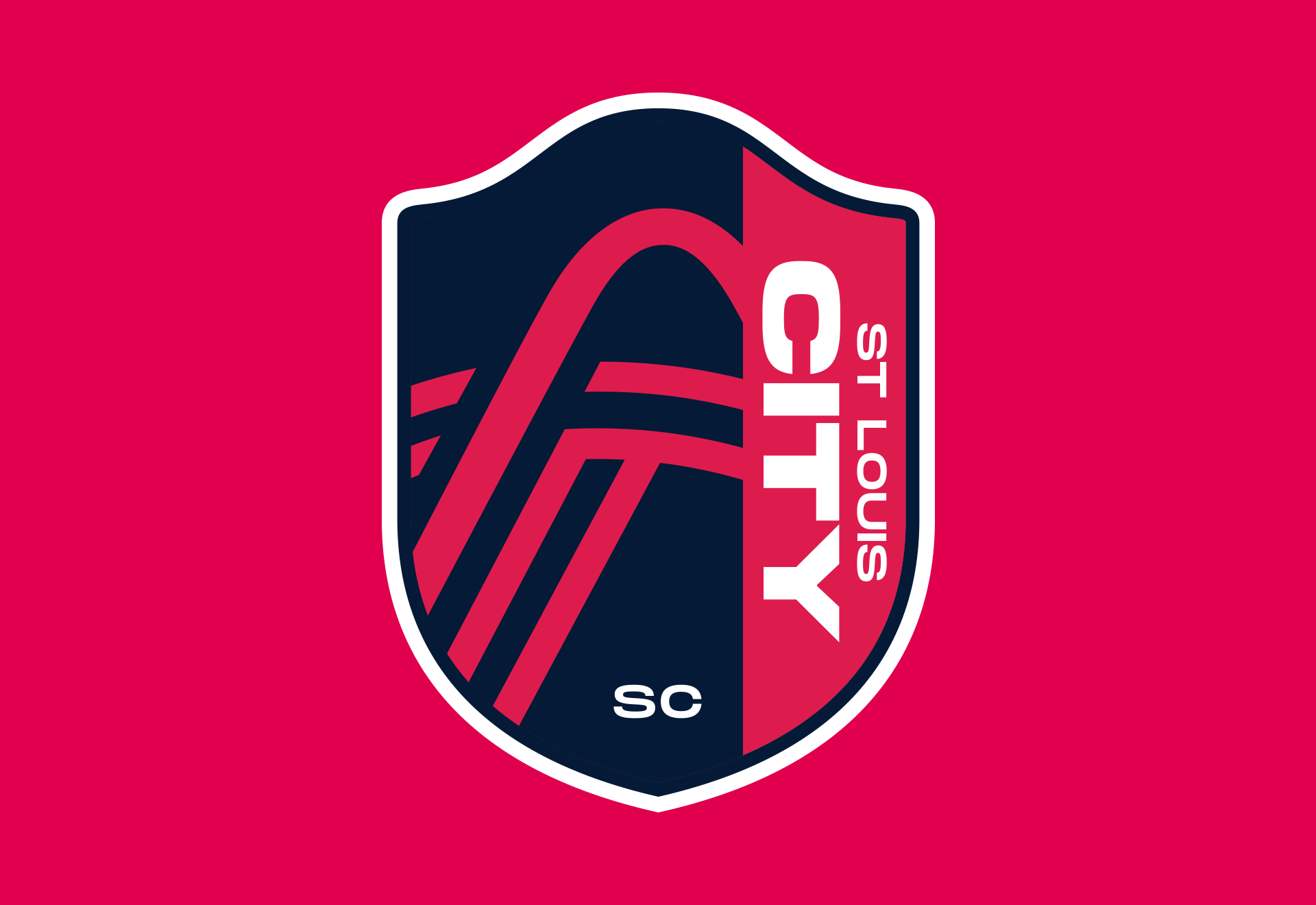
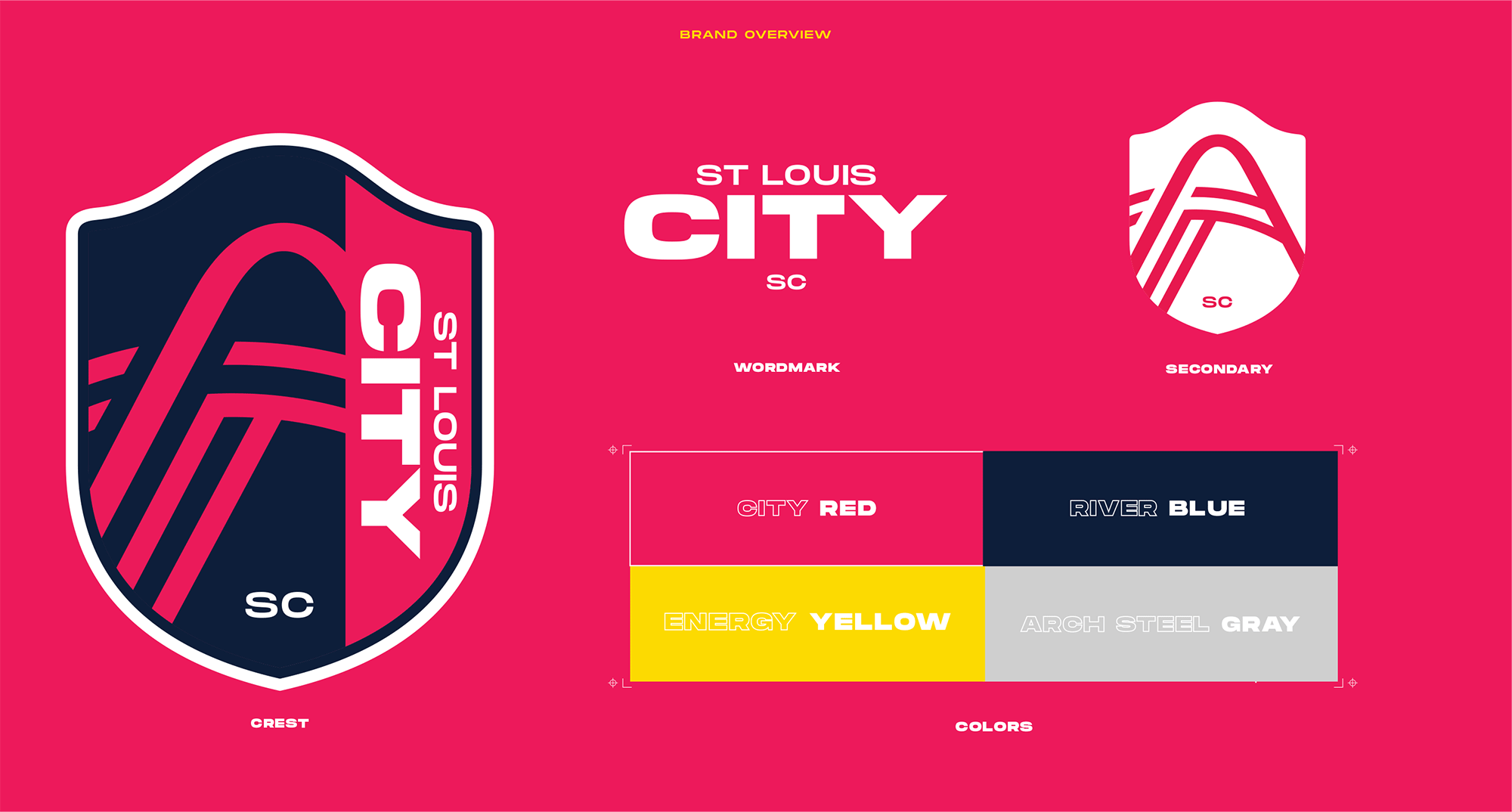
A diverse group of over 20 local designers created the crest based upon a common theme discovered through focus groups and discussions with various community members — a deep-rooted sense of unity and pride across the region in the St. Louis City flag. Using the flag as an inspiration, the team crest is an abstract depiction of the club’s passion and purpose, displayed through iconic elements found across the St. Louis region.
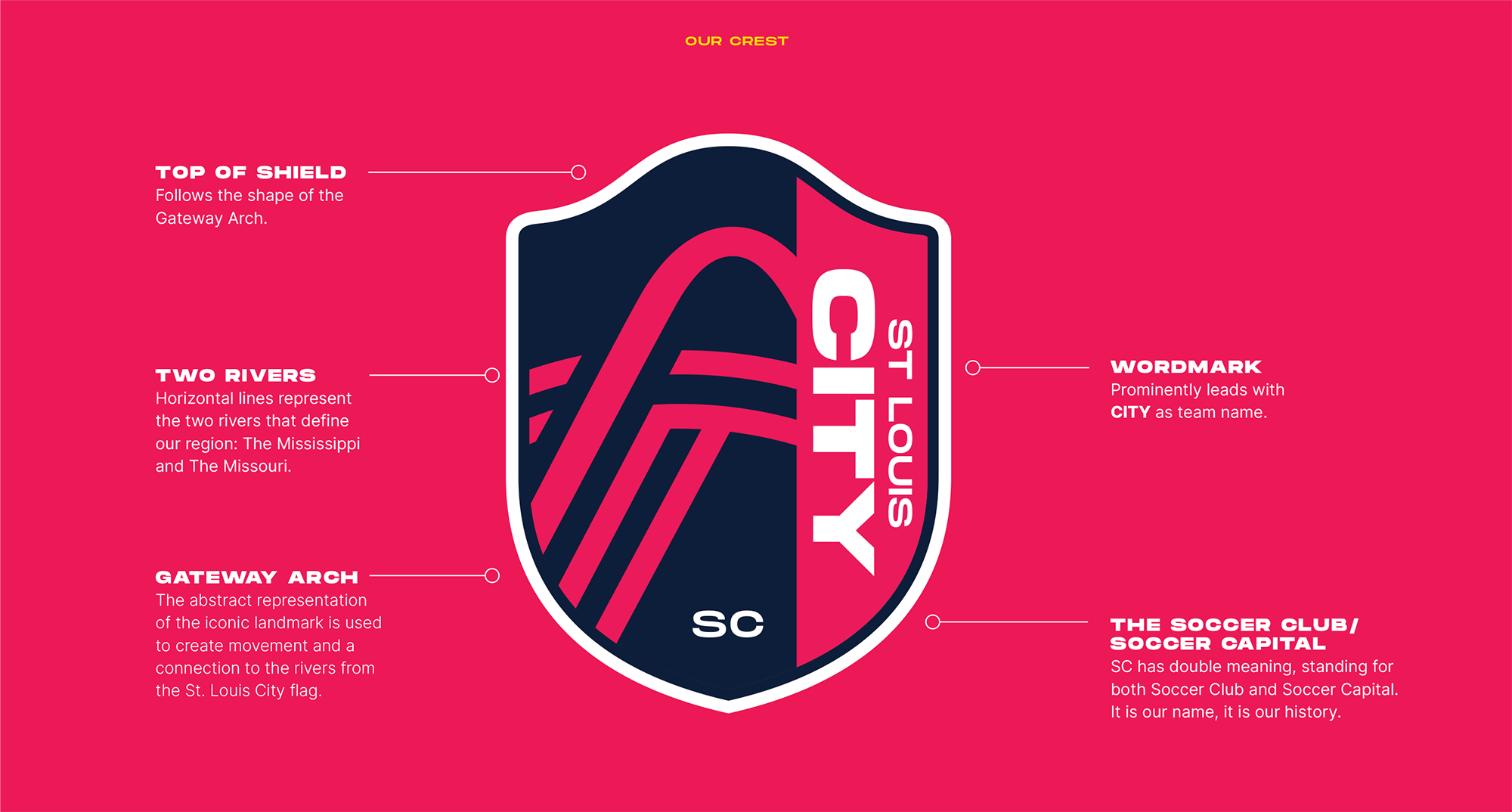
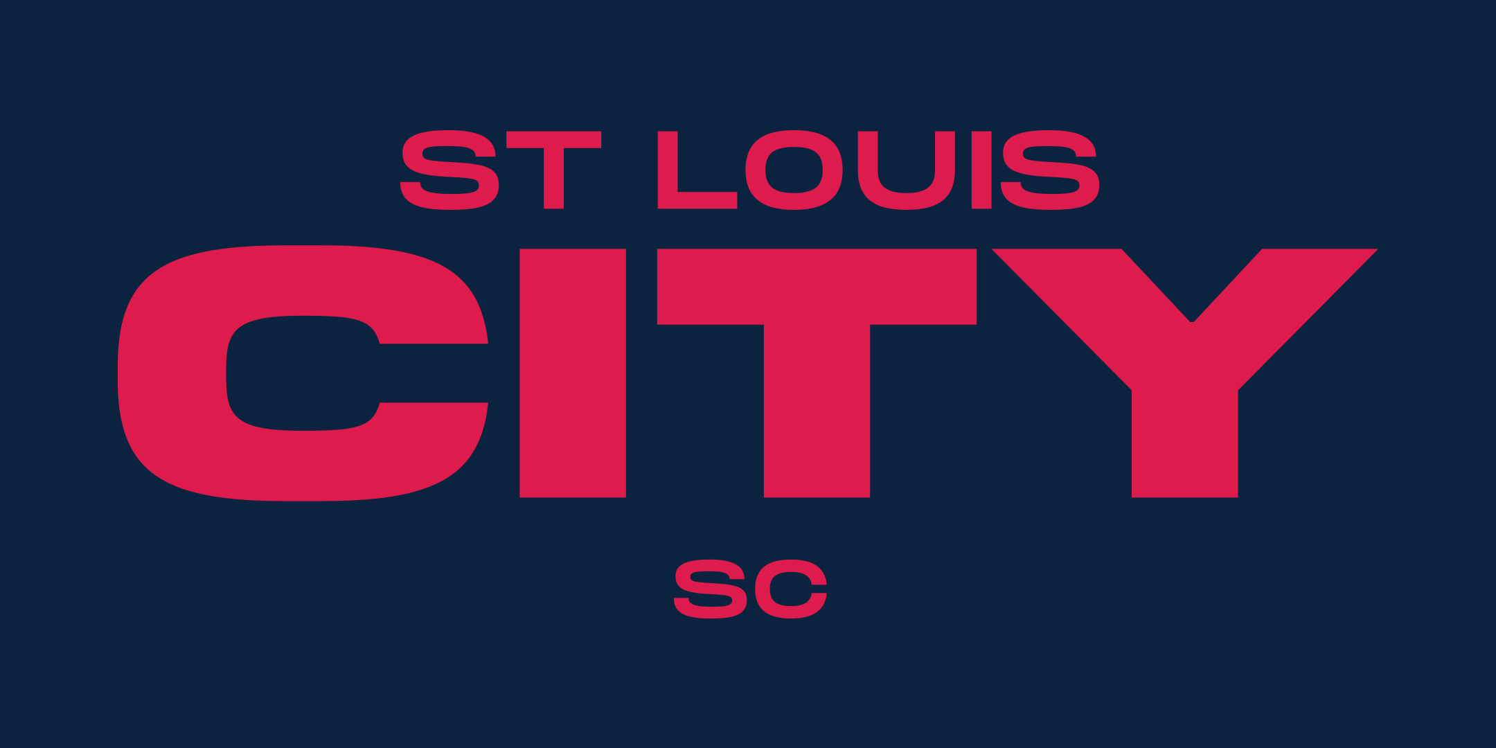
WORDMARK: Prominently leads with CITY as team name.
THE SOCCER CLUB/SOCCER CAPITAL: SC has double meaning, standing for both Soccer Club and Soccer Capital. It is our name, it is our history.
TOP OF SHIELD: Follows the shape of the Gateway Arch.
TWO RIVERS: Horizontal lines represent the two rivers that define our region: The Mississippi and The Missouri.
GATEWAY ARCH: The abstract representation of the iconic landmark is used to create movement and a connection to the rivers from the St. Louis City flag.
Images (opinion after)
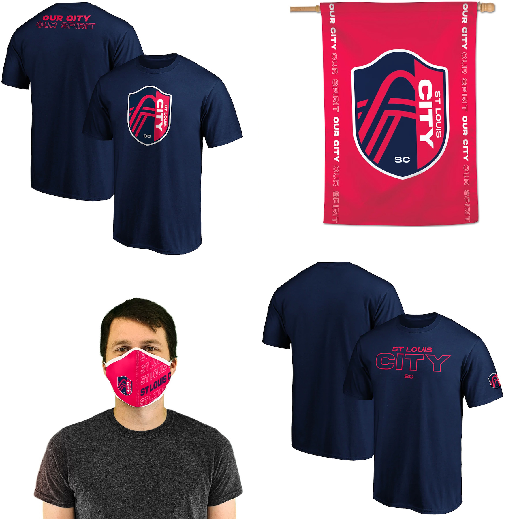
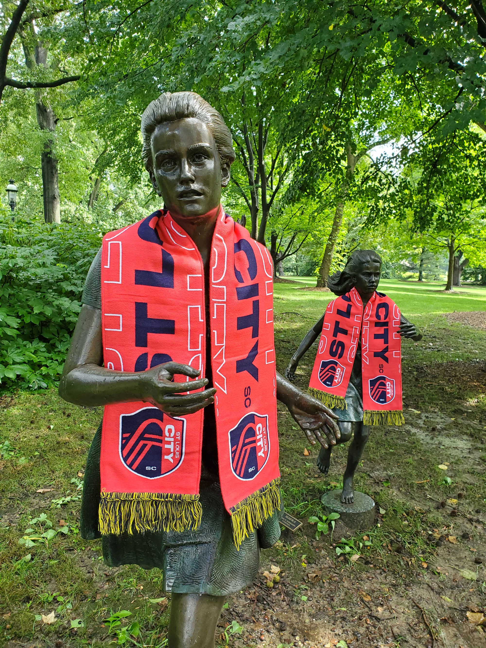
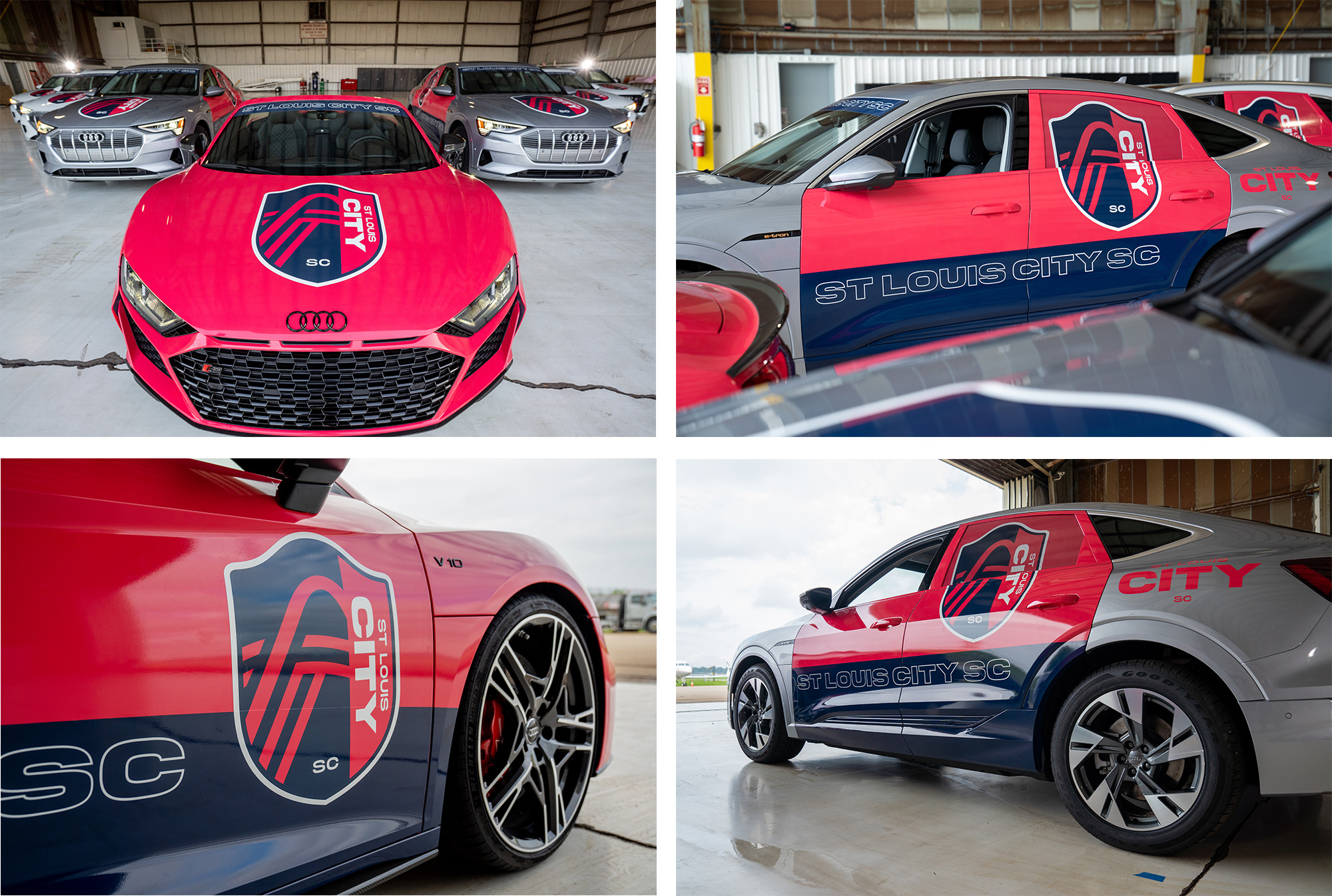
Opinion
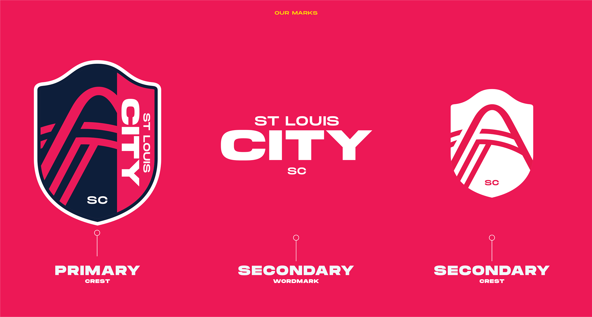
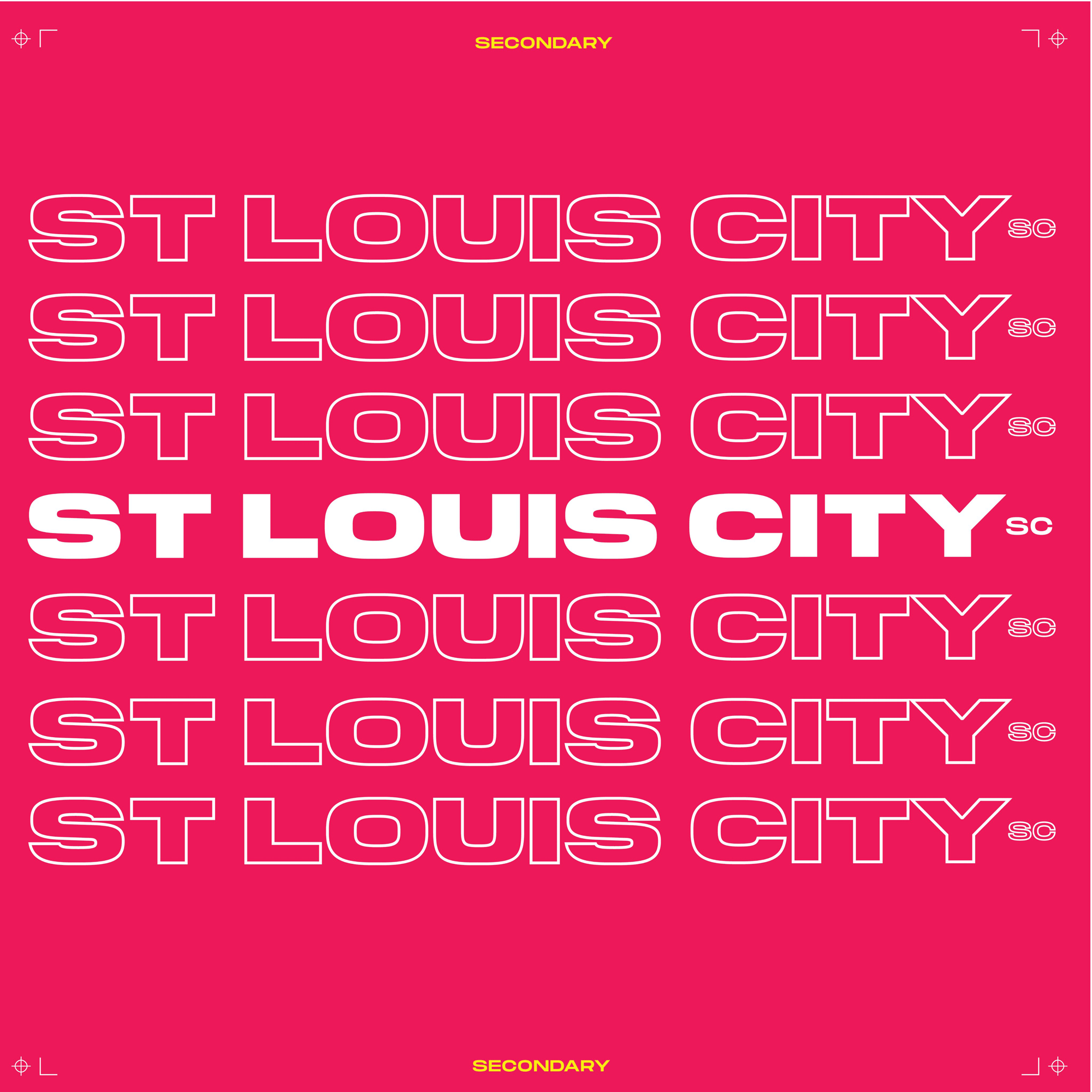
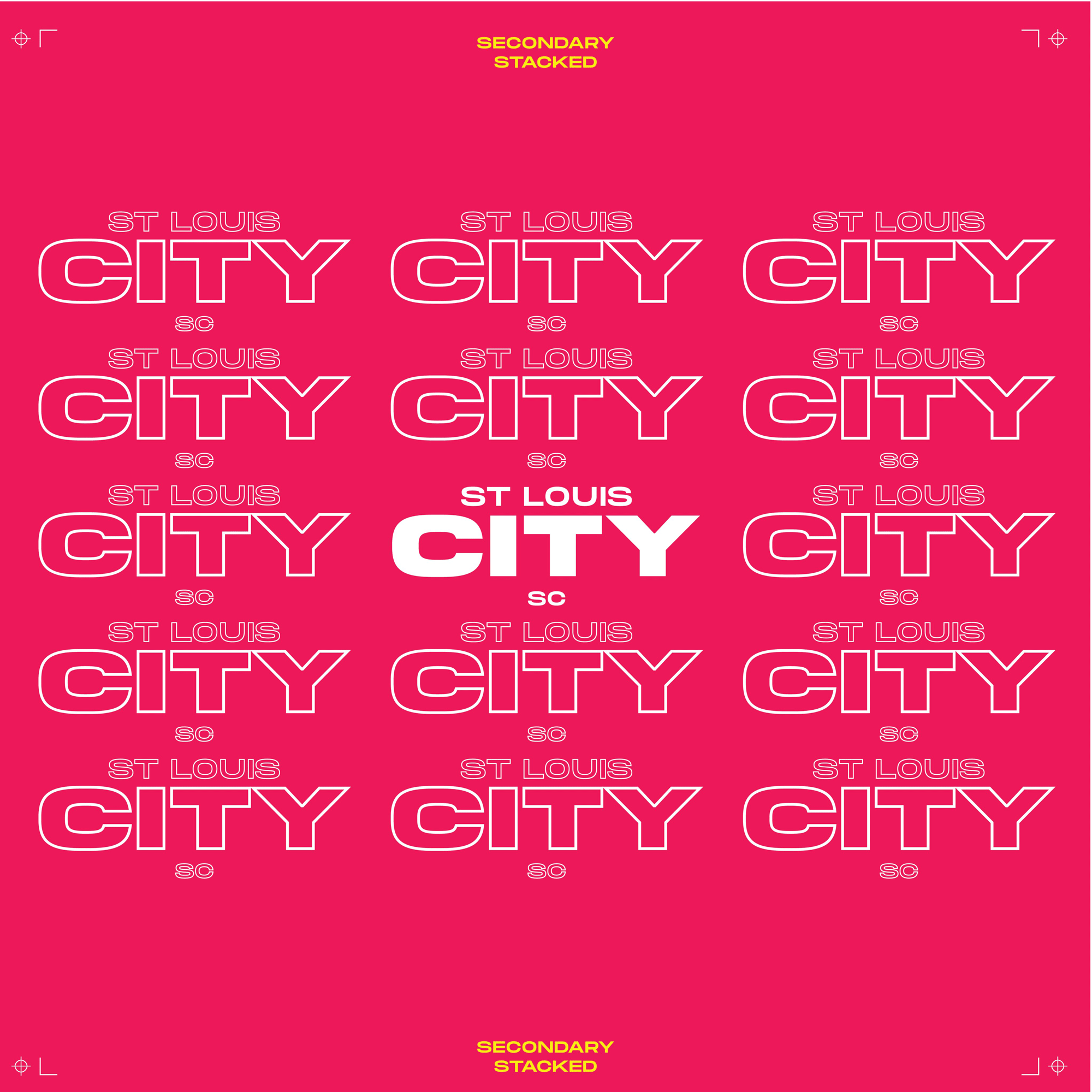
The name is kind of interesting in that, eventually, I assume, the team will simply be known as “City”, as in “Hey, did you watch last night’s City game?” or “I’m going to a City game” and that is a pretty powerful statement. I’m also intrigued that they went with “SC” for Soccer Club instead of the usual “FC” for Football Club as I know it’s a thing where football fans get upset when it’s called soccer. For a United States-based team I think this makes much more sense. The new logo, at a glance, looks good but there is definitely a sense that “a diverse group of over 20 local designers”, as the press release states, had a hand in this and interestingly not one of them could explain what the angled lines under the Arch represent. Lite sarcasm aside, the logo does have the right elements in it, I mean, how could you NOT include the Gateway Arch? I’m not sure the execution of it is quite right… it loses heft at the top but not enough to look as if it was done on purpose and the river lines are just slightly thinner but not thinner enough to look much different. The abrupt cut in the crest to fit the name vertically is, well, abrupt. I mean, it’s not bad, and as I mentioned, it looks good at a glance but there are some questionable decisions here and there. The secondary mark that shows the full arch is interesting but, again, there is something not right about the minimalist interpretation of the arch — like the curvature and depth is off. The wordmark is nice and chunky. Things get a little trendy with the stroked-type approach but no doubt looks exciting when animated. Overall, I would say this is pretty good and it’s a very convincing look — just a little off on some aspects that most fans won’t be bothered by at all.
In ấn Anpic In nhãn mác Anpic In brochure Anpic In card visit Anpic In catalogue Anpic In thiệp cưới Anpic In tờ rơi Anpic
In Ấn Anpic – Nổi Tiếng In Đẹp In Nhanh
Số 5 Ngõ 75 Nguyễn Xiển, Thanh Xuân, Hạ Đình, Hà Nội
0963223884
baogiainananh@gmail.com
https://anpic.vn
https://g.page/inananpic
In nhãn mác Anpic ✅ In brochure Anpic ✅ In card visit Anpic ✅ In catalogue Anpic ✅ In thiệp cưới Anpic ✅ In tờ rơi Anpic
https://anpic.vn/in-nhan-mac-dep
https://anpic.vn/in-brochure
https://anpic.vn/in-an
https://anpic.vn/in-voucher-in-phieu-giam-gia-khuyen-mai
#inananpic
Comments
Post a Comment