DesignStudio wants its AO brand refresh to raise smile with customers
DesignStudio has refreshed the identity for AO in a bid to create a better “emotional connection” with customers and distinguish the brand from its competitors.
Launched in 2000, AO is the UK’s largest online-only retailer for home electricals and appliances. In its 20-year history, the brand had developed several “core assets”: a bright green brand colour, a smiley face logo and a jingle.
But while these were recognisable elements of the AO brand, they were becoming dated and were not able to effectively separate the retailer from its rivals, according to DesignStudio design director Elise Santangelo. AO approached the studio earlier this year to perform a “long overdue facelift”.

“Optimised the logo for digital environments”
The initial focus of the project was to bring the smiley face logo into the present day and prepare it for the future, Santangelo tells Design Week.
“[The logo] was awkwardly drawn – the smile was too chunky, and the elements were uncomfortably spaced,” she says. “It was difficult to centre and didn’t sit comfortably in a square.”
Additionally, Santangelo says, it felt like there was a disconnect in styles between the “bubble ends” of the ‘a’ and “rounded ends” of the mouth.
The team redrew the logo to address these issues and in cleaning up the curves and spacing and helping everything to match better, the studio says it has “optimised the logo for digital environments”.

“Always on”
The smiley face graphic was then used as a base for further branded touchpoints. Santangelo explains a series of 3D and digital graphics have been extrapolated from the logo.
“Using these shapes, we created brand patterns and product category graphics, which helped give AO some much needed energy across even the simplest of applications,” she says. “We created a set of icons based on the same radiuses and curves, which are responsive to the digital environment they needed to live in.”
As well as the smile itself, these graphic elements are also inspired by the “creative concept” of “Always On”. This was a brand strategy that AO came to DesignStudio with initially and aims to reflect the personality of the brand and the fact it is always there to help its customers no matter what time.
To really underline this idea, Santangelo explains new motion principles were developed to ensure there was a sense of energy throughout, through continuous animation loops. Additionally, a rethought, more “vibrant”, colour palette has also been introduced.
“Evoking an emotional connection another way”
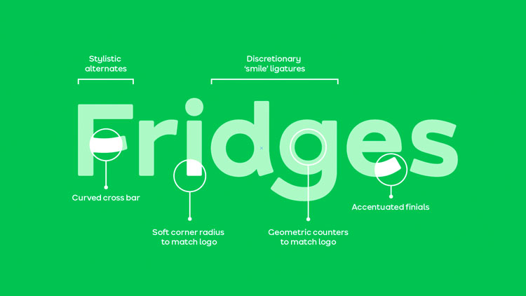
Beyond a series of patterns and graphics, one of the new core assets for the company is a custom typeface, or smileface, as the studio calls it.
Again, this has been extrapolated from the smiley face logo, and features a custom ligature set which, when turned on, makes the letterforms “smile”.
“It’s fun and its quirky and we just thought it would give AO an extra punch, especially for touchpoints that were just a headline,” Santangelo says.
Putting the focus on conveying energy and quirkiness was an attempt to “really articulate the brand personality of AO”, she continues.
“At the end of the day, AO is selling fridges and toasters which aren’t always the most glamourous of products, so we had to find a way of evoking an emotional connection another way,” Santangelo says. The end result, she says, is a “functional toolkit” which the AO team can make work for them.

The post DesignStudio wants its AO brand refresh to raise smile with customers appeared first on Design Week.
In ấn Anpic In nhãn mác Anpic In brochure Anpic In card visit Anpic In catalogue Anpic In thiệp cưới Anpic In tờ rơi Anpic
In Ấn Anpic – Nổi Tiếng In Đẹp In Nhanh
Số 5 Ngõ 75 Nguyễn Xiển, Thanh Xuân, Hạ Đình, Hà Nội
0963223884
baogiainananh@gmail.com
https://anpic.vn
https://g.page/inananpic
In nhãn mác Anpic ✅ In brochure Anpic ✅ In card visit Anpic ✅ In catalogue Anpic ✅ In thiệp cưới Anpic ✅ In tờ rơi Anpic
https://anpic.vn/in-nhan-mac-dep
https://anpic.vn/in-brochure
https://anpic.vn/in-an
https://anpic.vn/in-voucher-in-phieu-giam-gia-khuyen-mai
#inananpic
Comments
Post a Comment