Generative design and 90s nostalgia: Euro 2020 kits revealed
Kit designs have been revealed for the Euro 2020 tournament, which draw on a range of inspiration, from 1990s music videos to original artwork.
The 24-country tournament was supposed to take place this past summer, but has been postponed to the summer of 2021 because of the coronavirus pandemic. Despite the date change, the event is still being styled as Euro 2020.
Nike, Adidas and Puma have designed the majority of the countries’ kits and with a date confirmed for the tournament, most of the designs have now been revealed.
We speak to Nike about the design process and take a look at some of this year’s kit highlights.
Nike’s design process

Nike has designed the kits for nine teams including England, Portugal and France. The latest designs incorporate the brand’s technology and focus on sustainability, while the visual cues are more retro — taking inspiration from the 1990s for example.
Nike vice president of apparel Scott Munson tells Design Week that this year’s kits have created a bigger “toolbox for design”. He draws attention to the way that the new knitting technology allows for a multi-layered look, incorporating “hidden design elements” such as subtle patterns, and bolder imagery on top. Munson says that this has been especially useful in designing the England kits, and will allow Nike to explore this technology more in the future.
Sustainability is also a focus for Nike, Munson says, as the brand continues to strive for more environmentally-friendly production techniques. These kits are made from recycled polyester and it takes 12 plastic water bottles to make the shirt and shorts.
The design process for each kit involves various interest groups, from fans to influencers but most importantly the players. Using a “generative” design process, athletes’ data is input into a machine to work out the best kit design. This data includes “sweat maps”, “stretch maps” and “clip maps”. Athletes might need the fabric to breathe more in the centre chest area, but also stretch in the shoulder area, Munson says.
England

Munson says that the 2020 England kit is indicative of a more “inclusive” team (a sentiment echoed by England manager Gareth Southgate). “The big takeaway is that it’s a more modern and diverse England,” he says. Consultation with younger plays revealed that the 90s were an important reference point, and so the home jersey and its swoosh lock-up is inspired by the 1998 kit. Most noticeable is a lightning bolt-shape in a blue-and-red colourway on the side of the tops, which Munson says is evidence of the “premium” detailing. The away kit is inspired by the cult 1990 design — the never-worn “alternate” third kit that was styled by New Order’s Bernard Sumner in the video for World in Motion.

France
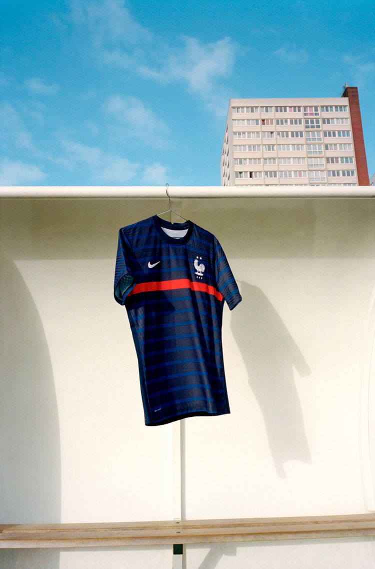
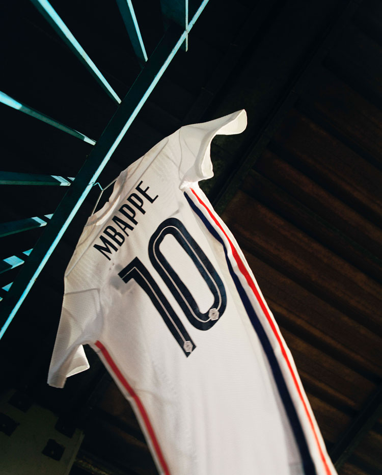
Munson calls the France kit typically “sophisticated” with a “classic design”. Featuring a stripe pattern in shades of blue — perhaps a nod to the country’s Breton tops — it shows that kits don’t need a “bold pattern” to make an impact. Its solo red stripe is a nod to a kit from the 1990s. Munson says that typography is important in conveying the “personality” of the football shirts, and France’s narrow font on the reverse aims to add to its elegant design.
Portugal
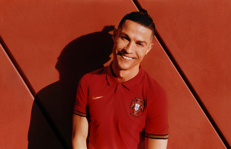
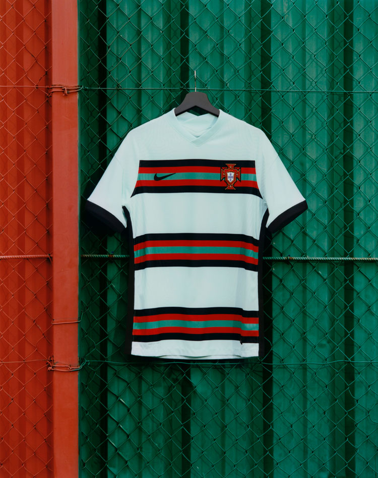
The Portugal home shirt is a deep red, with a sleeve trim inspired by the country’s flag. With a polo collar, the design has a more formal look and is completed by the ornate badge design. Nike’s away kit is more casual and playful, using the flag colours in a stripe formation.
Croatia

Nike’s home kit for Croatia features a bold red-and-white check pattern with blue side stripes, as a nod to the flag. Using the same shade of blue, the kit’s gothic-influenced typography is a neat complement to the chequered design.

Turkey

Turkey’s home kit puts the country’s crescent and star at its centre, with a red chest band. The away kit is red all over, though with tonal variations at the side — evidence of Munson’s smaller design details.

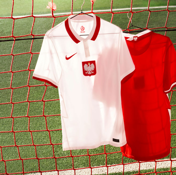
Poland

Poland has a red-and-white colour scheme though makes more use of the shirt’s collar and sleeves. The typography on the reverse seems to echo trends seen in this year’s Premier League kits, incorporating slashes.
Netherlands
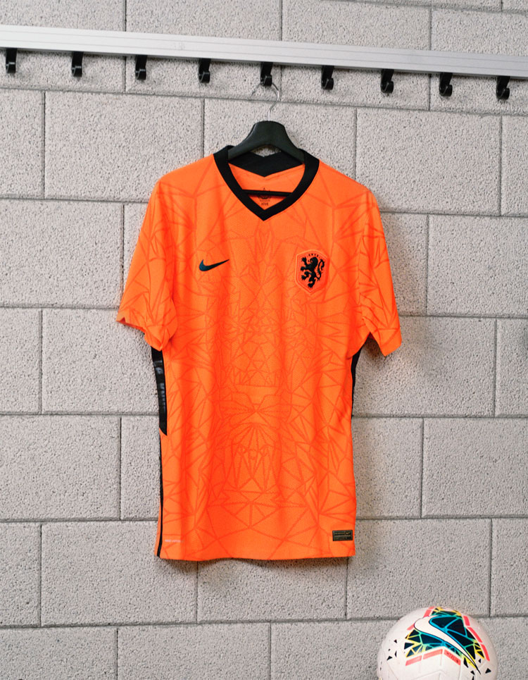
The orange-and-black kit for the Netherlands features a web-like detailing on the home kits, which has a generative look. The away kit inverts the colour scheme and drops the subtle background detail.

Spain
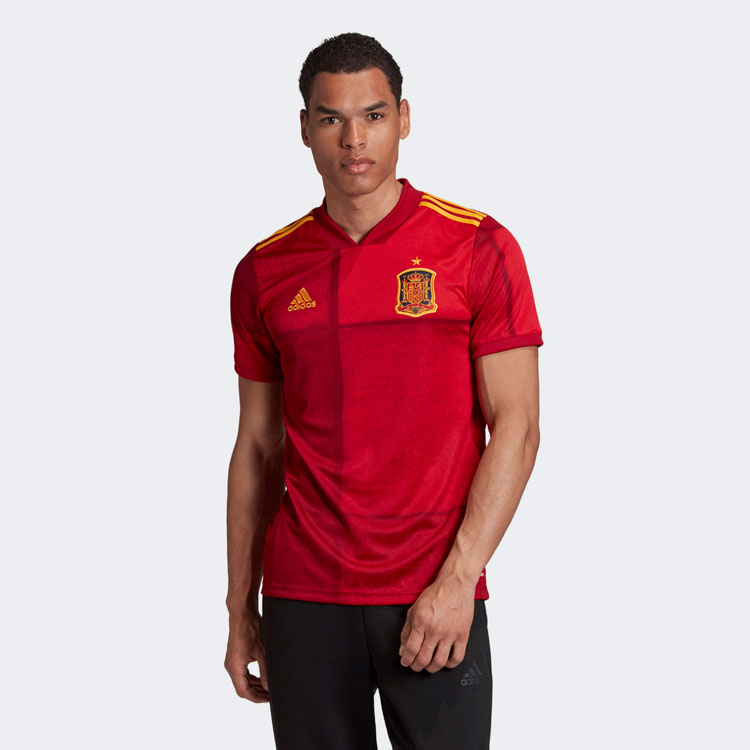
Spain’s kits have been designed by Adidas and uses variations of a red tone to channel the country’s flag. The pattern is actually an original piece of art, and the brand hopes that it “refreshes” the national identity. “1920” has been embellished on the neck detail as a nod to the 100th anniversary of the country’s first federation football shirt and introduction of the lion crest.
Germany
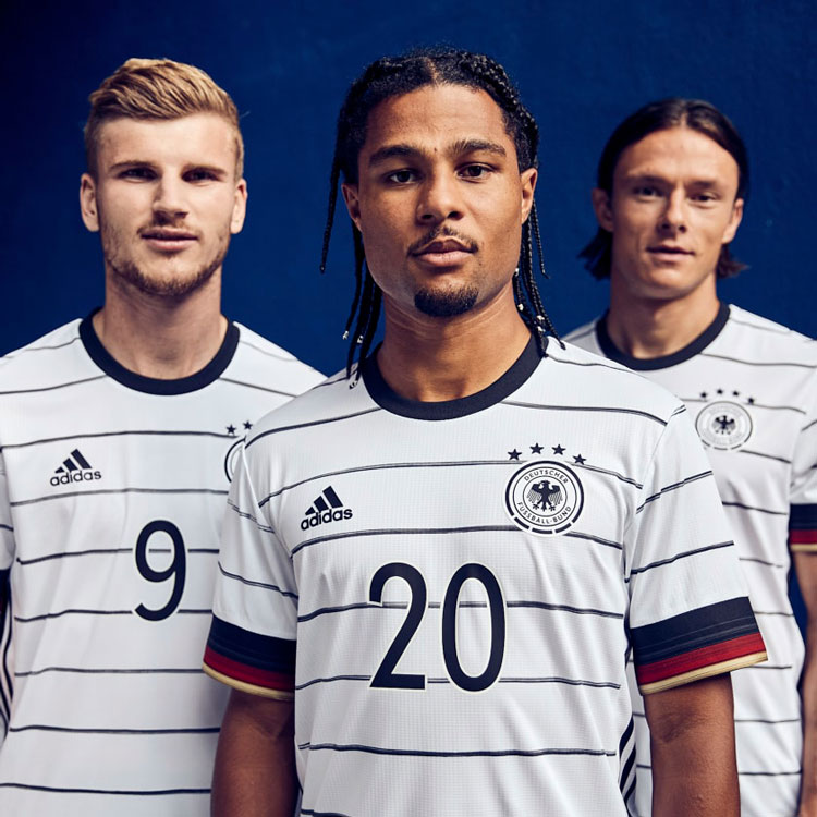
Adidas’ home kit for Germany also uses a stripe pattern though they are thinner and handpainted, aiming for a “bespoke” appeal. It says that the clean, minimal look has been inspired by the country’s street style fashion. The country’s flag are the basis for the sleeve details, which seek to convey an idea of “togetherness and inclusivity” and feature a gold trim.
Hungary
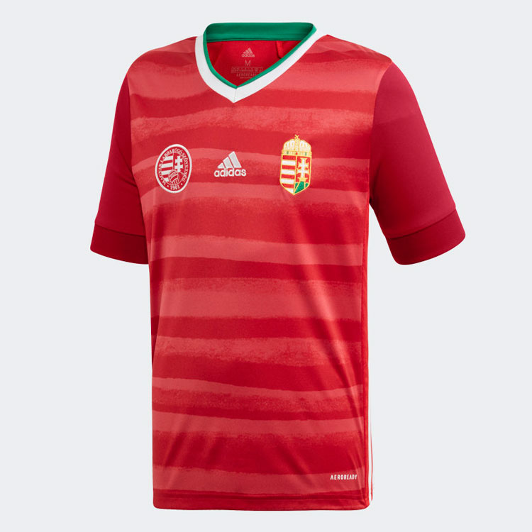
Adidas’ home kit for Hungary resembles Spain’s, but is inspired by the River Danube which flows through the country. The shades of red have been applied with a spray-paint effect to mimic the river’s waves and give the sense of floating. Green detailing at the collar is a nod to the national flag.
Italy

Puma’s home kits have not yet been revealed, though some of its away designs have. Perhaps the most striking of these is Italy’s, which seeks to celebrate the country’s culture of art and is inspired by the Renaissance. The shirt features a detailed backing pattern with Italian flourishes.
The post Generative design and 90s nostalgia: Euro 2020 kits revealed appeared first on Design Week.
In ấn Anpic In nhãn mác Anpic In brochure Anpic In card visit Anpic In catalogue Anpic In thiệp cưới Anpic In tờ rơi Anpic
In Ấn Anpic – Nổi Tiếng In Đẹp In Nhanh
Số 5 Ngõ 75 Nguyễn Xiển, Thanh Xuân, Hạ Đình, Hà Nội
0963223884
baogiainananh@gmail.com
https://anpic.vn
https://g.page/inananpic
In nhãn mác Anpic ✅ In brochure Anpic ✅ In card visit Anpic ✅ In catalogue Anpic ✅ In thiệp cưới Anpic ✅ In tờ rơi Anpic
https://anpic.vn/in-nhan-mac-dep
https://anpic.vn/in-brochure
https://anpic.vn/in-an
https://anpic.vn/in-voucher-in-phieu-giam-gia-khuyen-mai
#inananpic
Comments
Post a Comment