David Pearson: “We can be braver with book design in the UK”
The third year of book cover designer David Pearson’s university degree at Central Saint Martins, he admits, should have been spent focusing on his degree show.
But rather than following the example set by his classmates, Pearson was job hunting. He tells Design Week the search was all-consuming: “I was terrified of graduating without a job and having to move back to Grimsby, so I tried to get the jump on everyone else.”
It was a good strategy, it turns out – the day after he graduated in 2002, Pearson started work at Penguin.
“Cover design is at its most fun when you have something to kick against”
Reflecting on landing such a coveted position so early on in his career, Pearson says it really was a dream come true.
“I remember the biggest challenge of the interview was trying to mask the fact I was stupidly excited – I didn’t think they’d want to hire that person!” he says. Now, as he was then, Pearson says he is a big fan of Penguin’s work and the “indescribable secret formula” that goes into making the publisher’s covers.
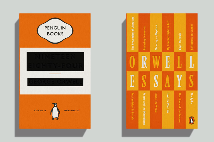
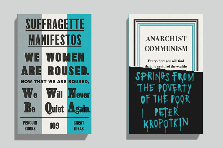
Pearson left the in-house team to go independent seven years ago, but Penguin remains one of his biggest clients. The most recent project from the partnership is the latest instalment of the Great Ideas book series, which he worked on with fellow designers Phil Baines, Catherine Dixon and Alistair Hall.

The series holds a special place in Pearson’s heart and career history – the mini-book collection dedicated to “great thinkers” has more than 100 titles and Pearson has designed the covers for most of them over the last two decades. New titles are brought out in volumes and each feature a stripped back colour palette. This is the only thing the titles share however, as all are designed to be “pleasingly inconsistent” when sat alongside each other.
“The Good Ideas series was always about trying to make each book as different as possible,” he says, adding that the first step for every stage of the collection was to set parameters and limits. “Book design is at its most fun when you’ve got something to kick against.”
The secret with the Great Ideas series, Pearson says, is “managing variables”. Designing 20 books in one go presents an “interesting dynamic”: “I could have made them all look crazy but then of course none of them would look crazy – my tactic was to allow four or five covers to look ‘straight’ and then went made with the rest.”
Pearson now has 18 years of cover design experience behind him, and a successful solo practice in Type As Image. Throughout his career, he says his working methods haven’t changed.
“When you do what I do, a lot of it stays the same,” he says. “Whether you’re a junior designer or a senior designer, whether you’re in-house or not, you’re still designing a book cover, and I like that consistency.”
But that’s not to say the output of work has stayed the same – audiobooks, e-books and social media have all had their effects on the profession. Instagram in particular has provoked a huge shift in the perception of cover design, he says.

“When I first started out, authors were not that preoccupied with how their books looked, but my god they are now,” Pearson says. “The success of a ‘cover reveal’ on Instagram is a huge indicator of how the book is going to sell.”
And the ongoing coronavirus pandemic has provoked another change in his work. For the last six months Pearson, who has spent most of his career working in backlist publishing, has spent considerable time working with living authors. The onset of the virus and subsequent lockdown, he explains, meant book tours were cancelled and publishers needed new ways of engaging prospective readers.
“I’ve had more work recently than I have in ages and I’m doing most of it right now from a very hastily assembled home office,” he says. “It’s been amazing.”

“What I can do is incredibly limited”
Pearson’s work – be it with the Great Ideas series or other covers for the likes of George Orwell, Karl Marx or John le Carré – is focused around typography. That’s “his thing”, he tells us.
“I can’t draw or paint or take photos – what I can do is incredibly limited, but I use typography in an expressive way on my book covers,” he says. “And that’s good, because when people approach me for work, they’re not going to be too shocked with what I produce.”
The good thing about the book cover design profession, Pearson adds, is that everyone within it has their own “wheelhouse”. For this reason, he views his fellow designers as friends and collaborators rather than rivals. He says: “We all operate in very distinct boxes and have unique skillsets that don’t really cross over, so what you can and can’t do drives things along.”

“I like creating systems in my work,” he says, referencing the Great Ideas collection as an example. “It’s not the most expressive or spontaneous way of working but it works really well for me.”
The way that Pearson arrives at the final product differs depending on the book at hand. The ideal scenario, he says, is to receive a manuscript, read it and then respond directly. But the reality can often be quite different, since schedules are often tight and changes need to be made. And sometimes the book simply isn’t finished.
“You have to work around these obstacles where you can and often this opens up some really interesting avenues,” Pearson says. “Talking to the author and discussing themes and emotions and tones is a great way around that and it really serves to bond you together.”
“You can tell when a book cover is quite apologetic”
So with almost 20 years of experience in the industry, how does Pearson view the state of the profession he is in? He says there are “waves of brilliance” coming from different publishers around the world. In particular, he says many UK designers are looking enviably at publishing imprints in the US, like Knopf and New Directions.
“There are lots like these two who are doing work that is consistently and endlessly brilliant,” he says. As for the UK, he says there is some similarly impressive work going on, but that “we’re maybe a little bit more fearful” here. “I feel like you can tell when a book cover is quite apologetic, or if too many people are working to make it dance to different tunes and I’d love for us to become braver.”

On the topic of dancing to too many tunes, Pearson is hoping the industry will soon embrace the idea of having more than one cover for a title. The standard at the moment is to have one cover to fit a growing number of contexts.
“A book cover is such a small space, and I’ve always had the opinion that each one should be redesigned for all it’s different uses,” he says. “A small thumbnail for online use, a poster, an e-book cover and the physical product require different treatments, I think.”
In the future, he hopes, publishers will embrace the idea of a “cover toolkit”, which features several designs that are all “fit for purpose”. Pearson says this way, “we could all go about our jobs in a braver way”.

“A book cover is basically a little poster”
As for how hopeful book cover designers might crack the industry, Pearson says the key is to be “an ideas factory”.
“A book cover is basically a little poster, so if you’re interested in the field I think it’s all about being able to demonstrate you have the power to snag someone’s eye and communicated quickly,” he says. “There are so many ways of interpreting a book, and you’re working with different content all the time, so you have to be able to put on different hats.”
For this reason, he says those wishing to get into cover design shouldn’t necessarily think they have to fill their portfolio with just examples of cover designs. Instead, they should focus on work that conveys good ideas and an understanding of typography. A little bit of resilience never hurts too, Pearson says, since “you can go through a lot of covers before you get an approval sometimes”.

So after all of this, what is Pearson’s favourite project? He says it is actually a recent collaboration with writer Nick Asbury for a series from John le Carré. Hiring a writer to do the copy for the cover was a first for Pearson, but he says the results were “dynamic and rewarding”.
In the 18 years he’s been designing covers, Pearson says he has no idea how many covers he’s actually created but estimates its “hundreds and hundreds”.
“Someone once said to me: ‘When a book comes round and you already designed the cover for it once, that’s when you should retire’,” he recalls. “But I must have designed 30 covers for Karl Marx alone, so I think I’m beyond that now.”
The post David Pearson: “We can be braver with book design in the UK” appeared first on Design Week.
In ấn Anpic In nhãn mác Anpic In brochure Anpic In card visit Anpic In catalogue Anpic In thiệp cưới Anpic In tờ rơi Anpic
In Ấn Anpic – Nổi Tiếng In Đẹp In Nhanh
Số 5 Ngõ 75 Nguyễn Xiển, Thanh Xuân, Hạ Đình, Hà Nội
0963223884
baogiainananh@gmail.com
https://anpic.vn
https://g.page/inananpic
In nhãn mác Anpic ✅ In brochure Anpic ✅ In card visit Anpic ✅ In catalogue Anpic ✅ In thiệp cưới Anpic ✅ In tờ rơi Anpic
https://anpic.vn/in-nhan-mac-dep
https://anpic.vn/in-brochure
https://anpic.vn/in-an
https://anpic.vn/in-voucher-in-phieu-giam-gia-khuyen-mai
#inananpic


Comments
Post a Comment