Norway’s redesigned passports pay homage to the Northern Lights
Norway’s new passports have been revealed, featuring illustrated natural landscapes and UV details.
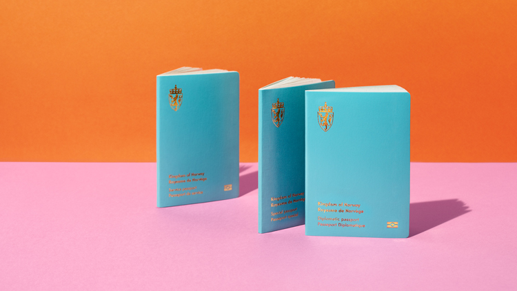
Designed by Oslo-based studio Neue, the new passports come in a range of colours, indicating different citizenship statuses.

Neue won the competition to design Norway’s new passport in 2014 with a concept based around the country’s scenic scapes and how they could unify Norwegian citizens.
Nearly 30 design studios competed to redesign the country’s travel documentation. The studio was picked from a shortlist of five.
An “identity project”

Neue creative director Lars Håvard Dahlstrøm told Design Week at the time that the studio thought of the passport as an “identity project”.
“I think we stood out because we managed to free ourselves from thinking of the passport as a traditional document,” he said.

As well as needing to have a “clear expression of Norwegian identity”, there was a range of considerations according to the studio. It needed to be “creative and innovative” and also “appear as a document of high value”.
There was also an overall need to increase security for all Norwegian travel and identification documents, according to Neue.

The passport comes in three different colours, each a nod to the Norwegian flag. Turquoise has been used for the diplomatic passport, a red for the standard passport as well as a white for an emergency passport. A version for foreign nationals comes in a pale blue design.
Neue’s design team previously told Design Week that these shades were part of a “fresher and more modern approach”. Type appears in gold on the passport covers, along with a pared-back version of Norway’s national crest.
“Belonging and pride”

The unifying theme for the project is nature, which aims to unite people across age, gender and regions. “The landscapes surrounding us give a sense of belonging and pride, and fill a symbolic function for the entire nation,” Neue says.
While it admits that scenic images can “easily become clichés”, it also says that nature is more than “just beautiful scenery” to Norwegians.

“It supplies us with rich fisheries, clean hydroelectric power, and various other industries,” it adds. The studio also says that these landscapes have witnessed many historical events important to the country’s heritage.
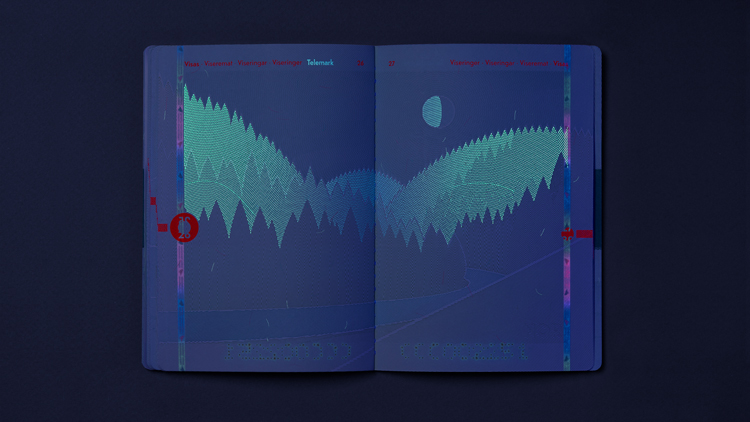
Each page “represents a unique story of Norway”, the studio says. The Visa pages have all been illustrated by the studio – depicting forest and mountain scenes, for example.
Scenes have been taken from across Norway’s geography, from north to south as a way to show the “contrasts in landscapes and climates”.
Day to night

UV details have been added which depict a shift from day to night in these scenes. For instance, when a UV light is applied to the mountain scene, an illustration of the Northern Lights appears.
The daytime forest scene also transitions to night, as the trees’ shadows are illuminated by moonlight.

The post Norway’s redesigned passports pay homage to the Northern Lights appeared first on Design Week.
In ấn Anpic In nhãn mác Anpic In brochure Anpic In card visit Anpic In catalogue Anpic In thiệp cưới Anpic In tờ rơi Anpic
In Ấn Anpic – Nổi Tiếng In Đẹp In Nhanh
Số 5 Ngõ 75 Nguyễn Xiển, Thanh Xuân, Hạ Đình, Hà Nội
0963223884
baogiainananh@gmail.com
https://anpic.vn
https://g.page/inananpic
In nhãn mác Anpic ✅ In brochure Anpic ✅ In card visit Anpic ✅ In catalogue Anpic ✅ In thiệp cưới Anpic ✅ In tờ rơi Anpic
https://anpic.vn/in-nhan-mac-dep
https://anpic.vn/in-brochure
https://anpic.vn/in-an
https://anpic.vn/in-voucher-in-phieu-giam-gia-khuyen-mai
#inananpic
Comments
Post a Comment