Reviewed: Friday Likes 299: From Peck Design Associates, Bienal, and Human
“From Peck Design Associates, Bienal, and Human”
A triple serving of food and beverage establishments this week, with work from Nashville, Mérida, and Mexico City.
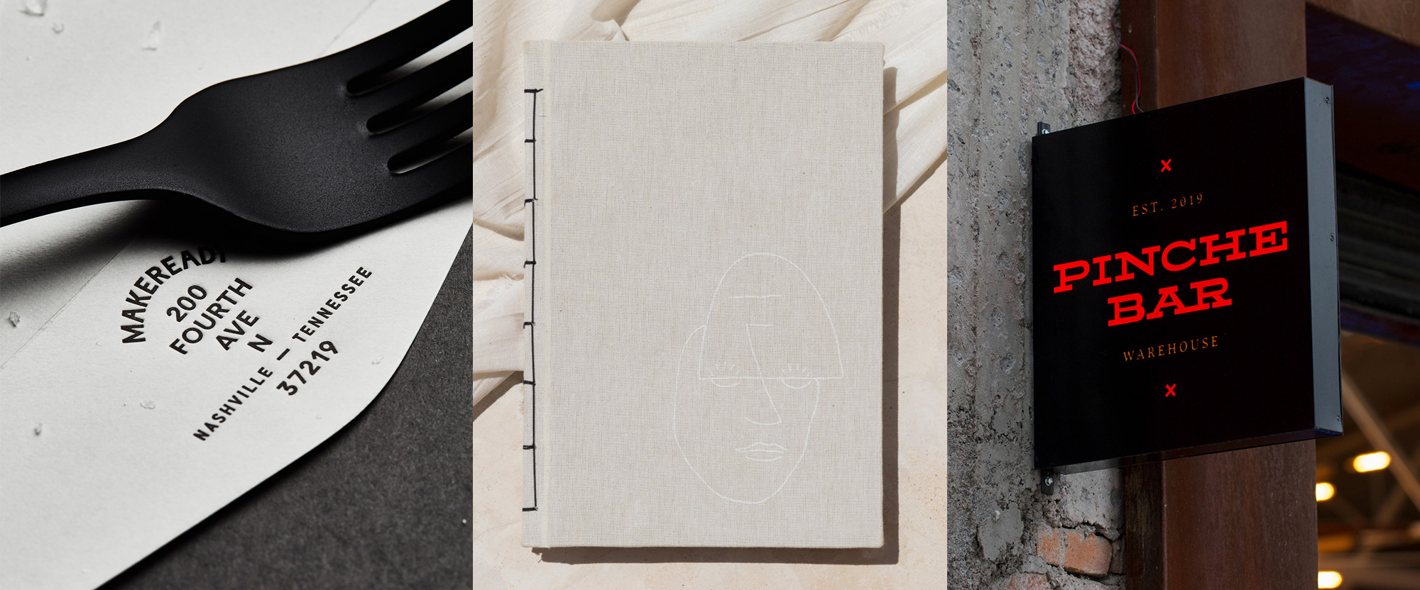
Makeready by Peck Design Associates

Makeready is a beer hall and restaurant in Nashville, TN's Printers Alley that exudes a hard work ethic, from its name to the way it describes itself to the identity, designed by local firm Peck Design Associates. Playing off of the saying "Burn the candle at both ends", the identity uses a series of semi-mirrored illustrations -- in the faces one is smiling, one frowning and in the sign one hand holds a fork the other a paint roller -- that add an irreverent touch to the foundation of the more serious and seriously excellent typography throughout, from logos to menu to signage. My only complaint about this project is that there were way too many cool images to have to chose four from for this post, so definitely go see the rest. See full project
Te Extraño, Extraño by Bienal
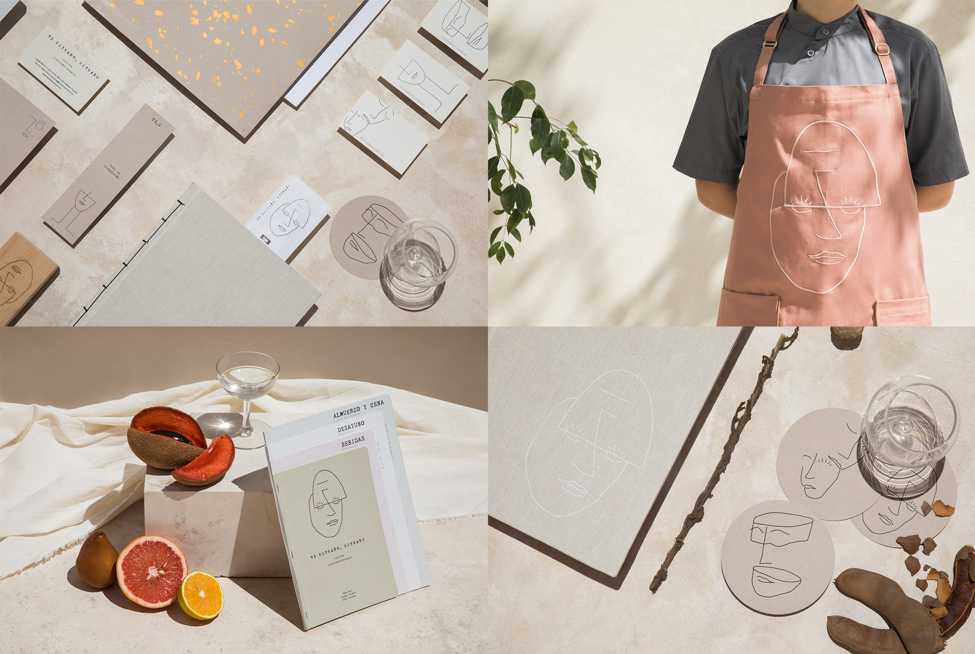
Te Extraño, Extraño -- which is directly translated as "I miss you, Stranger" in English but misses the play on words where Extraño in Spanish means both a stranger and the act of missing someone -- is a restaurant in Mérida, Yucatán, Mexico, offering a contemporary take on traditional local dishes. With a slightly philosophical name where the stranger is not an actual stranger but the stranger within you, the identity, designed by local firm Bienal -- yup, I am double-dipping into their portfolio in back-to-back weeks -- gets a little groovy with some lovely thin-line illustrations of faces in a loose hand-drawn style. The primary illustration with the faces meeting at the eyes is great and could easily be the killer cover art for a book. The typography, in a typewriter font, alludes to writing letters and if you are in the right headspace it could all be interpreted as you sending yourself a letter about yourself. Or something deep like that. Either way, it's a lovely identity and the food looks like something you would miss after you ate it. See full project
Pinche Bar by Human
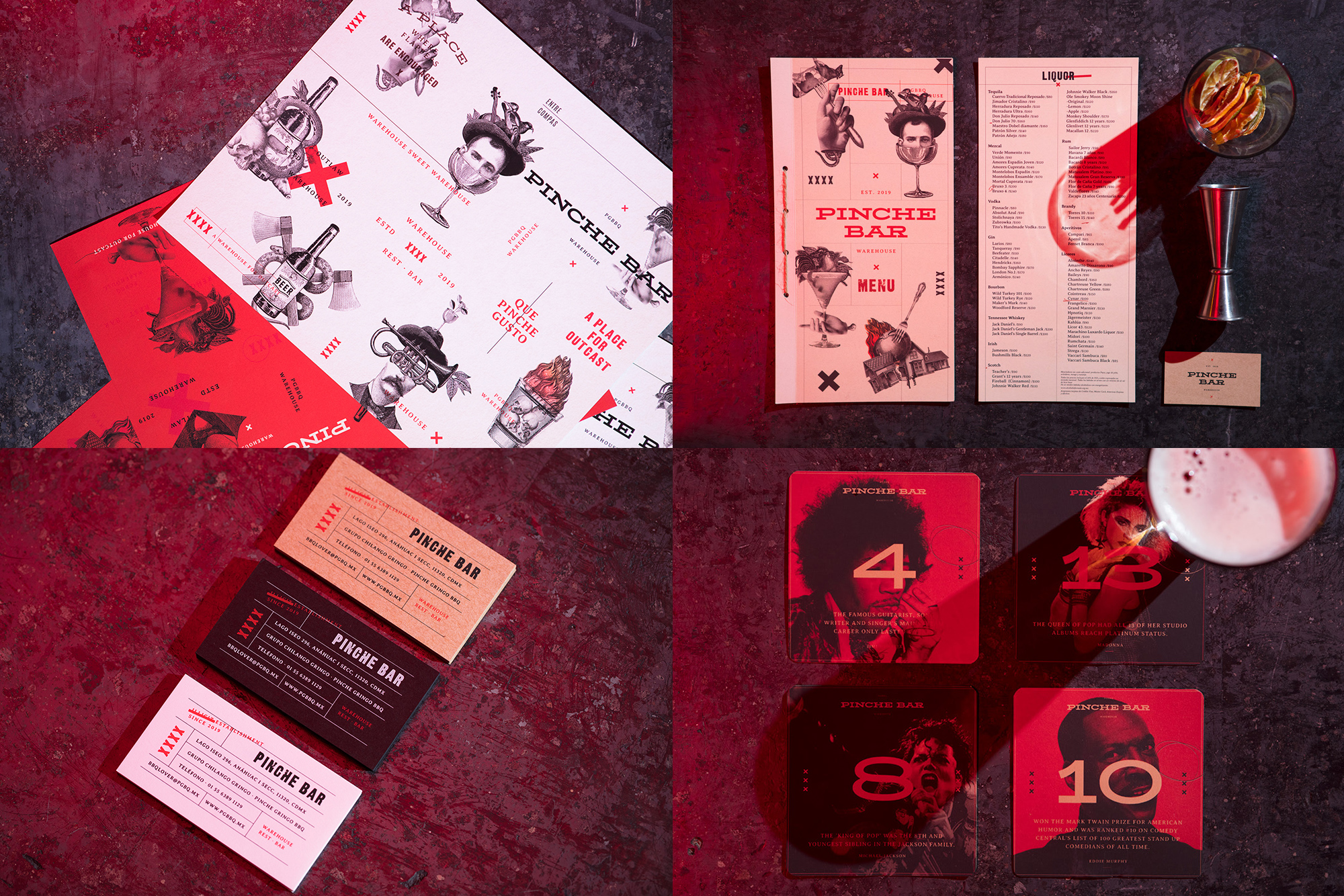
Pinche Bar -- which also gets a little lost in translation because of the many nuances of Pinche in Mexico would be "This Fucking Bar" -- is a bar in Mexico City that builds on the growing enterprise that is "Pinche Gringo BBQ", which started as a food truck and now operates in a giant warehouse. Designed by local firm Human, the identity has a kind of upscale somewhat polite middle-finger aesthetic with bold typography, lots of red accents, and some weird vintage clipart collages that, although none of it should go together, it does mostly due to the pinche attitude that holds it all together. See full project
In ấn Anpic In nhãn mác Anpic In brochure Anpic In card visit Anpic In catalogue Anpic In thiệp cưới Anpic In tờ rơi Anpic
In Ấn Anpic – Nổi Tiếng In Đẹp In Nhanh
Số 5 Ngõ 75 Nguyễn Xiển, Thanh Xuân, Hạ Đình, Hà Nội
0963223884
baogiainananh@gmail.com
https://anpic.vn
https://g.page/inananpic
In nhãn mác Anpic ✅ In brochure Anpic ✅ In card visit Anpic ✅ In catalogue Anpic ✅ In thiệp cưới Anpic ✅ In tờ rơi Anpic
https://anpic.vn/in-nhan-mac-dep
https://anpic.vn/in-brochure
https://anpic.vn/in-an
https://anpic.vn/in-voucher-in-phieu-giam-gia-khuyen-mai
#inananpic


Comments
Post a Comment