Reviewed: New Logo and Identity for Kroger by DDB
“The OG of Weird Logos”
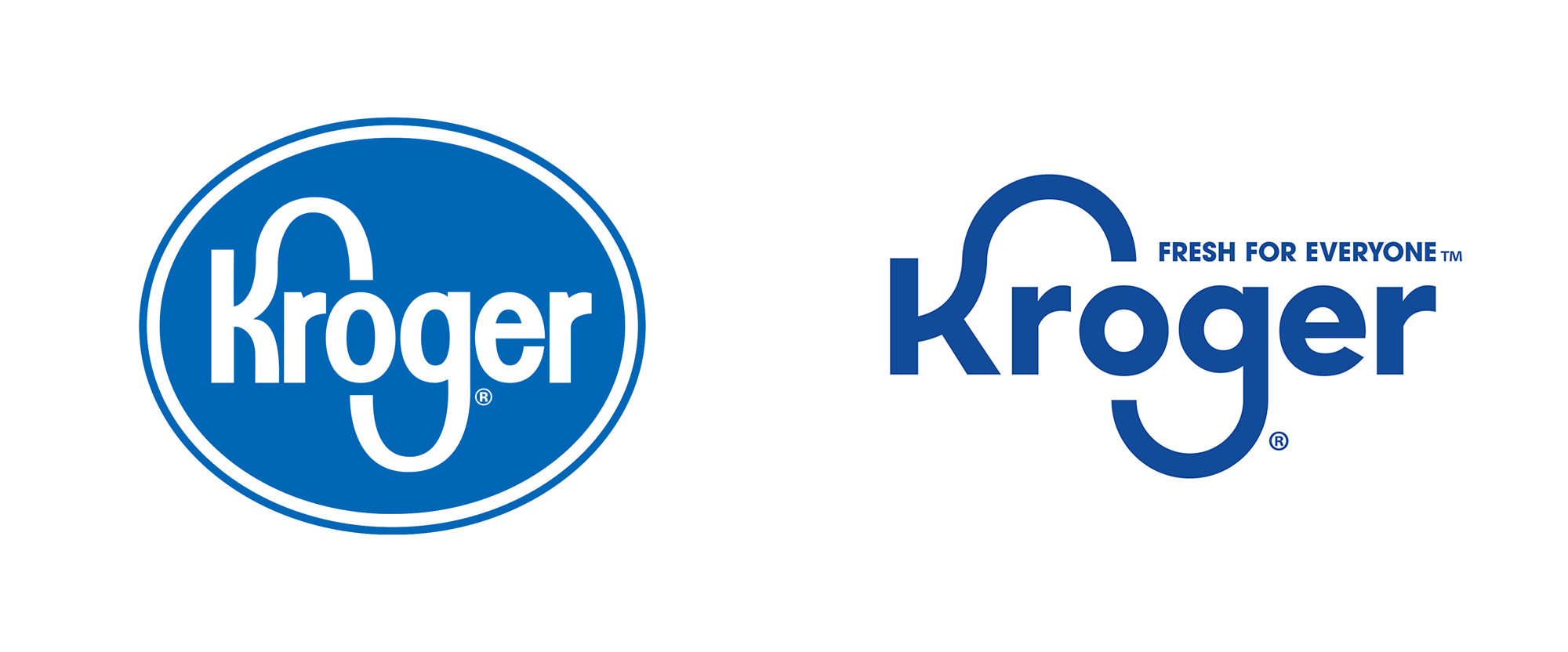
Established in 1883 in Cincinnati, OH, where the company is still headquartered, Kroger is not only the largest grocery store retailer in the United States but with almost 2,800 stores in 35 states and annual sales of more than $121.1 billion it makes it one of the largest in the world. Employing nearly 500,000 people, it serves 11 million customers each day. Many of its stores feature fueling centers, health clinics, and pharmacies and it creates its own private label brand products across almost every category in 37 manufacturing plants across the U.S.. Kroger also does good, donating $192 million alone in 2018 to support hunger in its local communities, it diverts tons of waste from landfills, rescues produce and reduces waste, and is constantly making electricity usage improvements. Yesterday, Kroger introduced a new identity designed by DDB.
The contemporary evolution of the redesigned Kroger logo reflects the company's strong, food-rich heritage by retaining the shape and movement of the iconic "K" and "G" loved by generations of Kroger customers.
Fresh for Everyone is Kroger's brand ethos. The universal tagline is simple and designed to drive an instant understanding of the uniquely egalitarian American brand, underscored by Kroger's commitment and belief that everyone should have access to fresh, affordable and delicious food.
Kroger brand page
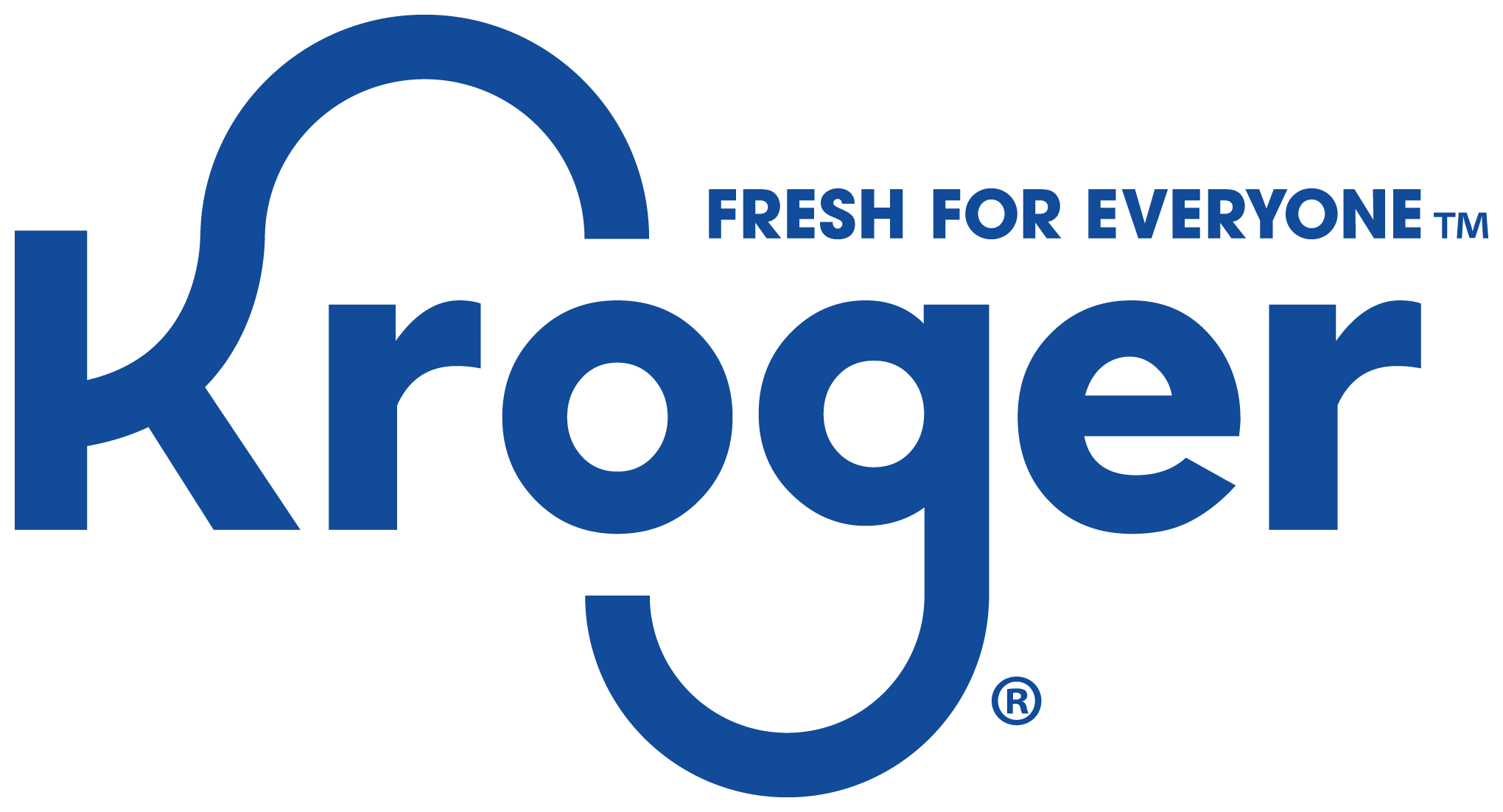
One of the most difficult aspects of having moved from Austin, TX, to Bloomington, IN, in 2017 was leaving behind HEB, Texas' amazing grocery store, and having to replace it with Kroger, which I (had) always thought of as outdated, dingy, and not... the best. At first, I really disliked going to Kroger -- rumor has it that our local store is THE largest Kroger in the U.S. -- but after getting used to its layout, quality private label brands, and crazy-ass discounts on crazy-ass random times, I have come to appreciate it. A lot. A huge part of my initial negative impression of Kroger was its logo, which had been around since the early 1960s and was an evolution of the same elongated "K" and "g" introduced in 1931. Every time I pull up to the store and see their big logo on the front, it makes me cringe but, as with most logos that have been around for an extremely long time, its recognizability factor is huge and those loops certainly stand out.
Although getting rid of Kroger's signature curves would have visually been the right thing to do -- because neither the "K" nor the "g" can naturally and convincingly expand and contort the way they do in the Kroger logo -- there simply was no way it would have been the right thing to do when it comes to the legacy of the brand. So, with that in mind, we move on to the execution: at first glance it's both not terrible AND terrible, which adds up to mediocre unfortunately. The rounder structure of the letters and their looser spacing do allow for better readability and a more relaxed-looking logo. Making the loops of the "K" and "g" be half circles feels very driven by someone's limited ability on Adobe Illustrator as opposed to being driven by someone's ability to customize letterforms expertly. The "g" now looks comical and the rounder "o" and "g" create a set of eyes for the smile of the "g" which is IHOP-ish in a bad way and the "K" is absolutely painful to look at. To be perfectly honest I do not know what is the best approach to solve this evolution -- my educated guess is that sticking to a more heavily condensed structure would have yielded a better result and trying to integrate the "o" with the loops could have created a unique ligature of some sort -- but this feels like the obvious, no-friction solution and, even if we accepted it as the right solution, the final drawing is not very good. I mean, again, it's fine but I feel like this deserved a really fantastic evolution done by someone with more talent and vision for what those letters could do together.
Lovable "Kroji" characters keeps Kroger fun and relatable.
Animation is Kroger's fresh creative medium to market, connect and differentiate. The Kroji (Kroger + emoji) animation features a loveable cast of characters to represent Kroger customers, associates and communities in an inclusive, relatable, optimistic and fun way.
Kroger brand page

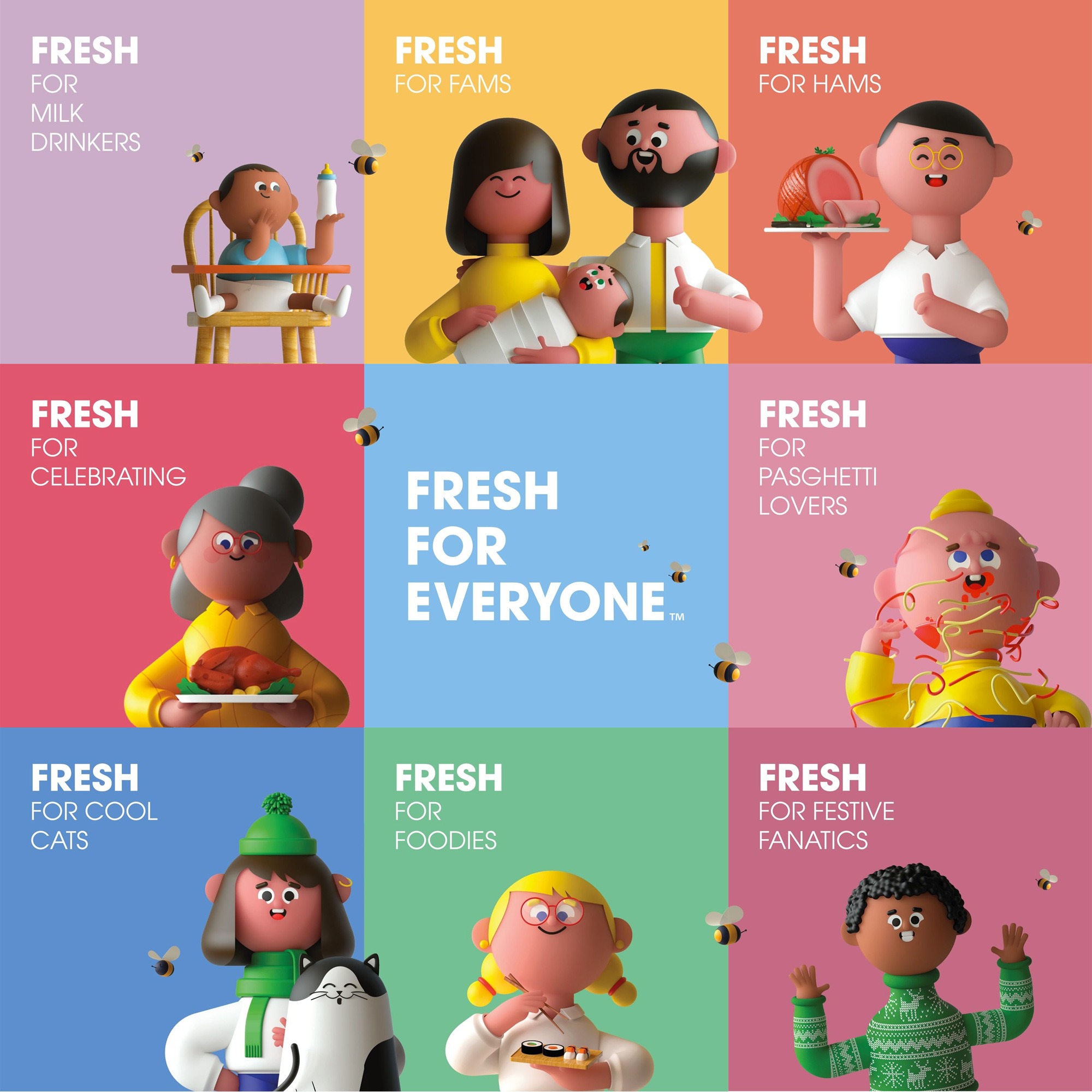
In a completely separate universe from the logo and what feels like such an advertising-agency-thing-to-do, Kroger has introduced a new set of 3D characters as the new brand expression. I think they are kind of cute and the flexibility to create people of every gender, race, and age on demand is actually quite brilliant but it feels like a random solution for a grocery store and, somehow, like an antiquated creative approach to take. But maybe I'm wrong... I dunno. It's such an unexpected solution that I'm not completely sure how to take it.
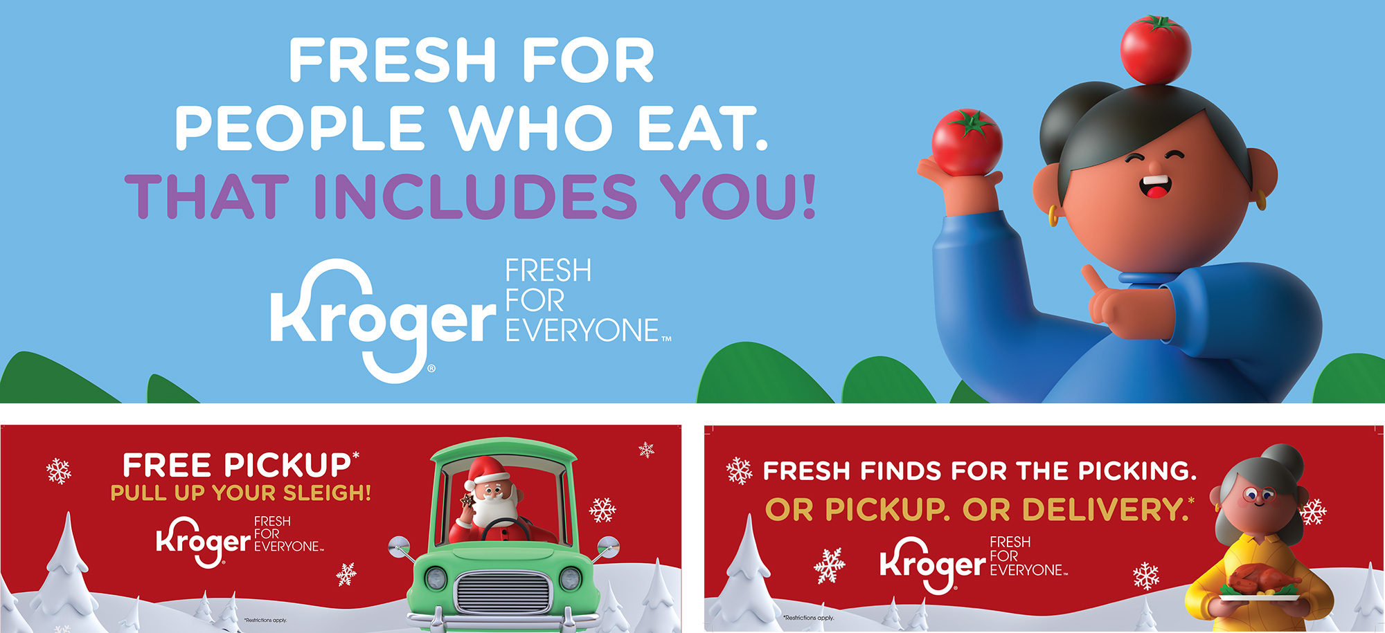
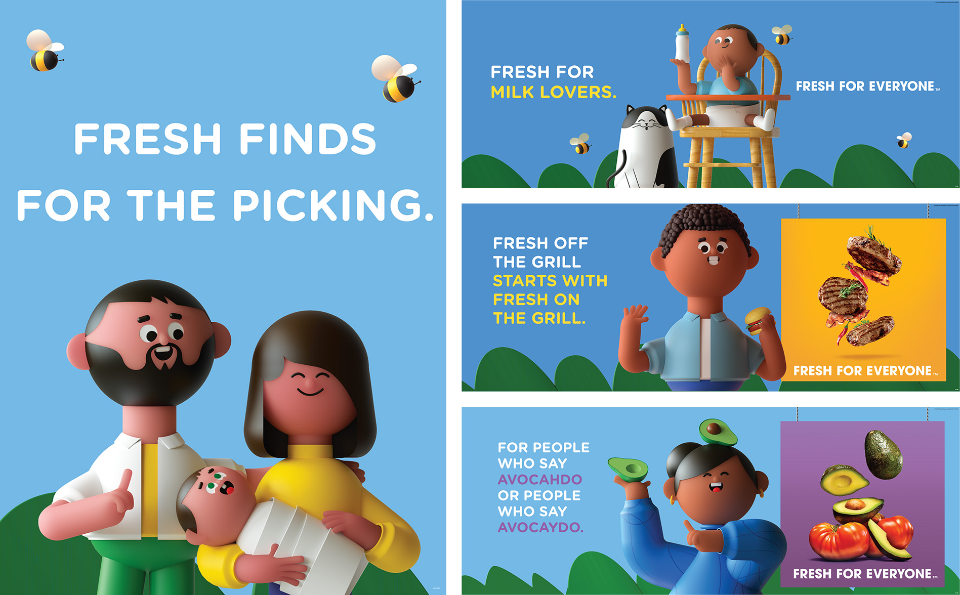
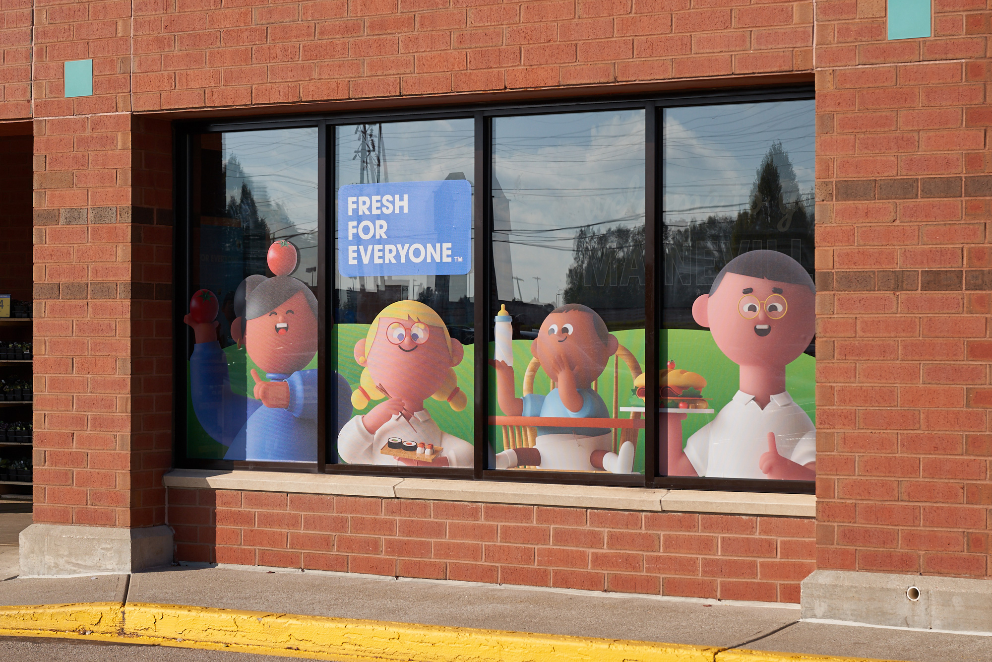
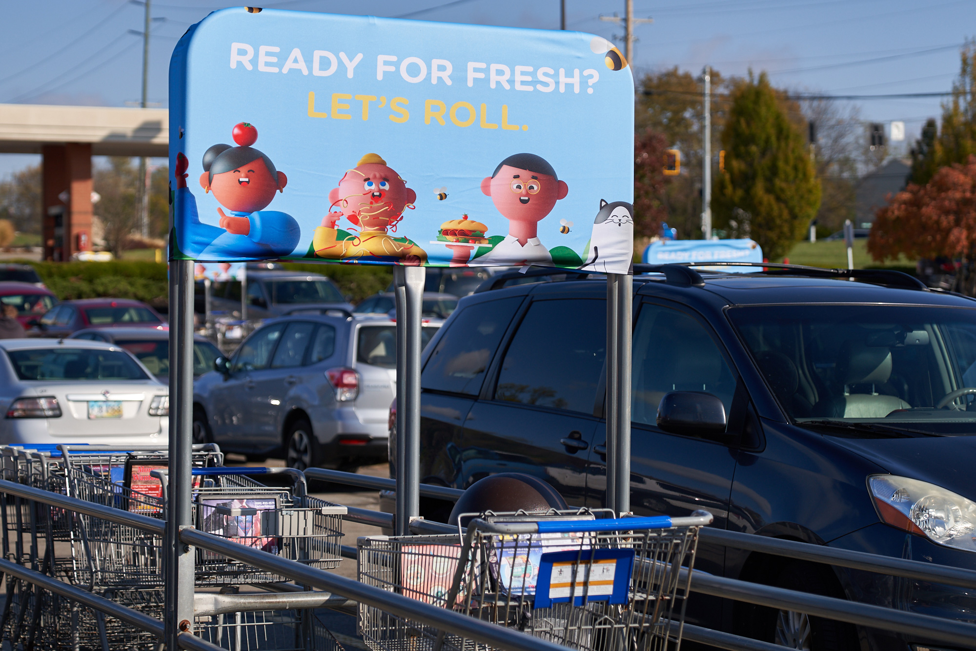
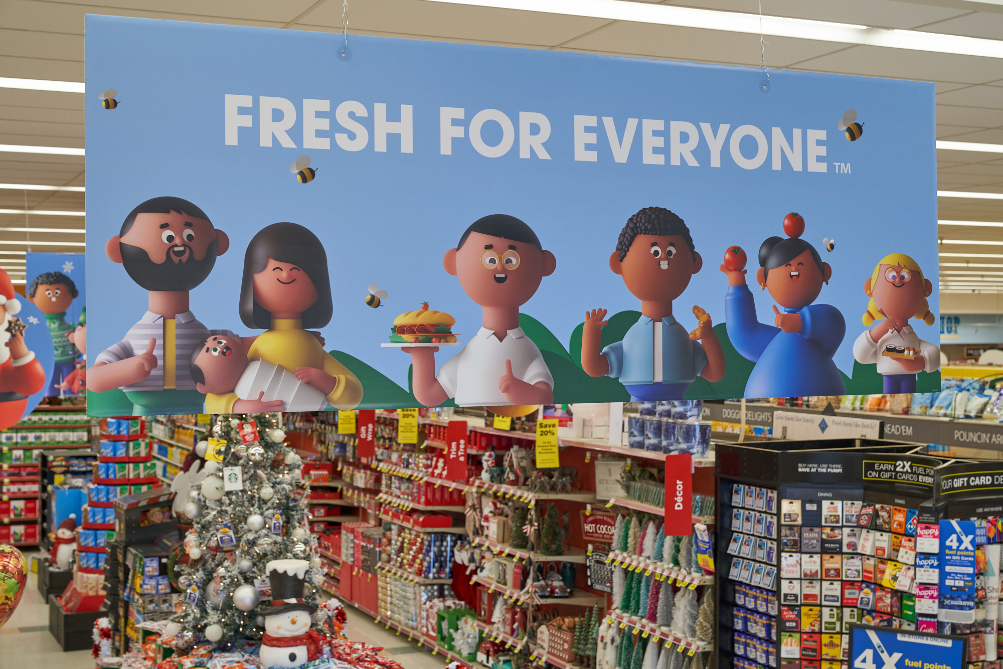
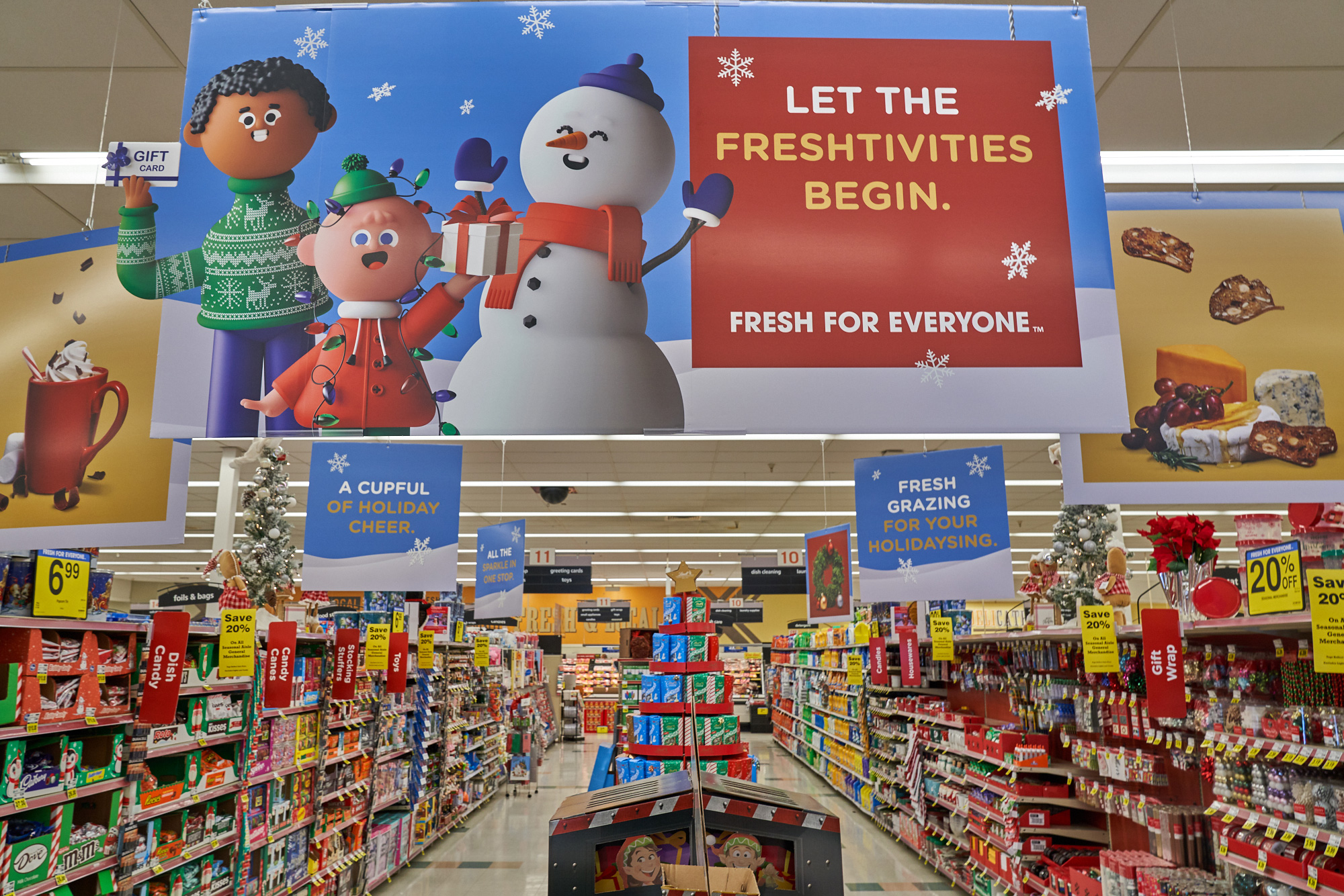
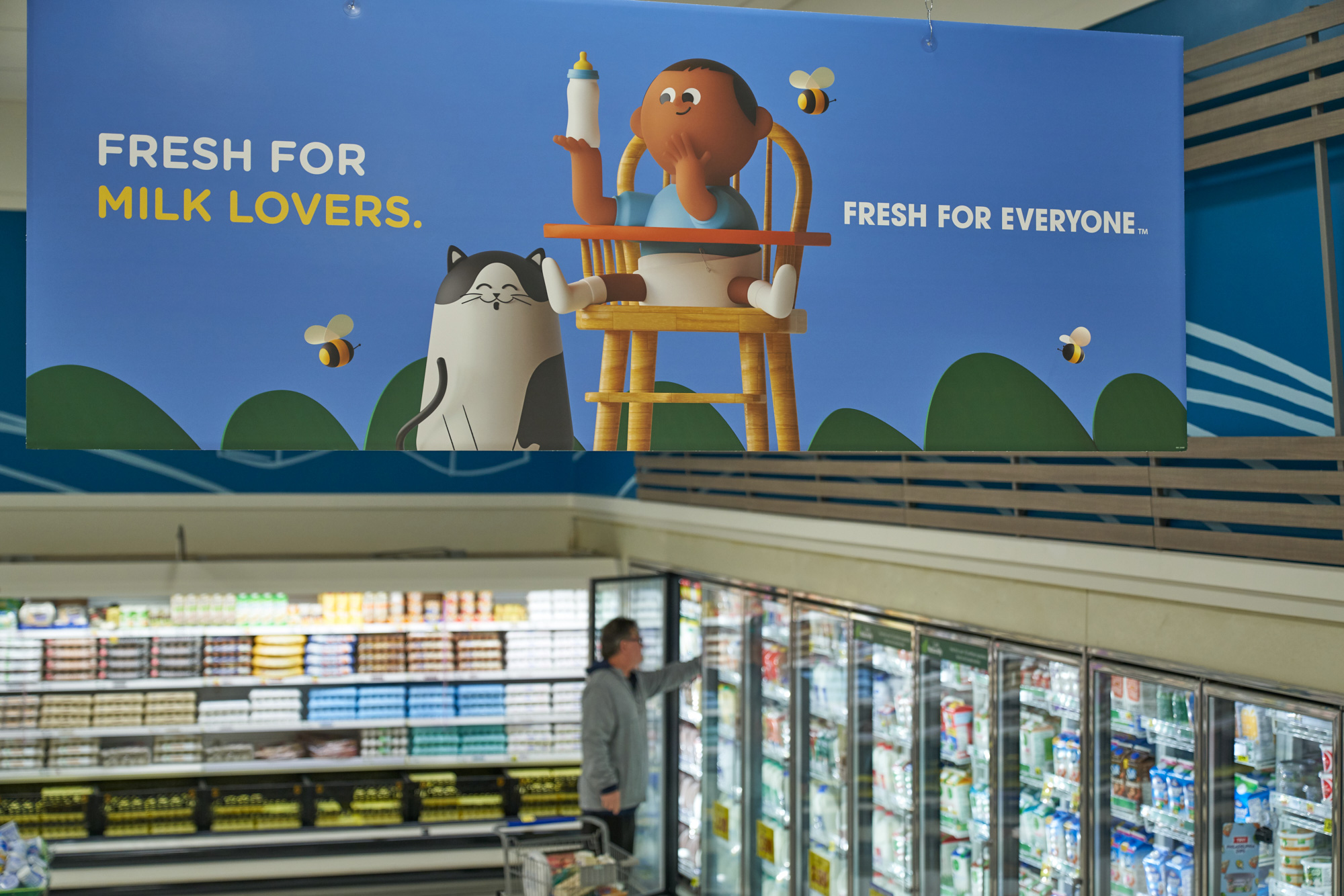
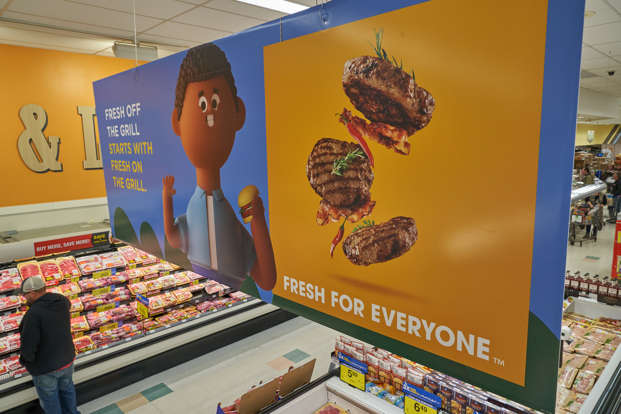
The in-store promos are the kind of approach I would expect from an ad agency, with too much focus on copywriting (flimsy copywriting at that in this case) and really bad layouts and graphic decisions. On the surface, and as visual noise to ignore as one shops, these might be fine but who in the world mixes a rounded sans serif with ITC Avant Garde Gothic -- which is its own weird antiquated choice for the tagline and the main brand typeface. But maybe I'm just being too judgy and preconceived about the abilities of ad agencies so I'm happy to take a self-prescribed chill pill.
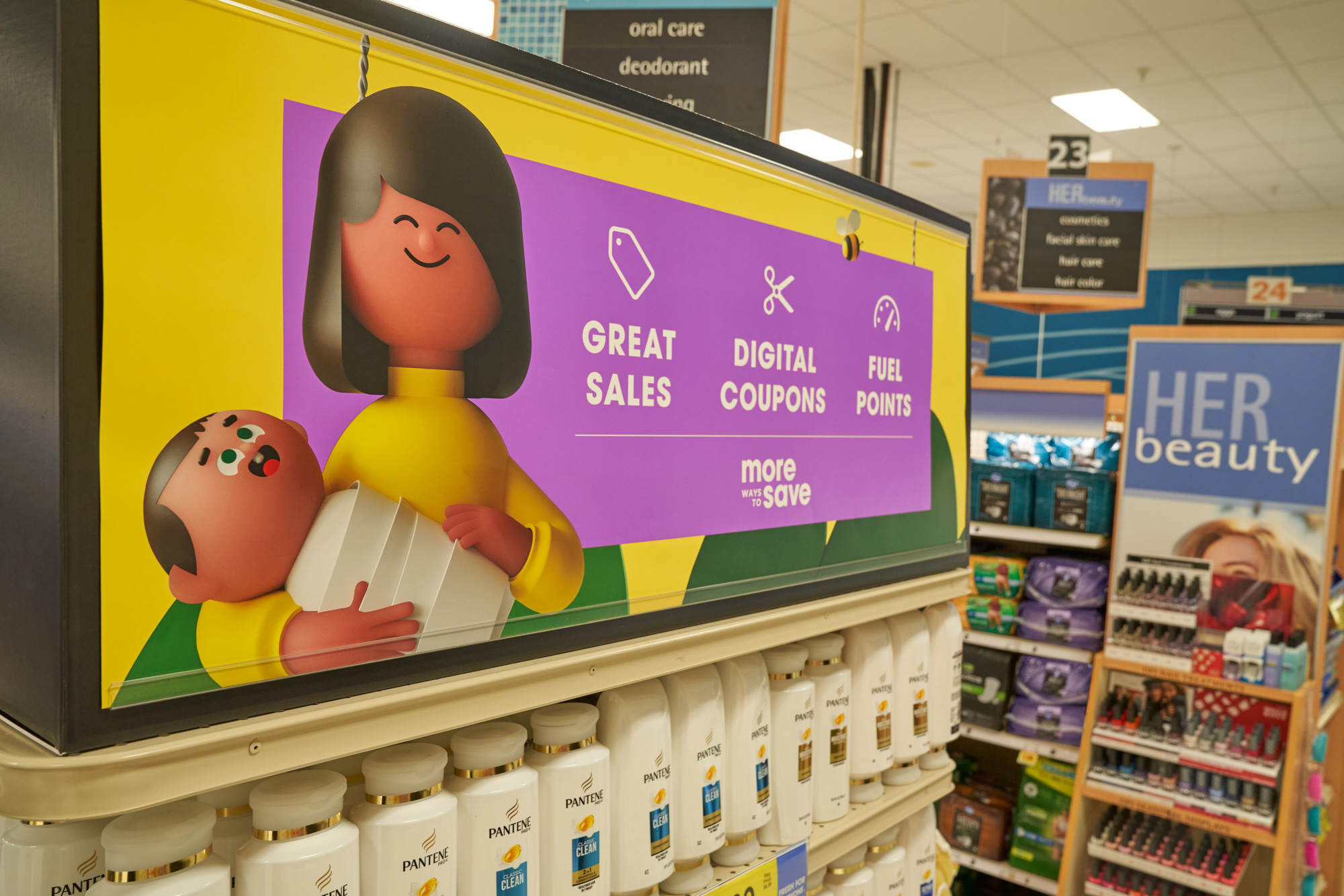
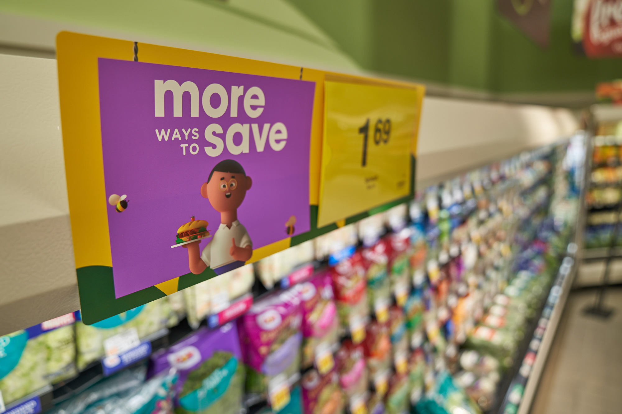
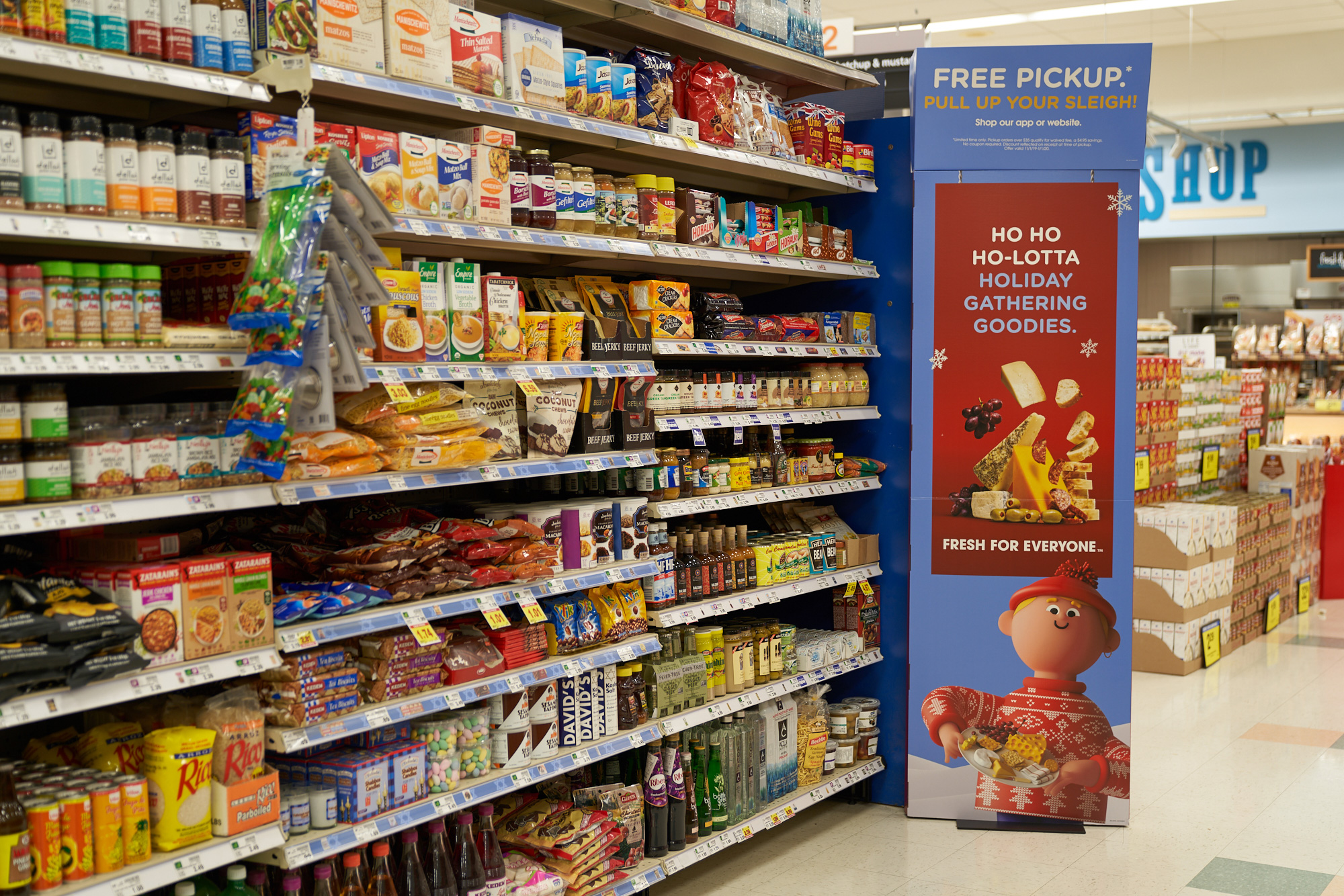
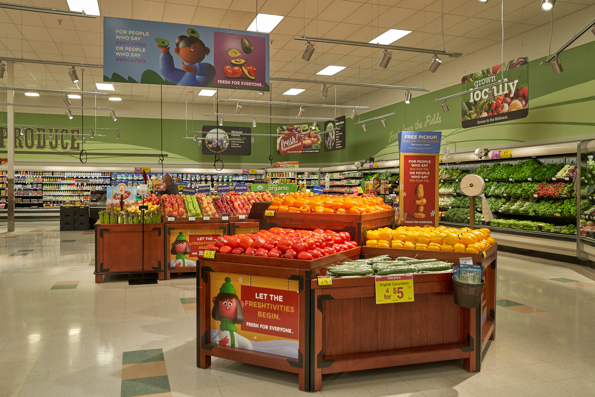
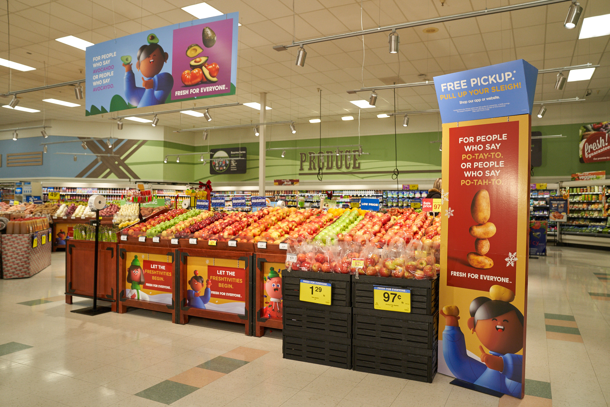
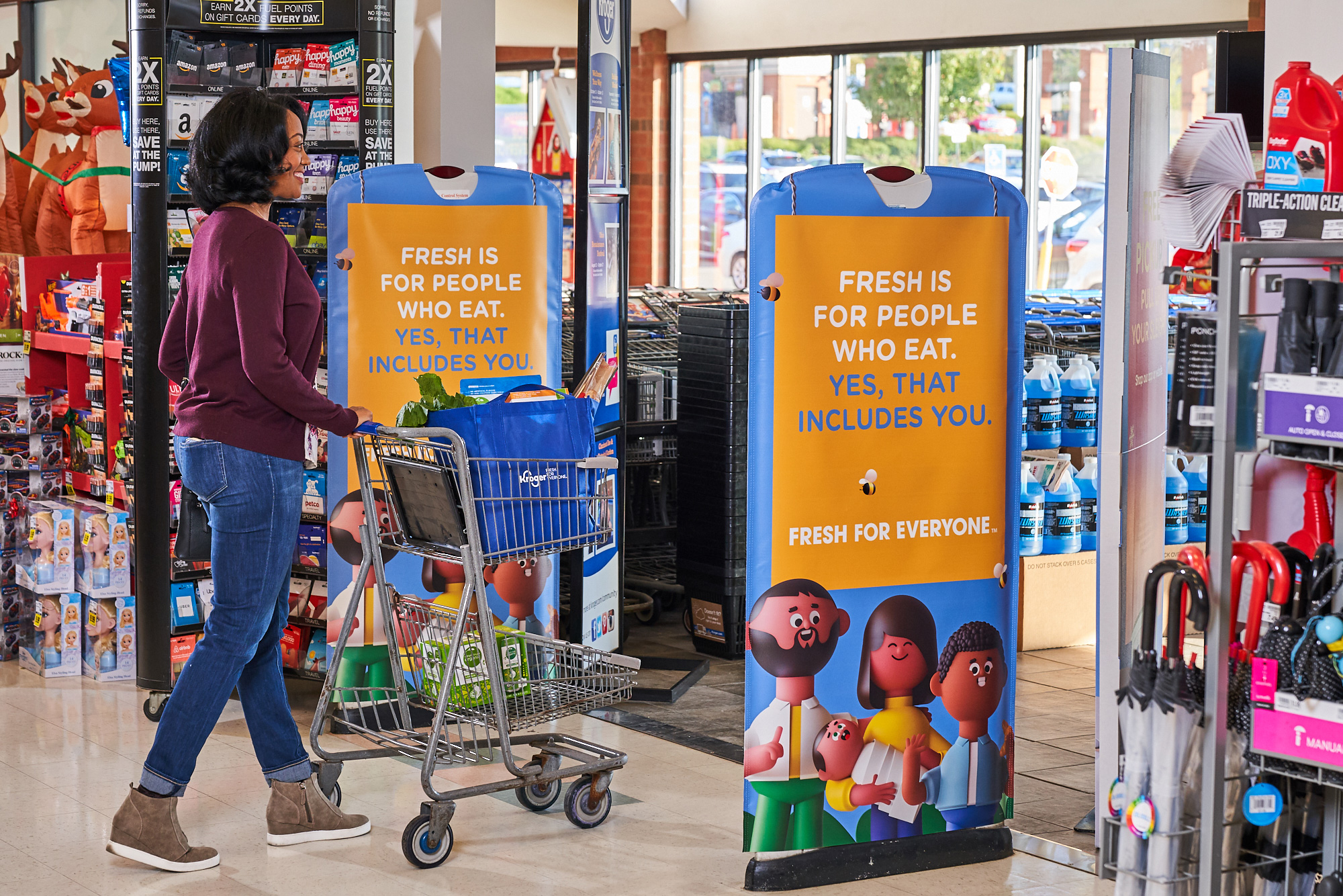
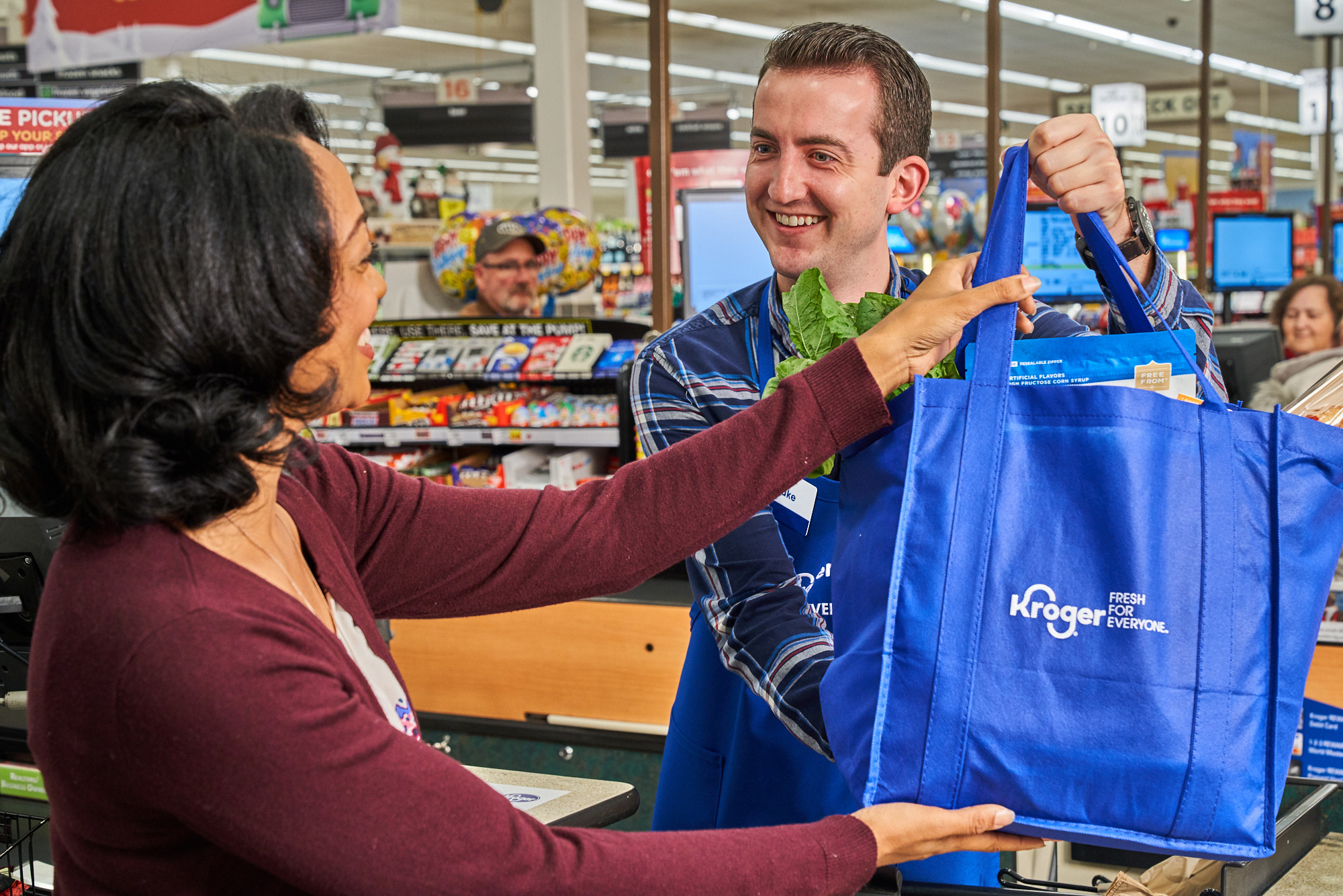
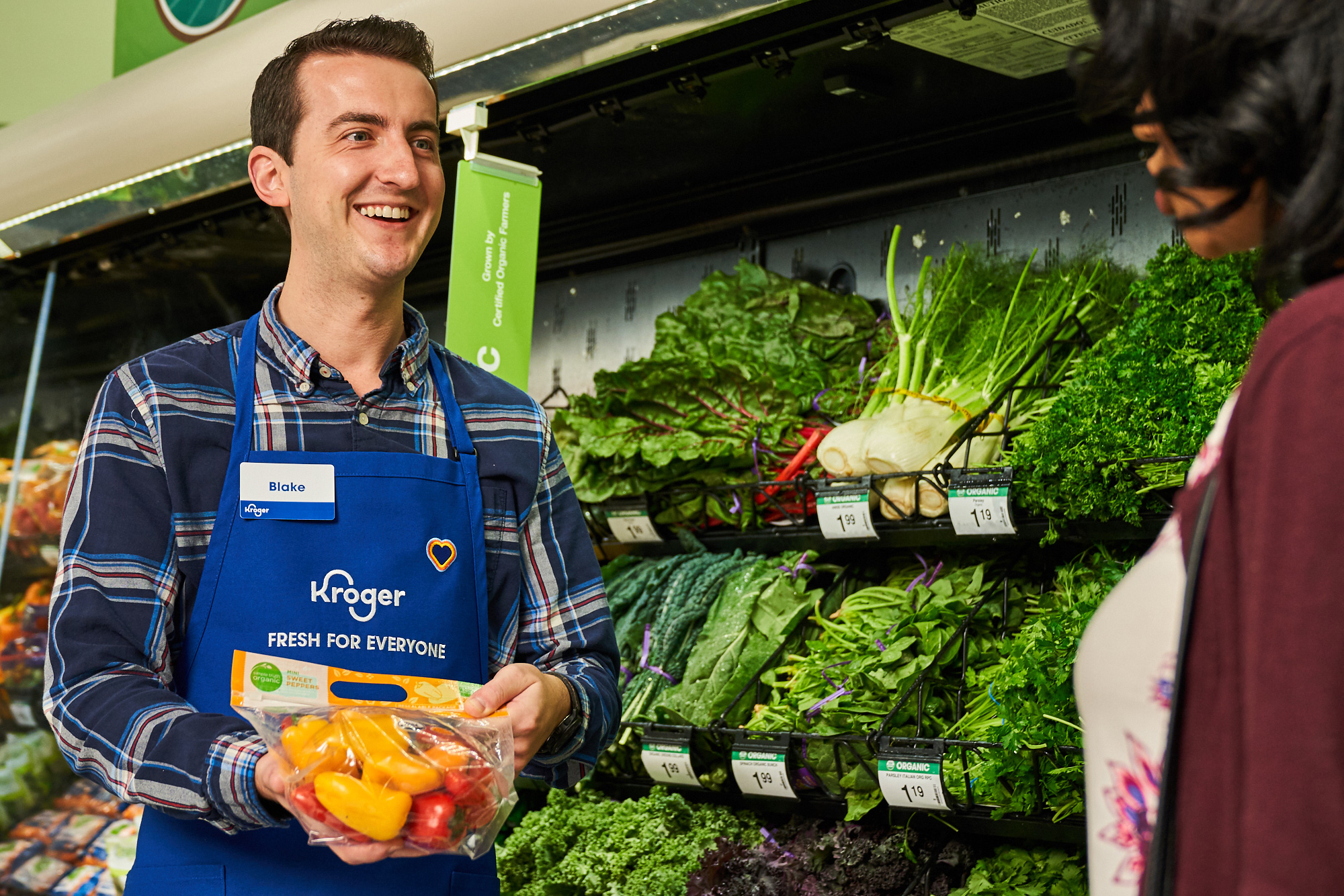
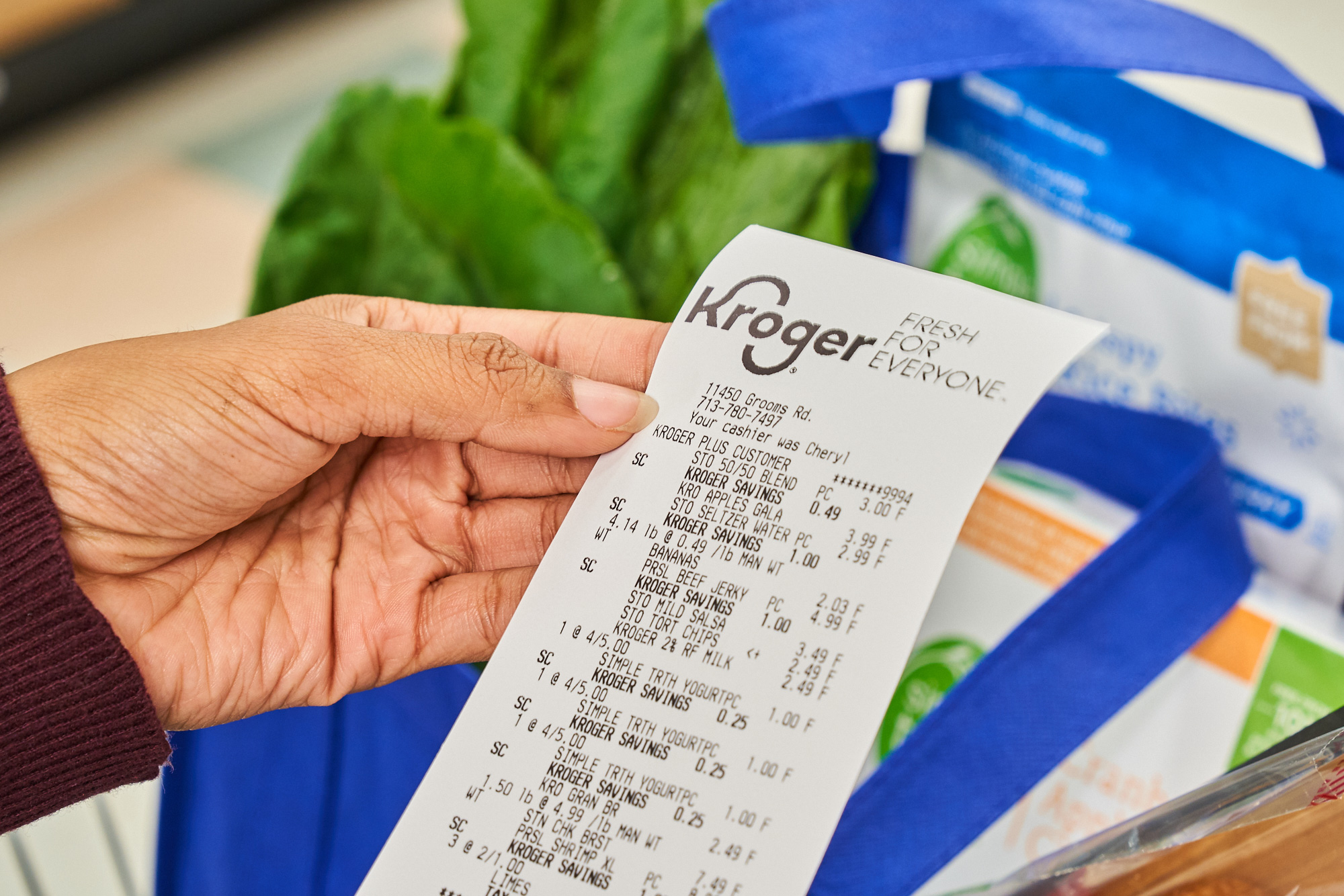
Overall, what this does well is extend the equity of the logo for another 20, 30, 40 years without messing with customers' expectations or in-store experience. Some people might notice the new logo, most will not and when you are operating at this volume it's better that most people just keep going on with business as usual. Do I personally wish this were better or more design-y or more memorable? Sure (and I do actually believe it would have been possible if working with the right branding or identity firm instead of an ad agency) but I also acknowledge this is a big, fat, cashable "fine" with little to no repercussions. At my most optimistic, I do hope this signals a wave of better presentation and in-store experience at Kroger which have a great infrastructure and they have some interesting innovations but everything is almost inevitably outshined by far too much messaging and signage in every conceivable graphic style.
In ấn Anpic In nhãn mác Anpic In brochure Anpic In card visit Anpic In catalogue Anpic In thiệp cưới Anpic In tờ rơi Anpic
In Ấn Anpic – Nổi Tiếng In Đẹp In Nhanh
Số 5 Ngõ 75 Nguyễn Xiển, Thanh Xuân, Hạ Đình, Hà Nội
0963223884
baogiainananh@gmail.com
https://anpic.vn
https://g.page/inananpic
In nhãn mác Anpic ✅ In brochure Anpic ✅ In card visit Anpic ✅ In catalogue Anpic ✅ In thiệp cưới Anpic ✅ In tờ rơi Anpic
https://anpic.vn/in-nhan-mac-dep
https://anpic.vn/in-brochure
https://anpic.vn/in-an
https://anpic.vn/in-voucher-in-phieu-giam-gia-khuyen-mai
#inananpic
Comments
Post a Comment