Announced: The Best and Worst Identities of 2019, Part 5: The Worst Noted
“2019 Year in Review”
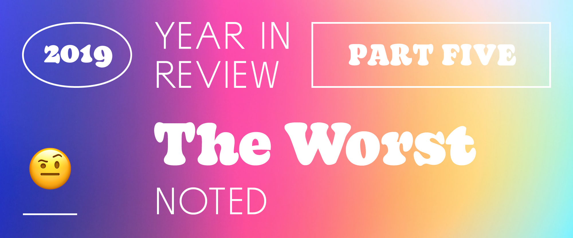
If you were disappointed with the lack of Worst inclusions from the Reviewed section, this might satiate your need for disdain. Plenty of clunkers this year in Noted. Here you go...
See also:
Part 1: The Most Notable Reviewed & Noted
Part 2: The Best Reviewed
Part 3: The Worst Reviewed
Part 4: The Best Noted
Backgrounds: crops of photos by Sean Sinclair on Unsplash
Fonts: Decoy by PSTL and Spoof by Polytype.
No.
12
New Logo for State of Colorado done In-house
Colorado had introduced a pretty decent logo and system six years ago and for some reason they replaced it with the most convoluted logo possible that needs 8 colors to work -- if you can call that logo working. See original post
No.
11
New Logo for Chicago Fire FC by Doubleday & Cartwright
I did not dislike this logo as passionately as almost everyone else but it's definitely a major letdown for a big city team.See original post
No.
10
New Logo and Font for It’s More Fun in the Philippines by BBDO Guerrero
A visually noisy icon that's unclear what it is gets no assist from a really ugly custom typeface.See original post
No.
9
New Logo and Identity for Cheetah by Moving Brands
I'm a Moving Brands fan and I do believe them when they say this funky logo is appropriate for the personality of their client so it pains me to say this but, man, that Cheetah-type-animal-thing is a real eyesore and the kind of concept perpetrated by a Year 1 design student.See original post
No.
8
New Logo for Sallie Mae
Ugh, no. Whatever is happening here, no.See original post
No.
7
New Logo for Lord + Taylor
What a waste of legacy, replacing decades of mostly decent and energetic script logos in favor of the lamest typography possible inside a square with the most pointless use of white space.See original post
No.
6
New Name and Logo for Peacock
Aside from the name, which I still dislike, the logo is so unappealing with its weird "p" and "k" that match none of the other letters. See original post
No.
5
New Logo for Sears
Winner of the Most Pointless Icon Award is Sears. It's an unnecessary addition to a brand name that despite not being the most well-regarded brand name has so much equity it doesn't need some abstract thing in horrible colors next to it. See original post
No.
4
New Logo for Sam’s Club
The old logo wasn't great by any standard but in comparison to the new one it's almost amazing. The gigantic arrows and lowercase wordmark add up to the poorest evolution possible. See original post
No.
3
New Name and Logo for AT&T TV Now
A terrible name complemented by terrible typography. A match made in hell.See original post
No.
2
New Logo for Macy’s
At first glance maybe it's no so bad but the lack of overshoot in the curved letters is inexcusable. There is a lot of subjectivity around typography but one objective, 100% factual, irrefutable aspect of it is that curved letters need an overshoot. This is typographic malpractice.See original post
No.
1
New Logo for American Bar Association by Finn Partners
This is the worst possible idea for a ligature executed in the worst possible way. No designer should look at that logo and think "I did a good job here, I can go home and sleep a peaceful, deep sleep knowing I have contributed good design to the world today". See original post
In ấn Anpic In nhãn mác Anpic In brochure Anpic In card visit Anpic In catalogue Anpic In thiệp cưới Anpic In tờ rơi Anpic
In Ấn Anpic – Nổi Tiếng In Đẹp In Nhanh
Số 5 Ngõ 75 Nguyễn Xiển, Thanh Xuân, Hạ Đình, Hà Nội
0963223884
baogiainananh@gmail.com
https://anpic.vn
https://g.page/inananpic
In nhãn mác Anpic ✅ In brochure Anpic ✅ In card visit Anpic ✅ In catalogue Anpic ✅ In thiệp cưới Anpic ✅ In tờ rơi Anpic
https://anpic.vn/in-nhan-mac-dep
https://anpic.vn/in-brochure
https://anpic.vn/in-an
https://anpic.vn/in-voucher-in-phieu-giam-gia-khuyen-mai
#inananpic


Comments
Post a Comment