Announced: The Best and Worst Identities of 2019, Part 6: The Best Friday Likes
“2019 Year in Review”
The funnest, coolest, graphic-iest projects from the 38 Friday Likes published in 2019.
See also:
Part 1: The Most Notable Reviewed & Noted
Part 2: The Best Reviewed
Part 3: The Worst Reviewed
Part 4: The Best Noted
Part 5: The Worst Noted
Backgrounds: crops of photos by Sean Sinclair on Unsplash
Fonts: Decoy by PSTL and Spoof by Polytype.
No.
12
Aburi Tora by Glasfurd & Walker
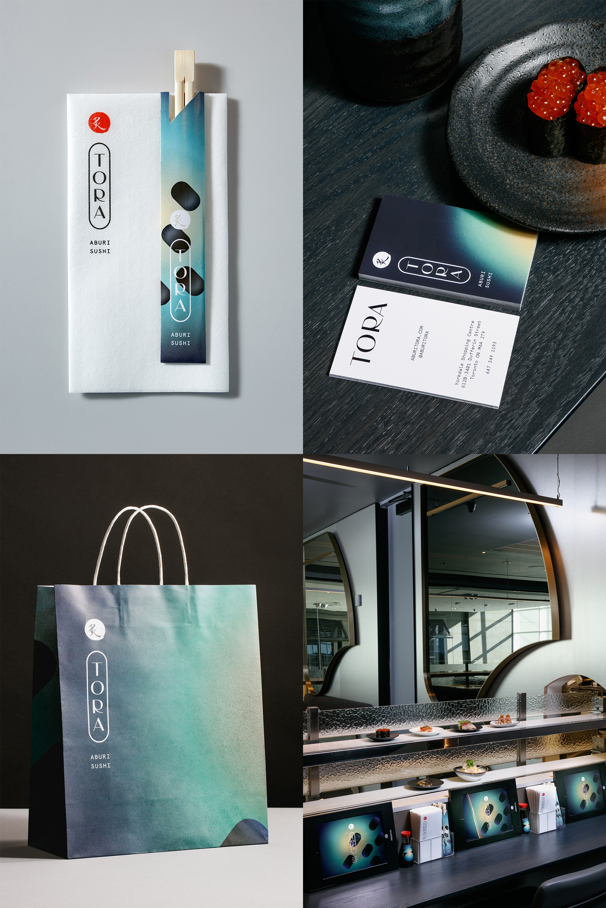
Funky and cosmos-y with great typography.See original post in Friday Likes 287
No.
11
Granger by Mildred & Duck
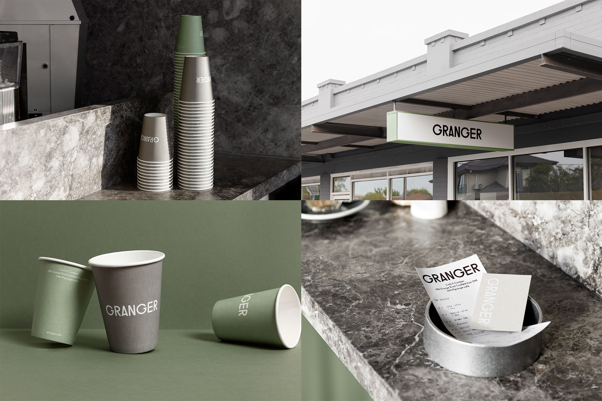
A delightful color palette of muted green and gray for a solid wordmark.See original post in Friday Likes 282
No.
10
LookBooks by Studio Lowrie
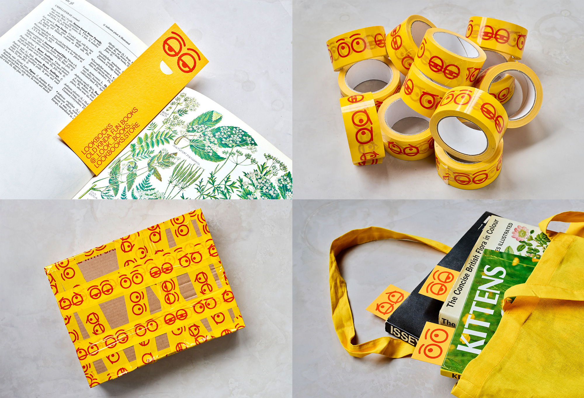
Playful, idiosyncratic, and featuring the best bookmarks.See original post in Friday Likes 307
No.
9
Jacob the Angel by Here Design
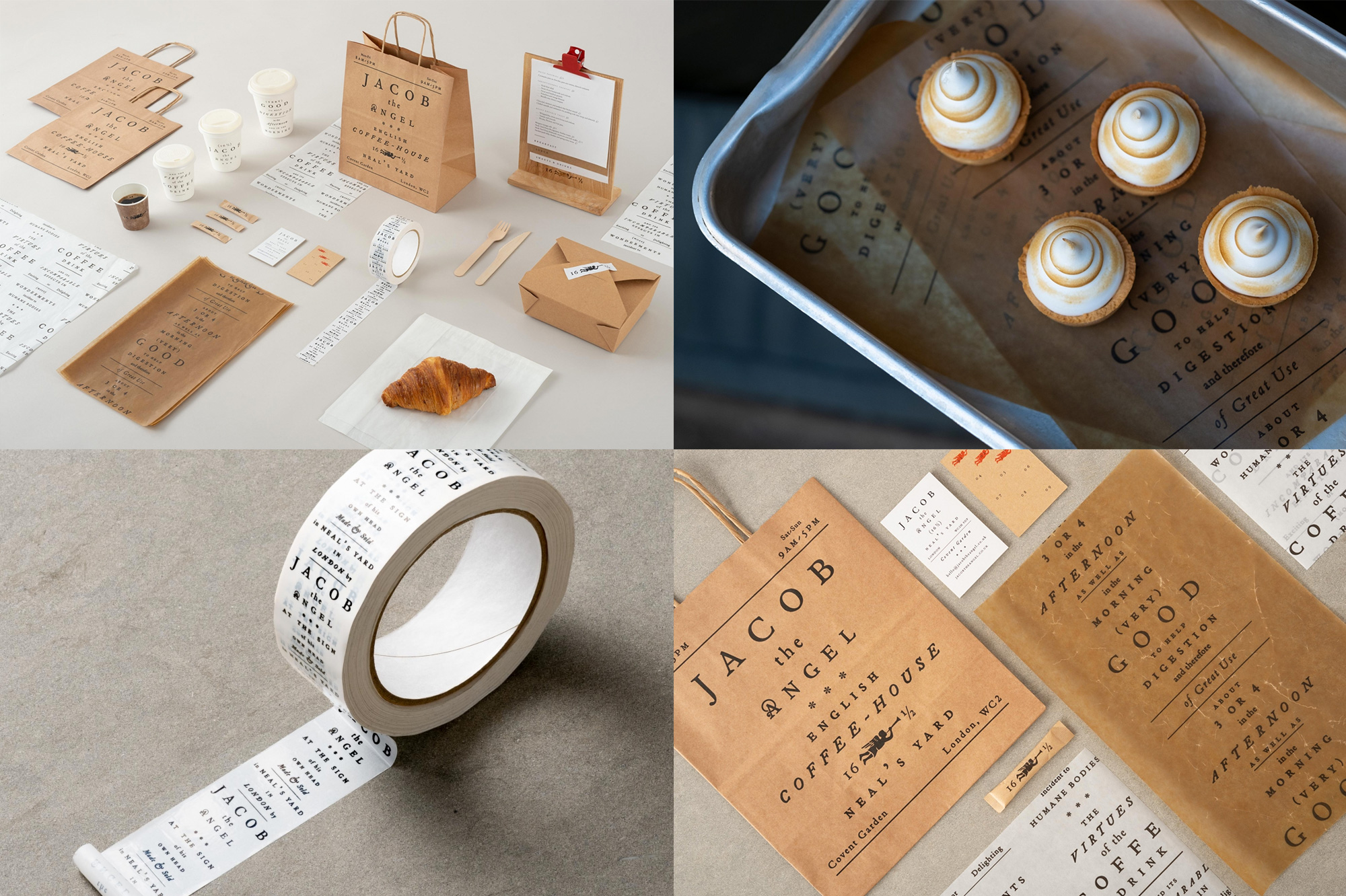
Centered-tracked-out-serif goodness.See original post in Friday Likes 308
No.
8
Workshop Built Inc. by Mubien
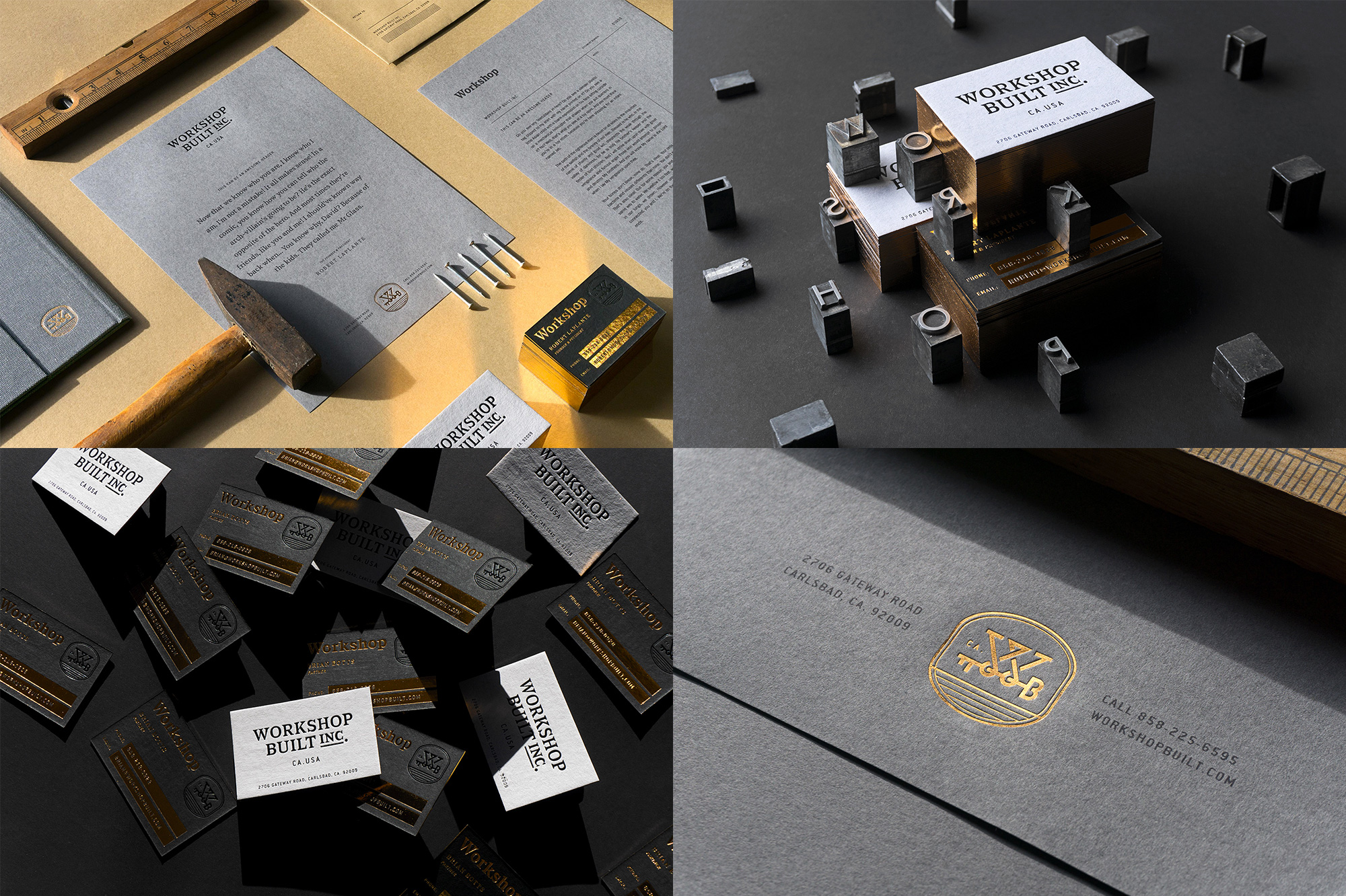
Some great typography amazingly printed and presented like a boss.See original post in Friday Likes 289
No.
7
Ida Graves by Buddy-Buddy
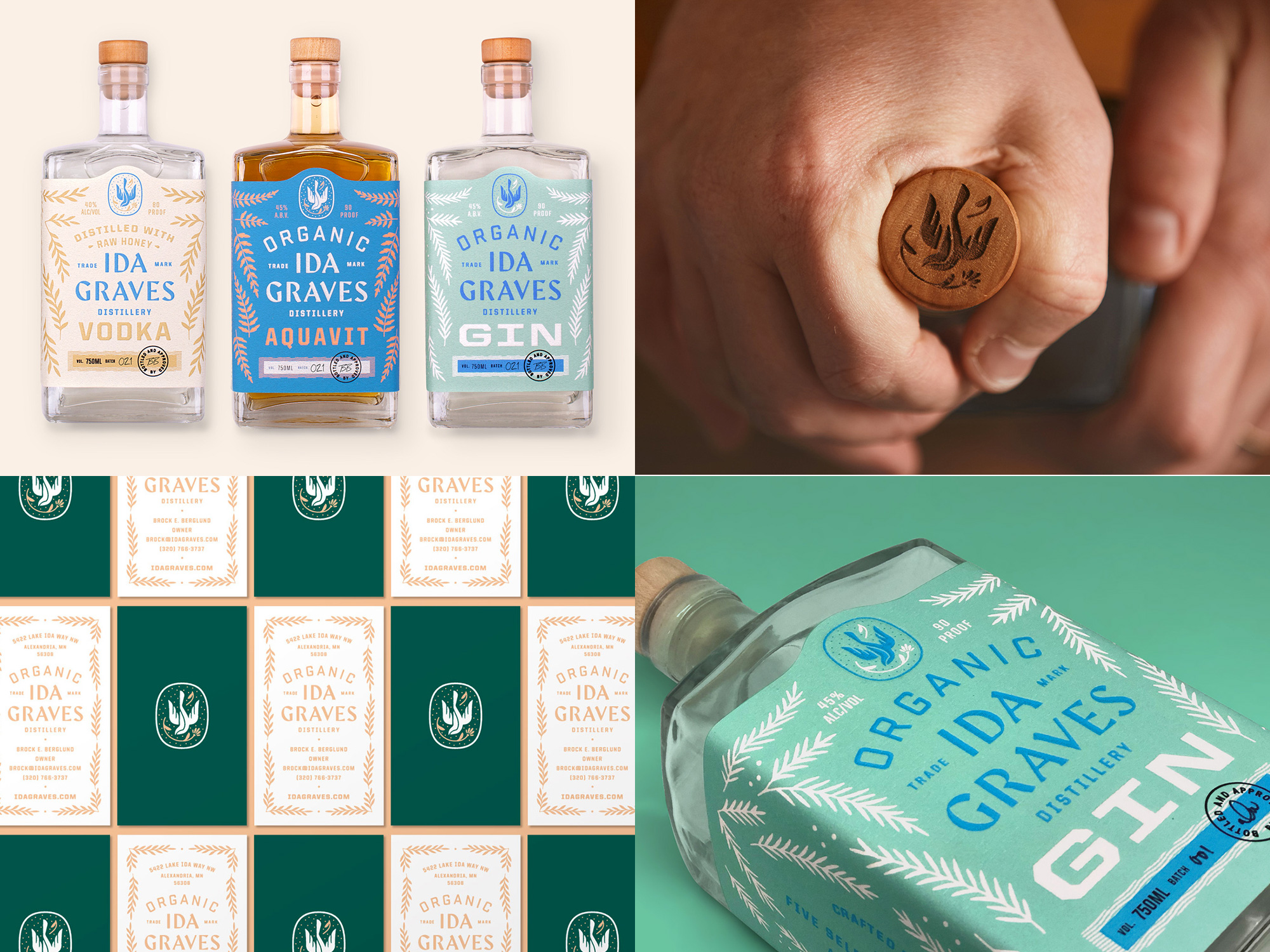
Lots of great ornamental details, beautiful varied typography, and a great color palette.See original post in Friday Likes 305
No.
6
The Golden Hour by Triboro
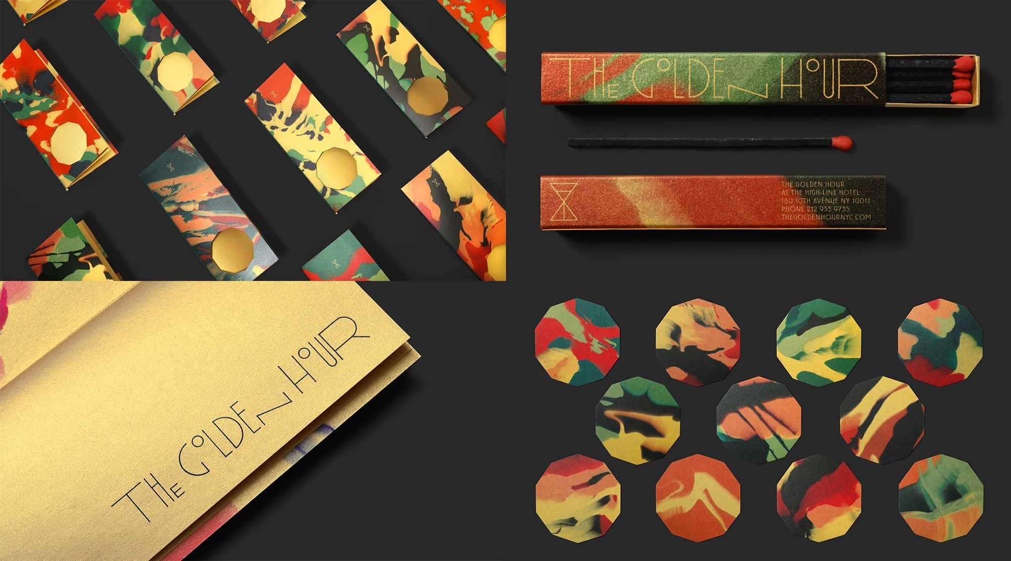
I still don't know what exactly is going on in this identity but it's one the best color palettes of the year and there is so much good texture to be enjoyed.See original post in Friday Likes 283
No.
5
Superthing by Futura
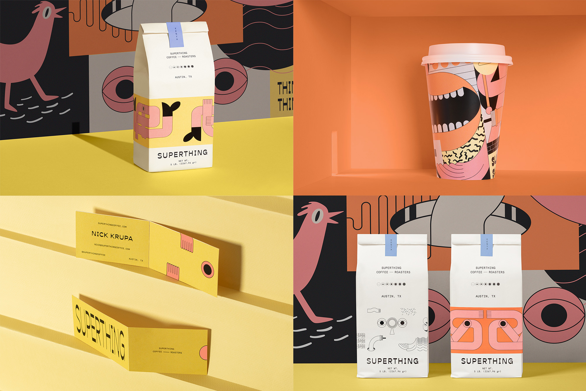
Another one where I have no idea what's going on but it's all such a fun graphic expression that takes a turn for the weird very quickly.See original post in Friday Likes 277
No.
4
Bartosz Ferments by Bartosz Szymkiewicz
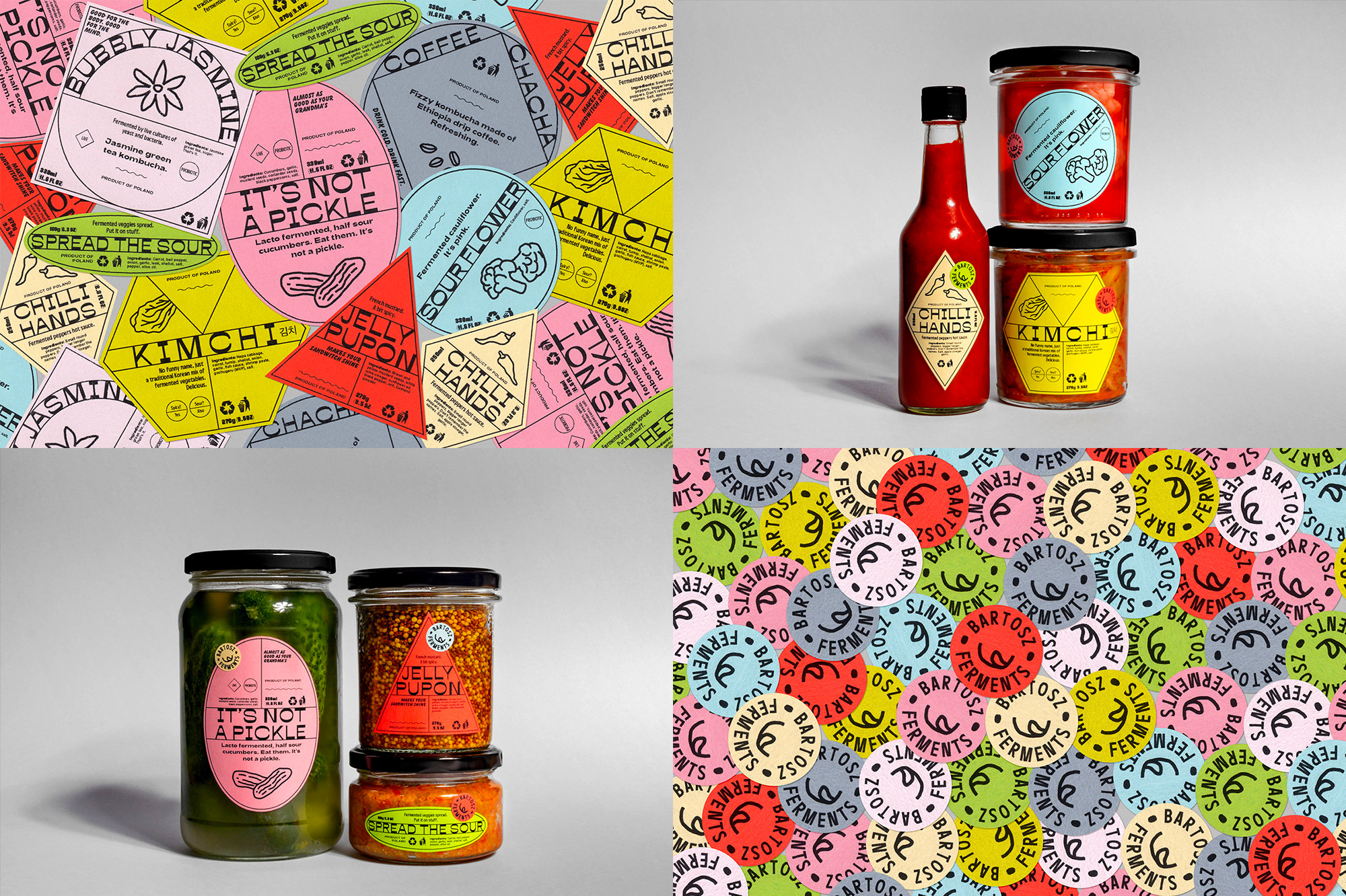
I know this isn't the most high-end of entries but there is something very authentic about these home-made labels. They are fast and furious... and fermented.See original post in Friday Likes 302
No.
3
Trit House by Office of SPGD
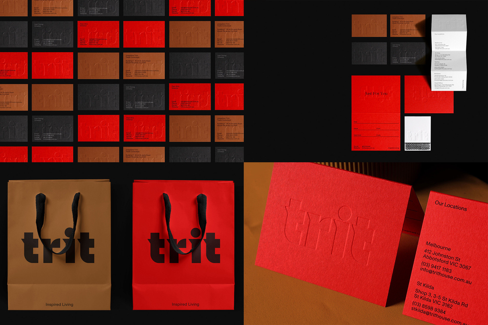
I love the boldness of this wordmark and its unapologetically big application across all items. This is also one of the few instances where a weird brown color actually works and it does look great paired with red and black. See original post in Friday Likes 292
No.
2
Makeready by Peck Design Associates

A great combination of oddball yet moody illustrations with industrious typography, all in a tightly produced package.See original post in Friday Likes 299
No.
1
Supertrash by Seachange
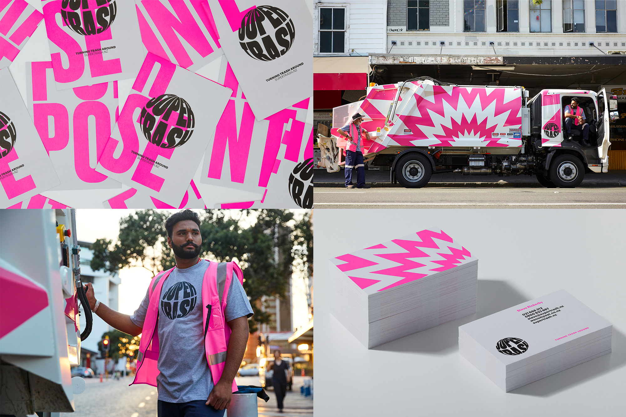
This is garbage. Literally. And it's the best garbage-related identity ever, defying every single expectation and non-existing convention for a trash pick-up service. It's pink and it's loud and I want that truck to come by my house on a weekly basis.See original post in Friday Likes 301
In ấn Anpic In nhãn mác Anpic In brochure Anpic In card visit Anpic In catalogue Anpic In thiệp cưới Anpic In tờ rơi Anpic
In Ấn Anpic – Nổi Tiếng In Đẹp In Nhanh
Số 5 Ngõ 75 Nguyễn Xiển, Thanh Xuân, Hạ Đình, Hà Nội
0963223884
baogiainananh@gmail.com
https://anpic.vn
https://g.page/inananpic
In nhãn mác Anpic ✅ In brochure Anpic ✅ In card visit Anpic ✅ In catalogue Anpic ✅ In thiệp cưới Anpic ✅ In tờ rơi Anpic
https://anpic.vn/in-nhan-mac-dep
https://anpic.vn/in-brochure
https://anpic.vn/in-an
https://anpic.vn/in-voucher-in-phieu-giam-gia-khuyen-mai
#inananpic
Comments
Post a Comment