Noted: New Logo and Identity for International Paralympic Committee by North
“Spiraling into Control”
"Founded on 22 September 1989 as an international non-profit organisation, the International Paralympic Committee (IPC) is an athlete-centred organisation composed of an elected Governing Board, a management team and various Standing Committees and Councils. Since 1999 we have been headquartered in Bonn, Germany. The IPC's primary responsibilities are to support our 200 plus members develop Para sport and advocate social inclusion, ensure the successful delivery and organisation of the Paralympic Games and act as the international federation for 10 Para sports."
Design by
North (London, UK)
Related links
N/A
Relevant quote
The Paralympic symbol has been in use since the 2006 Winter Paralympics in Turin, Italy. Whilst the symbol has become recognised internationally, the organisation has lacked a broader visual identity to support it. North was approached to build an identity system around the symbol that would unify the IPC’s visual output and contribute to the wider aim of challenging existing perceptions around disability.
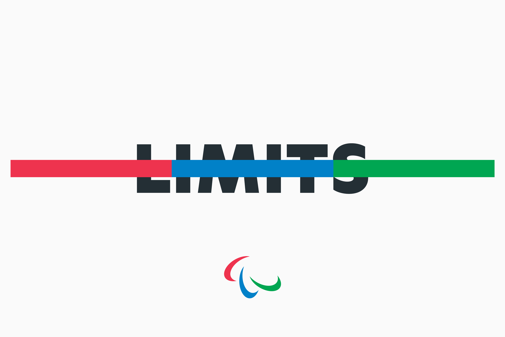
The symbol itself has been completely redrawn so as to confirm and reinforce the implied dynamism of the original construction. The geometry of the new symbol also aims to resolve a number of practical reproduction issues with important applications, including the production of three dimensional signage and clarity at small scales. The Red, Blue and Green have been brightened to give the symbol parity with the Olympic rings.
A set of patterns derived from the geometry and colour palette of the new symbol was created in order to offer an alternative to photography.
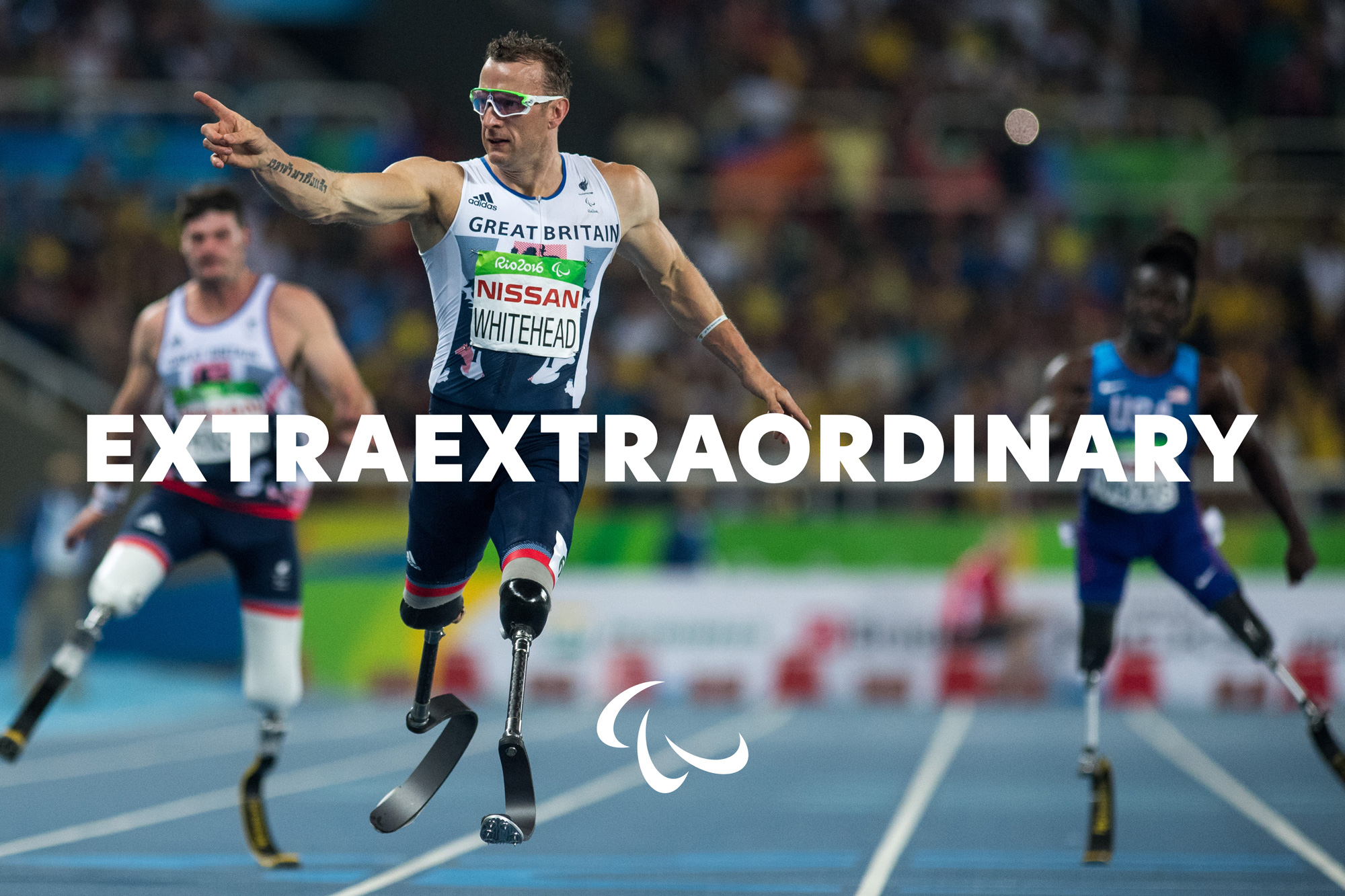
The IPC’s tone of voice has also been emboldened with the introduction of a new typeface. ’New Hero’ enables a more motivational, energetic style of messaging more in tune with the broader visual language of contemporary sports brands and events.
These elements come together in a flexible design system that encourages consistent expression across a broad variety of materials, from athlete handbooks to the IPC’s video channels.
Images (opinion after)


Opinion
The old logo was surprisingly messy and since it generally plays a secondary role in Paralympic Game logos — in the same way as the Olympic Rings — it was hard to notice how bad it was. The new logo is what our collective minds interpreted the old logo to be: a crisp set of swooshes with excellent bezier curves organized around a tight axis. It’s funny how that was so not the case. So, yeah, great improvement on the logo, no doubt. Even the subtle tweak to the colors make it more lively and, to boot, now match colors from the Olympic Rings. The few identity elements around the logo are okay… nothing too exciting… the typeface is interesting, as a kind of spinoff of Futura and the textures are intriguing. There is not much of a system to speak of… so there is not a whole lot to agree or disagree with. Overall, everything is pointing in the right direction now both literally and metaphorically.
In ấn Anpic In nhãn mác Anpic In brochure Anpic In card visit Anpic In catalogue Anpic In thiệp cưới Anpic In tờ rơi Anpic
In Ấn Anpic – Nổi Tiếng In Đẹp In Nhanh
Số 5 Ngõ 75 Nguyễn Xiển, Thanh Xuân, Hạ Đình, Hà Nội
0963223884
baogiainananh@gmail.com
https://anpic.vn
https://g.page/inananpic
In nhãn mác Anpic ✅ In brochure Anpic ✅ In card visit Anpic ✅ In catalogue Anpic ✅ In thiệp cưới Anpic ✅ In tờ rơi Anpic
https://anpic.vn/in-nhan-mac-dep
https://anpic.vn/in-brochure
https://anpic.vn/in-an
https://anpic.vn/in-voucher-in-phieu-giam-gia-khuyen-mai
#inananpic


Comments
Post a Comment