Reviewed: New Logo and Identity for BERA by How & How
“For the Foreseeable Future”
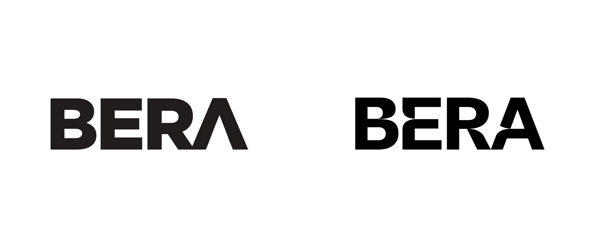
Established in 2013, BERA (Brand Equity Relationship Assessment), headquartered in New York, NY, is a predictive intelligence brand-building platform. What that means, in yet more hard-to-understand words, is that the platform uses a "causation algorithm that has been tested on 4,000+ brands across 7 years, [allowing] you to know exactly what impacts your sales, sales profitability, or your sales-to-enterprise value ratio." I have poked around their website quite a bit and I'm still not sure what they do but I believe that, in a nutshell, you input your own brand's metrics across different categories and it will compare it to the 4,000 brands and 2.1 billion data inputs in its database to give you suggestions on what steps to take next -- all while updating and reacting in real time to evolving data. BERA also generates a "BERA Growth Score", which is a "data-driven cultural rank with the proven ability to forecast the growth and profitability of a brand" -- Instagram, for example, has a score of 70, while Kylie Jenner a 27. BERA recently introduced a new identity designed by London, UK-based How & How.
Our solution was to transform the 'magic' of their platform into a solid reality. We used chaos theory to explain how seemingly random information (data) can have systematic patterns underpinning it. We developed an icon set based on circles, which could have complexity added or abstracted away. From these icons we developed the 'North Star' -- the brand marque which was etched into the logotype and used across company collateral as a visualisation of their process, as well as philosophy.
We used BW Gradual to create a customised wordmark, choosing the font for its pure shapes and fast curves which lent themselves to a 'Star' like effect.
How & How project page

The old logo was rather blunt and uninteresting even with its "A" pretending to be interesting by posing as an arrow. The new logo maintains the overall silhouette of the old one but builds in a couple of stars in the negative space between each pair of letters. The effect is instantly evident, which is a good thing, and it works the best between the "B" and the "E" as the star doesn't have to deal with the angles of the "R" and the "A". I feel like it was so close to being resolved very well but something in the end isn't quite right -- perhaps using a typeface with a more condensed and less angled structure like, say, Tungsten, would have allowed for better negative-spacing but since they are using BW Gradual for the logo and the identity in general, the stars was almost already pre-set in "BERA" and the extreme-notch element is easily extended across the identity.
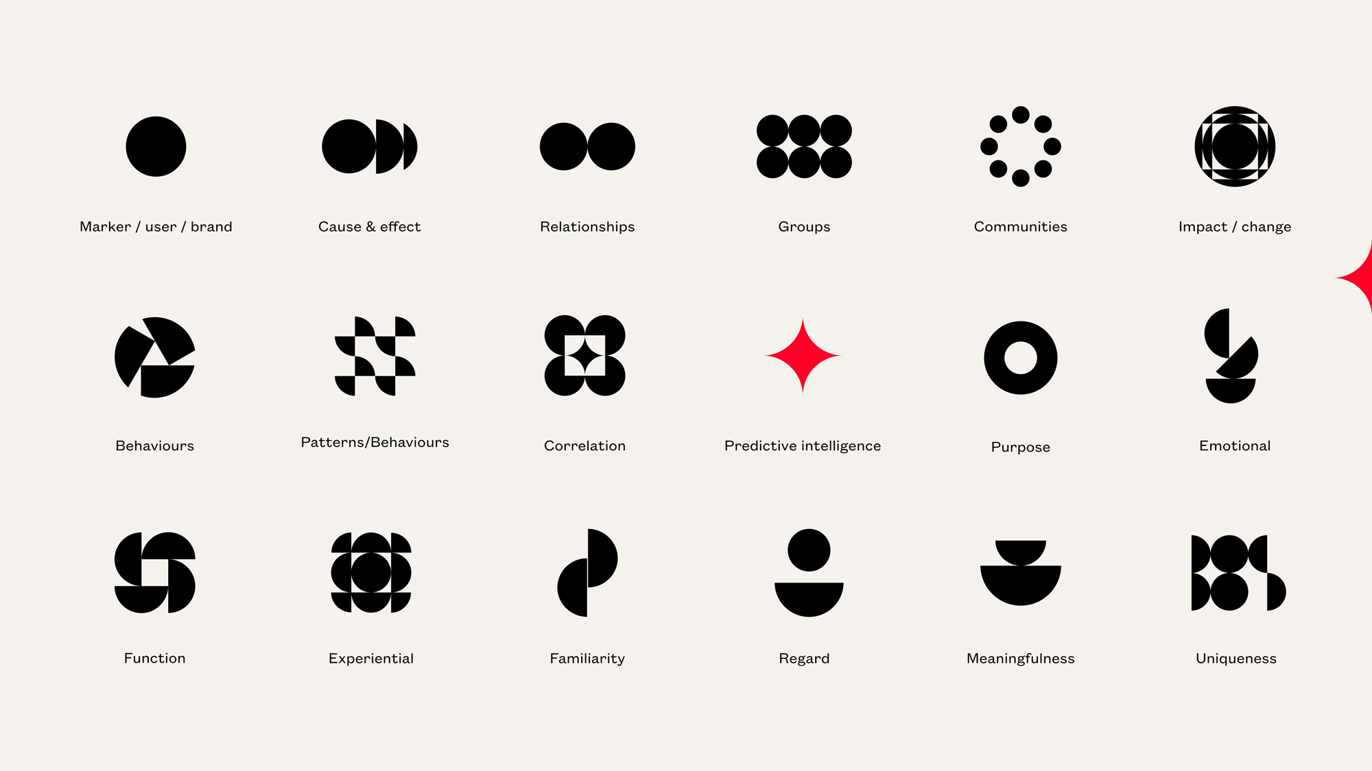
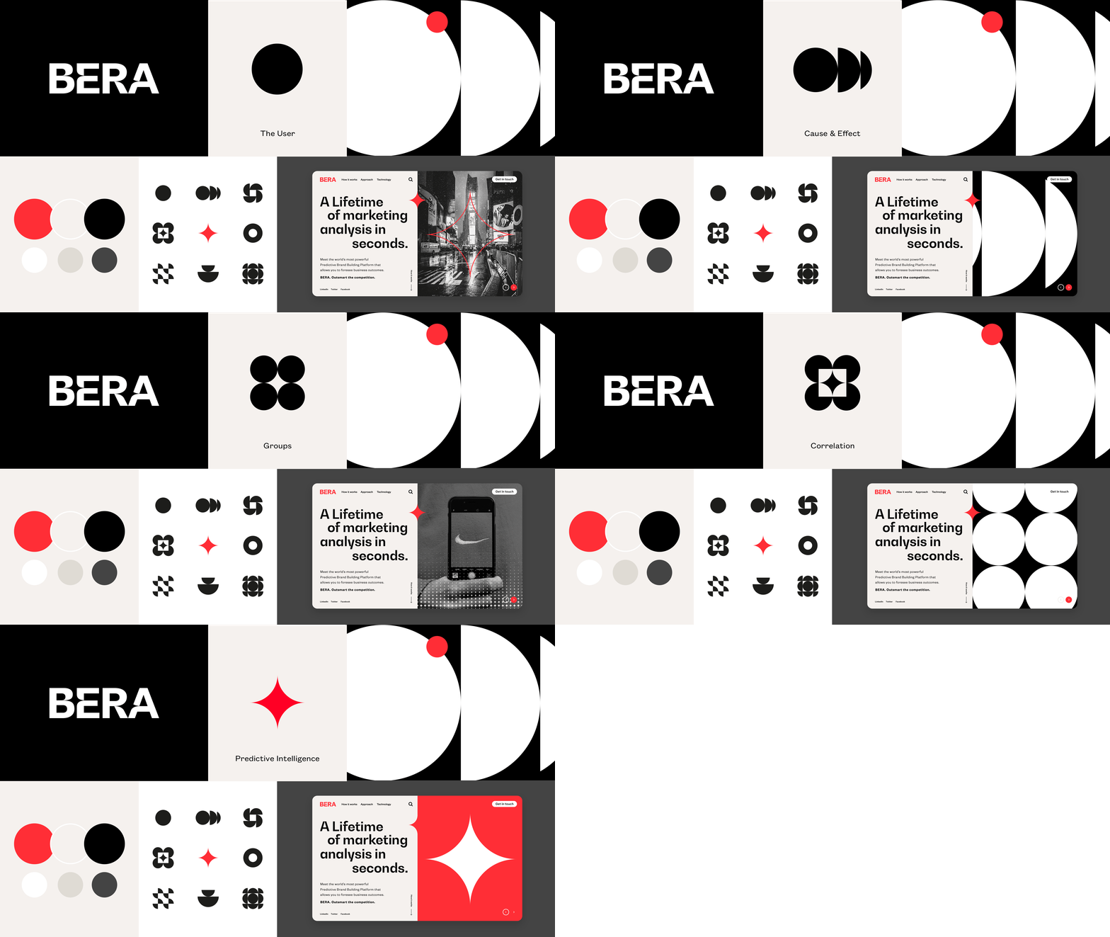


The identity gets more exciting as some abstract, geometric elements are introduced and as different ways of displaying the "North Star" are explored. Like the platform itself, everything in the design is a little ambiguous and I'm okay with that. In a way, I feel like the identity visualizes the idea of interpreting and parsing similar data points in different ways -- visually represented as circles cut in half, rotated, and stacked in different ways.
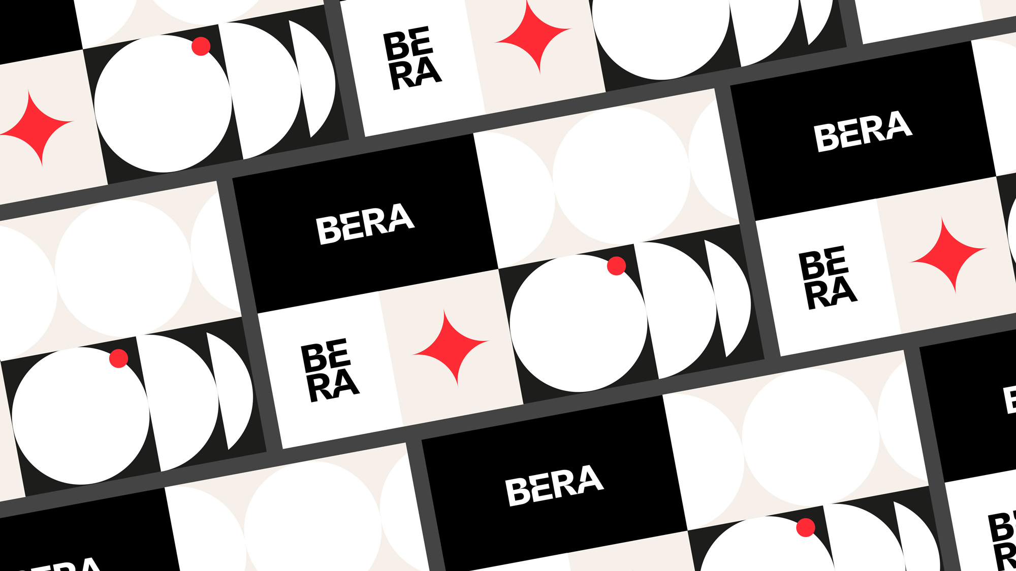
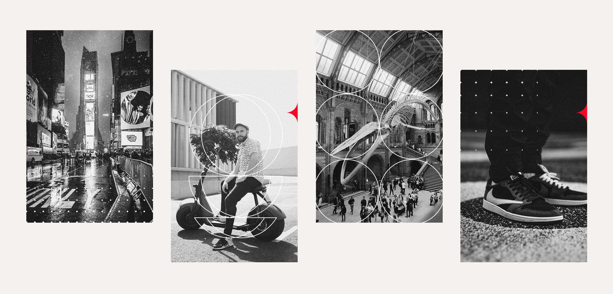
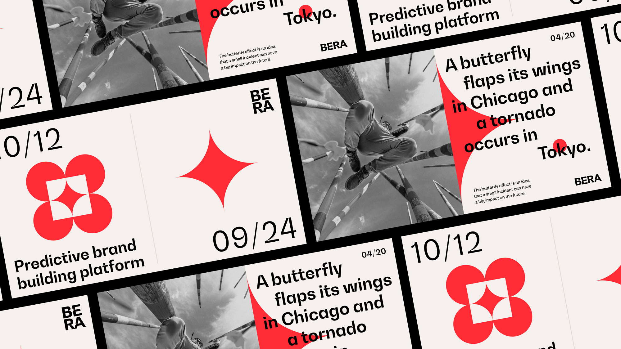
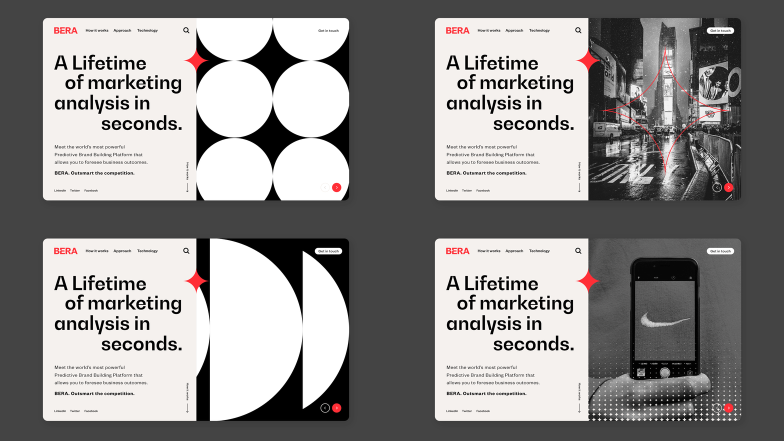
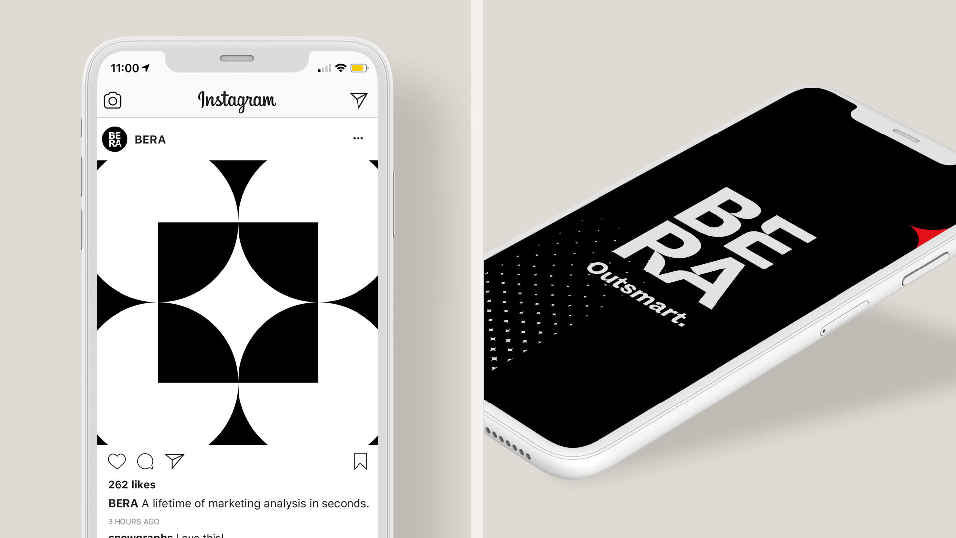
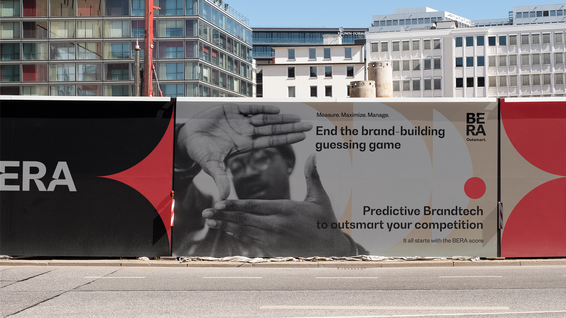
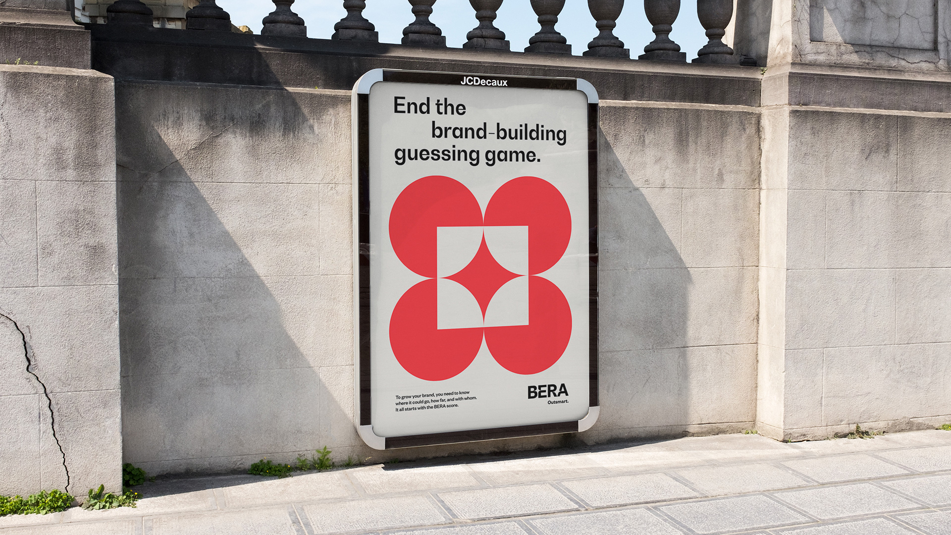
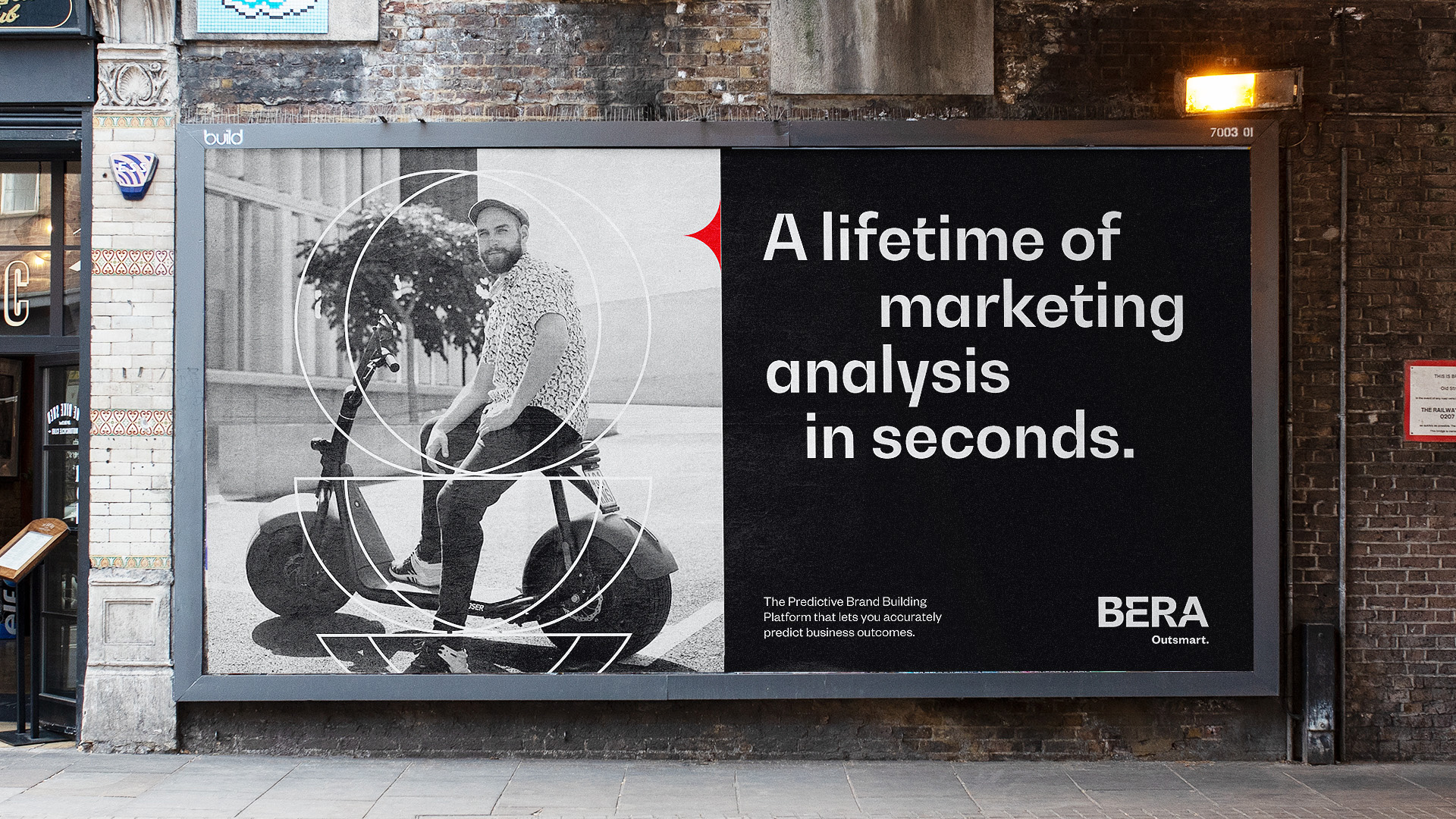
From the moment BW Gradual was released, I was a fan, so I pretty much like every identity that uses it and I think it fits particularly well in this one, along with the circle/sharp-star motif. Message-wise, if I were to see any of the billboards above out in the world I would have no idea what they are advertising but even after reading their website over and over I still don't know what they do so, at the very least, what this identity does well is give a visual voice and draw you in, in a dynamic way, into this predictive branding platform that could provide more answers than the Oracle. (Not that Oracle, this Oracle).
In ấn Anpic In nhãn mác Anpic In brochure Anpic In card visit Anpic In catalogue Anpic In thiệp cưới Anpic In tờ rơi Anpic
In Ấn Anpic – Nổi Tiếng In Đẹp In Nhanh
Số 5 Ngõ 75 Nguyễn Xiển, Thanh Xuân, Hạ Đình, Hà Nội
0963223884
baogiainananh@gmail.com
https://anpic.vn
https://g.page/inananpic
In nhãn mác Anpic ✅ In brochure Anpic ✅ In card visit Anpic ✅ In catalogue Anpic ✅ In thiệp cưới Anpic ✅ In tờ rơi Anpic
https://anpic.vn/in-nhan-mac-dep
https://anpic.vn/in-brochure
https://anpic.vn/in-an
https://anpic.vn/in-voucher-in-phieu-giam-gia-khuyen-mai
#inananpic
Comments
Post a Comment